
Reuniting with director Ed Zwick, this 1994 romantic drama offered James Horner a sweeping canvas on which to paint one of his most epic and beloved scores. Filled with a multiplicity of themes and motifs, and Horner at his most lush and emotive. Although many have, perhaps rightly, criticized the film for its over-the-top melodrama, Horner's music absolutely brings the needed emotions, and greatly elevates the film. When I first saw the film, I remember finding it highly flawed, but when I rewatched it recently, especially with the weight of Horner's passing, I found myself utterly absorbed by the romance and drama, and the master's score unleashed many a tear from this sentimental viewer.


The original cover always bugged me. The main poster featured a ragged Brad Pitt grainy and blurred, though commanding the screen. Add onto that a muted tone, odd text placement and for years, only low resolution online--a poor cover for a worthy score such as this. Earlier in 2020, Intrada Records finally released an expanded edition--though despite some higher image quality, the design remained almost identical.
In revisiting this project almost two years after I first published it, I wanted to offer some more variety, as well as fix some small issues I had with my previous work. So I've now added an additional two covers, as well as offering improved edits on my original covers.
Years back, I'd worked on a custom cover, one of my most ambitious projects at the time, since I was essentially creating a new custom poster from various sources. I took the same basic poster as the base, but then replaced Tristan, using alternate posters of Pitt, and then adding Julia Ormond (a still from the film). Trying to match the look of all these images took some work, and I wanted to also breathe some life into the image by adding a splash of color to the bottom landscape. The cover then sat unfinished and abandoned for years, and I'd stopped doing cover art altogether for quite some time. The release of the expanded album inspired me to return to finish this cover, and that sparked this whole project and the birth of this site, so this cover will always hold a special place for me.
Years back, I'd worked on a custom cover, one of my most ambitious projects at the time, since I was essentially creating a new custom poster from various sources. I took the same basic poster as the base, but then replaced Tristan, using alternate posters of Pitt, and then adding Julia Ormond (a still from the film). Trying to match the look of all these images took some work, and I wanted to also breathe some life into the image by adding a splash of color to the bottom landscape. The cover then sat unfinished and abandoned for years, and I'd stopped doing cover art altogether for quite some time. The release of the expanded album inspired me to return to finish this cover, and that sparked this whole project and the birth of this site, so this cover will always hold a special place for me.
My updated work on this was subtle, mostly tweaking some colors and blending here and there, and updating the text and credits a bit.
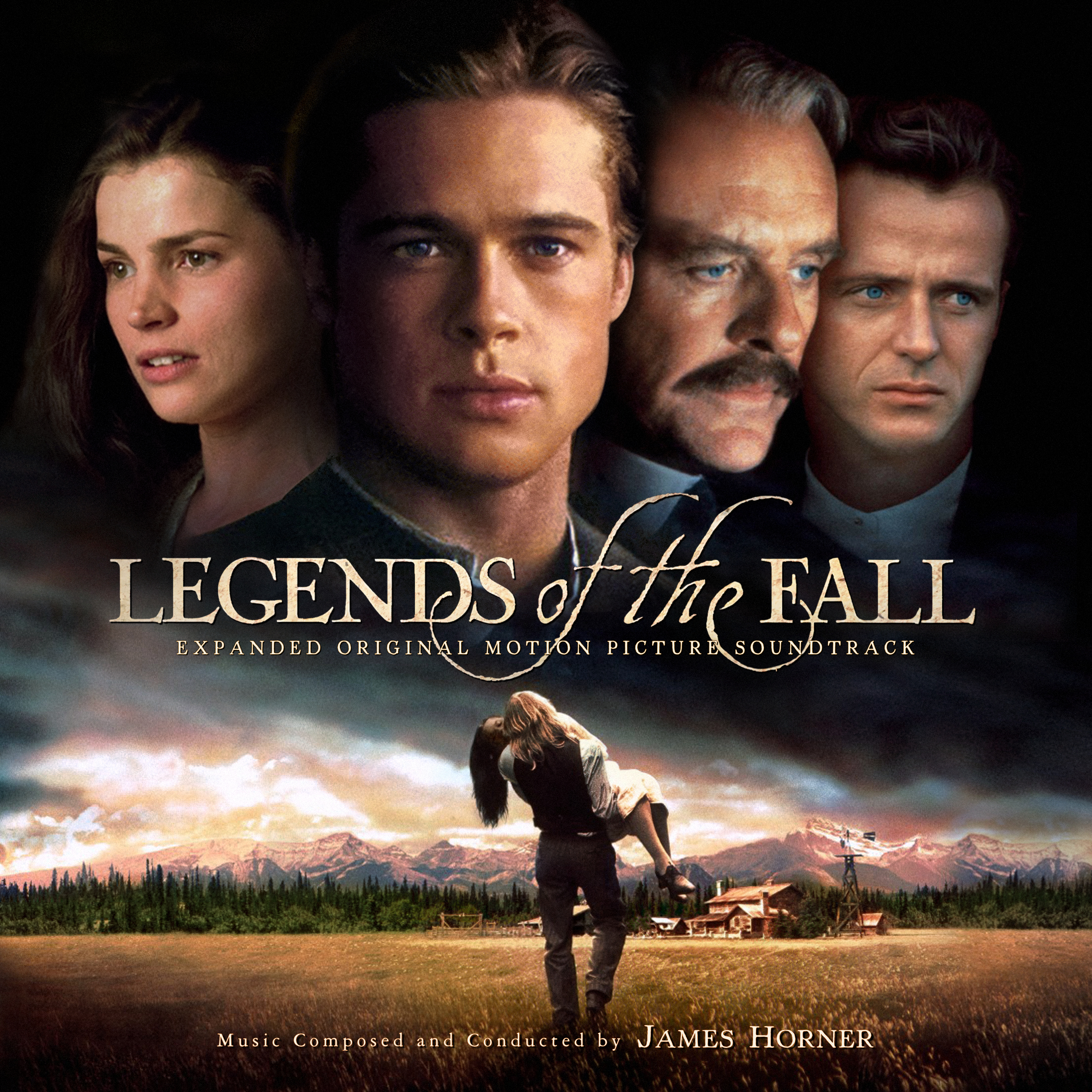
Cover 2 is a new addition to the set, and my twist on Intrada's expanded cover variant. I had to expand and edit numerous parts of the image in order to remove the blue bars and patch in all those missing bits of the image to fit my new composition and make the image overall feel more spacious and epic. I also did some work on Julia Ormond's face, the official image seems artificially widened and unnatural, so I tried to squeeze it back down to feel a bit more human.
The third cover, was a simpler job, using a home video box art, which gave a dramatic image. Ironically, when I first created my custom cover above, I thought I was breaking new ground by incorporating that particular image of Brad Pitt, thought it seems that most of the more modern artwork for this film had the very same idea. For my update on this cover, I did some tweaks to improve text clarity and positioning. Also did a minor tweak to Julia's face (as discussed in the previous cover). The biggest change was editing the bottom part of the image, shrinking things down a little bit and widening out the landscape to allow more space for the Horner credit.
The third cover, was a simpler job, using a home video box art, which gave a dramatic image. Ironically, when I first created my custom cover above, I thought I was breaking new ground by incorporating that particular image of Brad Pitt, thought it seems that most of the more modern artwork for this film had the very same idea. For my update on this cover, I did some tweaks to improve text clarity and positioning. Also did a minor tweak to Julia's face (as discussed in the previous cover). The biggest change was editing the bottom part of the image, shrinking things down a little bit and widening out the landscape to allow more space for the Horner credit.
Finally, Cover 4 is a brand-new addition. My original 2 covers just didn't seem adequate by my current standards, even though this film really didn't have much quality artwork to choose from (hence why so many elements are repeated among the various posters). This one uses an early teaser poster, a bit sparser and more colorful. Getting the text colors and placement right took a lot of experimentation, but I like the end result.
Hope you enjoy this remastered revisit to these covers, and let me know your favorites below.
Cover 4 is freaking fantastic!! :)
ReplyDelete