I'm delighted to present my first cover set for a video game! In 2019, EA gave us an exciting new Star Wars game, following a young rogue Jedi trying to survive the aftermath of Order 66. Although a few promo cues were released at the time, and some bootleg rips later surfaced online, fans were rightfully clamoring for a proper soundtrack release of the score. Fortunately this was finally rectified in August of 2020 with a comprehensive (though still trimmed) 3+ hour release. Gordy Haab and Stephen Barton create a stunning musical soundscape to guide us in this epic tale, perfectly capturing the spirit of John Williams, while delivering rousing drama, action, and several spectacular new themes to the galaxy far, far away.
So, full disclosure--I'm not actually a gamer myself, regardless, video games these days have matured radically in terms of their music, frequently rivaling or even surpassing their cinematic counterparts (though having to play with different structural rules). Nevertheless, my love of the music, and the art and world of this game, had me excited to jump into a plethora of cover options to finally celebrate this score release. The official album artwork is fine, I like the actual teaser artwork, though not the overcrowding of text and logos--so I compiled seven new ones to choose from.
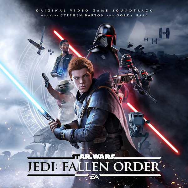
The first cover adapts the main game cover. I had to comp together a few different versions to be able to work with the widest image possible, and to patch over some areas with higher-rez sections. It can be hard sometimes to fit text into such a busy image, so I struggled with the text placement. I ended up trying the sort of yin-and-yang split effect on the title to help it pop against the background (which I used on the following cover as well).
The second cover is a simple crop on a central wallpaper image, and I think one of the first bits of promo artwork for the game. Again, with the dramatic shifts in parts of the image from dark to light, it was a little challenging to figure out where to place and how to color the text, but I think this suffices.
The third cover is using this epic piece of concept art showcased on the "Art of" book of Cal approaching a Zeffonian tomb. The lead concept artist on the project was Jordan Lamarre-Wan, though I couldn't actually find if this painting was his, or by someone else on the design team.Changed up the usual Trajan font to go with the font used on the prequels, to give it a bit more of an ancient feel.
Covers #4 and 5 are meant to pair: his/hers, Light-side/Dark-side. The Cal Kestis art used for the Deluxe Edition is a lovely piece, and I simply cropped into square, kept the title as is, added the soundtrack credits and called it a day. Phewf, it's nice to have a dead-simple cover every once in a while. For a game of this magnitude, I surprisingly had a really hard time finding fully hi-res images, but I knew I needed to showcase Trilla, as she's such a bad-ass design. I found one wallpaper, though it's a much wider shot. I wanted to crop in significantly, to echo the design of Cals's image, though by zooming into the image that much, the image really started to suffer. I tried a number of techniques (adding digital grain, sharpening, etc.) to try to save it as much as possible, but if you look closely, it definitely still suffers a bit. I also changed the ancient rune background, shrinking it down to match the tighter composition, and had to paint around to fill in the gaps. Overall, I think these function nicely as a set, and the tiny font gives it a bit of a different design that I kinda dig.
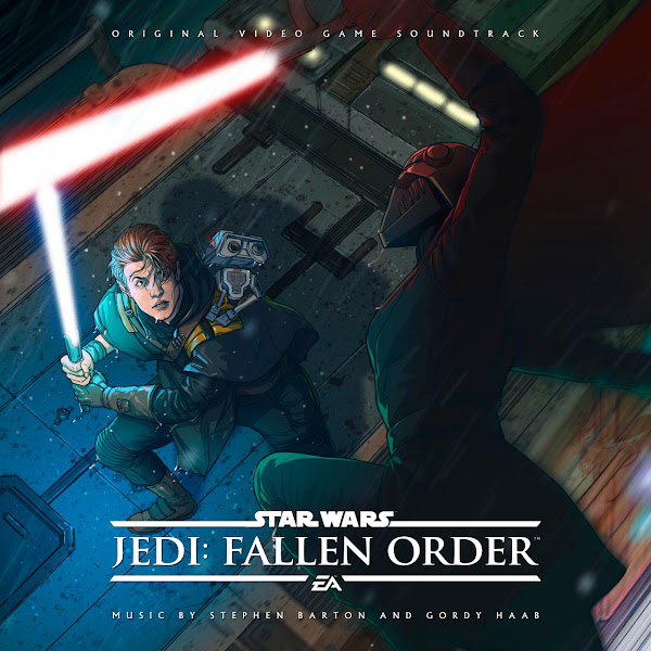
The final two covers are more action-packed, featuring a (presumably) climactic duel between Cal and Trilla. I'm guessing that both of these are basically depicting the same moment in the game, though obviously in very different styles. Cover #6 is dark and dramatic, and as far as I can tell was an early bit of promotional art for the game. Sadly all versions online were in low quality and very blurry. I tried to sharped up where possible, but ultimately I decided to maneuver around this by superimposing a streaked-metal pattern, the texture of which hopefully adds some clarity and distracts from the softness (and coincidentally end up adding to the thunderstorm feel). Cover #7 uses a lovely bit of fan art by Madibek Musabekov, that captures another dramatic interpretation of this lightsaber duel.
There you go, young Padawans. Hope you enjoy these covers. Frankly, I could have kept going endlessly with this project, but I had to draw the line at some point. Let me know your favorites among the bunch, and what major goofs I no doubt made in describing the project by being a clueless non-gamer.


No comments
Post a Comment