In 2010, director M. Night Shyamalan adapted the beloved Nickelodeon show, "Avatar: The Last Airbender" into this infamous live-action film. The film was universally hated, often considered one of the worst ever Hollywood films, and it abjectly failed to capture the charm, humor and rich characterization that defined the series. It did nevertheless, give the director a chance to reunite with composer James Newton Howard (who remain one of the greatest director/composer collaborations in cinema history, though they sadly haven't worked together since 2013). JNH seized the chance to write an epic fantasy score, one that is beloved by many (though for me personally, I've always found its narrative thematic structure to be oddly sparse and nebulous). Nevertheless it is a rich score, well worth exploring, and one that is begging for a proper chronological expansion to really do the material justice.
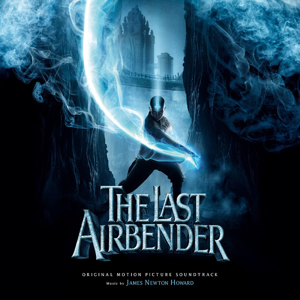
This was a fun project to work on, and I was able to move through it all in just two days. Fortunately, most of the art is pretty slick and, save for a few exceptions, required little alteration, besides the usual color tweaking and text addition. The original album cover is fine enough, so I didn't bother remaking it, though I used a subtler text style throughout. Though it's far from my favorite JNH, I know this is a fan-favorite among many, and the poster art was fun to play with, so I went ahead and tackled a total of ten covers.
The first cover was pretty simple, though the color on the original poster is rather odd, so I simply added a bit of extra warmth to Aang, Zuko, and Sokka's faces to make the random color transitions less jarring. Although the colors are very muted, for some reason, this cover and the next one, seem to echo the Nickelodeon look in a way different to the other posters. Also the poster itself had blank spaces that naturally suggested where to place text (although in very unconventional places compared to my usual style), this was actually one of the later covers I did, so I didn't bother trying to restructure the whole image, and in the end I kinda liked it having a more unusual composition.
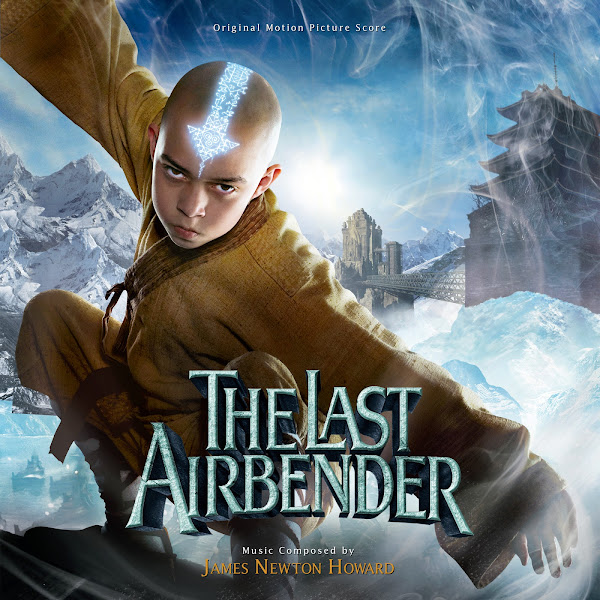
The second is simple but elegant, and very punchy with the bright, cartoony colors, used for many of the video releases. I always changed around the colors of the title on the covers, and in some I liked the juxtaposition of the warm and cold together (though hopefully it doesn't look too goofy).
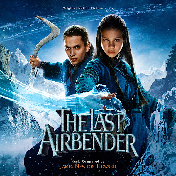
Covers 3 - 5 were the striking character teaser posters, and I like their stylish element-colored look.
Covers 6 - 8 again present our main protagonists in alternate solo posters. I had to brighten up Aang, and reduce contrast on Zuko's face, but otherwise the posters are pretty much as-is. Usually, I avoid solo character posters (outside of the central protagonist), though in this case, they were all charming, and easy enough to produce, I figured I'd just do the whole set.
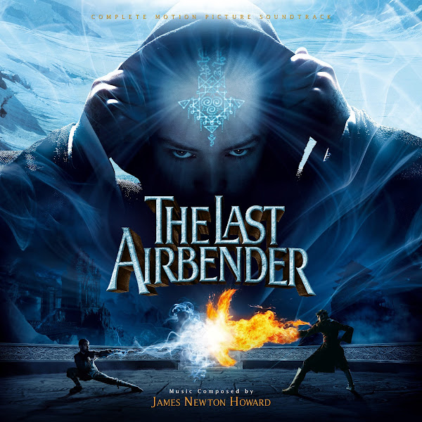
The ninth cover uses this moody poster, though again the colors needed some tweaking (I'm not usually a fan of layering on a hard, monochrome color filter). So I chose to add a bit of warmth to Aang's face, and also to add some some more contrast and color detail on the duel at the bottom, trying to add a subtle added glow from Zuko's fire. Although the blue/orange color scheme is the central style used for Hollywood marketing for ages now, and mostly totally overplayed, here I found the contrast of fire and ice (wind doesn't have a color exactly...) to suit the storyline, so for once, I actually added more orange to an image.
The tenth and final cover is for this dynamic floating-heads international poster. I like the style overall, but the color choices on the poster are baffling. The main one features a sickly green hue, and there's an alternate with a faded blue color. So I had to comp together a few versions, and played around for a long time, trying to restore a more naturalistic and varied look to it, and to give the character something resembling human skin color. I'm still not 100% satisfied with this one, but I still prefer it to any of the original versions.
Well, there you go folks! Hope you enjoy the selection and some of my style tweaks. Let me know your favorites.


You're currently 3-for-3 in terms of making covers to scores I adore. You have impeccable taste in music my friend! Although of course I'm going to say that because your tastes are aligning with mine quite nicely.
ReplyDeleteJames Newton Howard is an old favourite of mine, most of his scores have a wealth of alternate covers made, so I speak from a solid knowledge base when I say this series comprises the better collection of covers for this score. One thing I'm really noticing across the sets you've made, but perhaps highlighted most in this set when I compare to the covers from other artists I've got is that a lot of them went for bold, blocky fonts while you (as you very much pointed out) went for a more subdued style, as well as mixing colours around to highlight composer credits and such. It's not the most exciting part of cover-making (I myself really don't have an eye for it and was probably the skill that took me the longest to hone), but alas, it has to be done. You could have great art material to work with but it be mostly for naught if the font selection, size and placement isn't good.
This set is interesting because, unlike Troy and How To Train Your Dragon, I really like the official cover we got (well, I mean the rejected score for Troy didn't get one but you know what I mean). Surprise, surprise, this is another score which I attempted some cover making of my own, but just like Troy I gave up. The material I was going to use was the same as yours though, with the exception of the videogame front cover which was just the titles over a rocky texture (I like to have at least one minimalist design if I'm doing a set). I generally lose interest in cover design if I feel I can't make something better than what's official, or if there's one clear cover that just clicks with me.
Having said that, your set is interesting because I personally don't like the artwork for the film, but on a personal, nitpicky level. I love the show, love the design of it and official artwork for it, and the film artwork seems positively garish to me in comparison. If the movie was a fun family romp like the show I could see cover #2 with those bold colours working well. On the other hand, for the surprisingly moody direction Howard went with the score, I prefer the muted atmospherics of covers #1, #3-#5. Especially #3, it makes sense for a film called "The Last Airbender" to have the eponymous last Airbender solely on the cover, isolated ("last") and performing a feat of airbending ("airbender"). #3 is my personal favourite of this set followed closely by #1 for me, although #4 really looks great too. Although not a favourite of mine, good job on #10, the colour work you did on that looks like it took quite a while.
Another great set, although I'm not sure if #3 will replace the official cover for me, that speaks more to the strength of the original cover then your work, they are both fantastic. Eagerly awaiting your future work as always.
Thanks, glad you're digging them! And hope you check out the back catalog, I think I'm at 15 now total.
DeleteYeah, love JNH too, though is far from my favorite score of his, and I'm sure I'll have many more of his to come (in fact, I already finished another, smaller set for him). I definitely try to make the very best possible, at least to the extent of my skills, though with graphic design, there's maybe never a strict "better" or "right", but just a lot of subjective taste and personal instincts. There's definitely covers (whether fan or official) than I'm just like "definitely Nope", and often as you say, the biggest offender is the font work, especially on the fan covers. I try to go for simple and elegant, and obviously matching the font in style for the project overall/existing text. Yeah, blocky text, or fonts that are noticeably jarring in terms of clashing styles for the piece, or amateur use of heavy shadow or glows, etc., are just painfully distracting for me. I tend to use a pretty similar approach 90% of the time in terms of basic text rules (hopefully it doesn't get boring), but again, that's just what looks good to me. In fact, usually the text is the most painful part, I can easily spend hours working on the poster, blending, moving, recomposing, color correcting, etc. That part is fun and engrossing, but it's the hours that I spend shifting text around from one part of the image to another, changing the font color, weight, size, spacing, etc., back and forth, back and forth, to a place where it all just Fits properly and feels correct and balanced is can be exasperating.
Yeah, I toyed with doing a remake of the official cover, as the art itself is nice, and I would have tweaked the fonts slightly (again, they're a bit blocky to my taste), but I just figured I have enough alts already.
A more minimalistic one could be nice too, I generally don't go that route, I tend to like covers that display all the major characters/visual elements of the story, but there's definitely a place for more textural, minimalistic covers. Maybe I should try to include more like that in the future. I know there was a series of posters with the title over multiple different gritty backgrounds, but from what I recall, they were oddly mirrored and cheap, creating a janky butterfly effect, so I didn't bother.