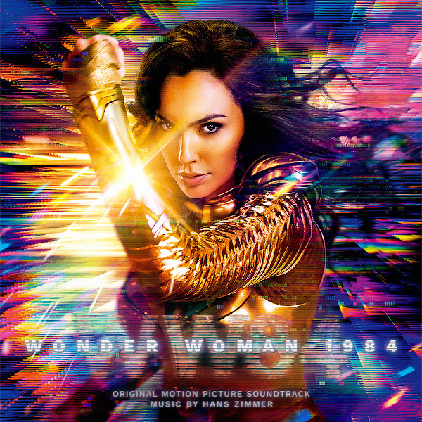
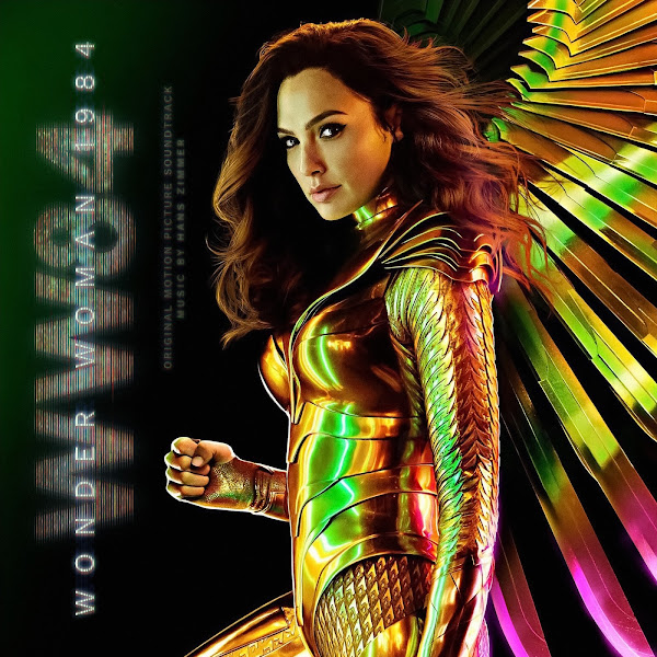
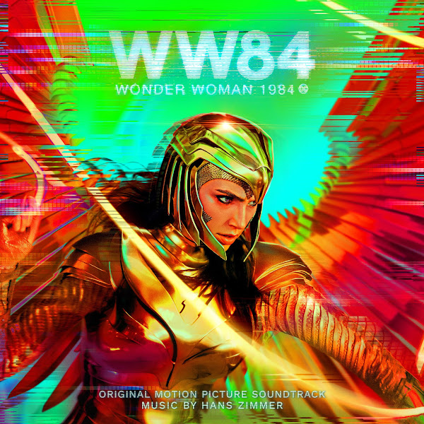
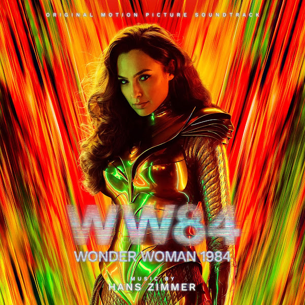
Director Patty Jenkins returns to the world of Themyscira for "Wonder Woman 1984", the sequel to 2017's film. Landing with a dual theatrical and streaming release, the film hasn't escaped without its share of criticisms and haters, though it is mostly a fun, colorful and stylish flick that combines modern superhero film cliches with a healthy dose of old-fashioned cinematic joy and cheery optimism that is sorely missed. Returning to the world is composer Hans Zimmer, who first penned the Amazonian demi-goddess' "war cry" action riff in "Batman v Superman", which then got developed by Rupert Gregson-Williams for her first solo outing. Here Zimmer returns in grand style, adapting her rhythm and melody into a grand major-key olympic fanfare, complete with choirs, as well as new romantic material and two villain themes. The score is a rousing affair, clearly one he put his passion into, and a return to form to his more brazenly anthemic scores of yesteryear.
I'm one of those weirdos who likes to wait to listen to the score till after I've seen the film (at least for major releases that I know I will want to see right away), so I had to wait for the HBOMax launch on Christmas Day to finally hear the music (even though the score had released a week or so before). The plan was to rush these covers out to come out on the film's release date, but I figured no one would be checking these out on a holiday anyways, plus I wanted to actually watch and listen to it first. Plus, as per usual, I ended up needing the extra time to make endless little revisions to the covers, plus I added a few more last-minute after finding some cool additional posters.
For the most part, the art on these covers are fairly straight-forward, all art from the official marketing campaign, featuring Diana in her Golden Eagle armor--which in this case are a total delight of retro 80's extravaganza, complete with psychedelic neon-rainbow colors, so I couldn't stop myself from creating a total of fourteen (14) covers.
In part because of the number of covers, I figured this time I'd skip all the individual descriptions. Mostly the poster art itself was left unchanged. I was able to find most of them in textless options, except for two or three in which I had to (quite painstakingly) clone out the titles, and it was very time-consuming to have to paint back in from scratch missing background art on such complex images. I used a hi-rez of the 'WW84' logo that was easy enough to superimpose as I wanted (after discovering the godsend that is the 'blend modes' tool in Affinity). The most challenging part of this project was inserting the additional text credits and longer title, and attempting to vaguely match that style. The title has that glitchy, VHS-looking style, which I had no idea how to do. There's probably some more hi-tech way to do it, but I ended up just improvising my own methods, which don't look quite right, honestly, but which I hope will mostly be acceptable. Each text line has multiple effects and filters, as well as 4 versions of the text in each case, to create that anaglyph 3D effect where the three color channels sorta split off to the side of the main image. There's probably a fancy way to do this automatically, but I had to manually stack and color each layer individually to create the effect I wanted, which was a real nightmare when I was changing the text size and spacing, etc., which is always a required part of the design process. In the end, I hope the text generally matches the overall style and isn't too incompetent or distracting, though I'm generally happy considering I had to improvise this from scratch without having done anything similar before. Hopefully all my janky process is mostly invisible, as I really wanted to just let the posters themselves shine.
So many gorgeous posters, it's hard to narrow them down. Hope you enjoy a more current and topical post and let me know your favorites of the bunch. And hope everyone had a happy holiday and a great new year to come!


No comments
Post a Comment