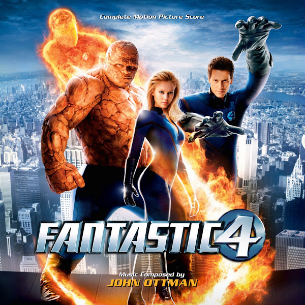
Tim Story's "Fantastic Four" hit theaters in 2004, to pretty lackluster reviews, but was successful enough to earn a sequel. Before the superhero rebirth of the Christopher Nolan's Dark Knight series and the MCU, this was an odd duck flick that didn't seem to know what to do with its genre, presenting a colorful, but silly mess. Scoring duties were handled by John Ottman, coming off "X2" (with his incredible "Superman Returns" coming the following year). Though perhaps not a beloved classic, his score is nevertheless an old-fashioned, entertaining score, with a group fanfare and motifs for the individual characters.
The film is far from a favorite, and Ottman himself has topped this work in the superhero genre (as well as his work in thriller, horror and fantasy). This one wasn't on my master list of projects to work on. It started out just as a quick cover for my personal collection, but the artwork was fun and colorful and enticing enough to convince me to tackle a full cover set. I was never a fan of the original album art, the scenic idea is fine, but I prefer featuring the central characters, and the spacing here was uncomfortable.
The first cover shares poster art that was used for the song soundtrack album, though naturally I tweaked things around. I dig the very classic superhero look for these images, very iconic and worthy of Marvel's First Family, if in looks only. I cloned the sides of the image to widen it a bit, but to make sure the look was still smooth and consistent when expanding the '4' logo they're standing on. I found a lighter treatment of the white text worked better here.
For Cover 2's poster, for some reason (maybe regrettably) I chose the orange variant, rather than the blue one. I didn't have any wider versions to work with, so the composition here is maybe a little odd, but passable.
The third cover uses what apparently was a Mexican poster. The original art was very flat, so I had to play around with correcting black levels, doesn't look perfect, but it's dynamic enough. I tried to use different variations on the title treatment, where possible.
Cover 4 was a royal headache. There's two versions, the poster design, and then a wallpaper version, which totally restructures the composition of the characters and background. Ideally, if I had all the separate elements, a clean background image of the city, and the characters separated, I would have done a new composition somewhere in between these two options. One was too tall, one far too wide. I tried cutting out the characters from the wallpaper (which had better resolution), but then it was too difficult to get the background city skyline to line up and fill in the missing parts that would be needed, so I ended up scrapping this idea. I basically just stuck to the widest version of the vertical poster I could, and then still ended up layering on and adjusting the wallpaper versions of those characters superimposed on the bottom composition, to try to extract more detail. This one was a real headache, and as is often the case, I made things way harder on myself than I probably needed to. The main issue is the big gap at the top of the image, between Johnny and Reed. Ideally the whole image would be moved up, so Sue and Ben aren't was squished down at the bottom, but I couldn't just chop off Reed's hand of Johnny's head. I had an early version with a smaller title fit in this space, but that felt awkward too. In the end, again, the composition here isn't ideal, but maybe no one else will care. I'd spend enough hours fighting with this image, and I just had to compromise and move on.
The fifth cover offered a different look, and title/font that I enjoyed using. The central poster I found in decent quality, though it was cropped at the sides, so I had to grab a low resolution image with the full width, and then cloned to widen out the background even more. It has more negative space than I would usually like, but the vertical arrangement of the characters left few options. In the end, I like enjoy the more minimalist style.
Cover 6 was actually the first one I made. I'd first made a smaller version, which took like half an hour, ironically then when I went about making a better quality version for the full covers set, it ended up taking a fair bit longer. Multiple version of the poster were overlapped to get best sharpness and tonal range detail to give it a slightly softer and warmer look. The trickiest part was actually adapting the title logo. The actual title art I was to work with are the ones used in Covers 2 and 3. The one in 3 was in better quality, but having a logo that large didn't fit most images, but then the one in 2 was smaller quality and also had a weird shadow around the fire that I didn't want to fight with (and looked terrible against a lighter background). So I ended up taking the text from 3, and then cutting out the "Four" text, and cloning parts of the circle around the "4" emblem to complete the image in a clean way without the flames. In the end, it took a little bit of work, but I liked how it came out.
So an unexpected project, but an enjoyable one (except for Cover 4). Hope you enjoy, and let me know if you have a favorite of the bunch.


No comments
Post a Comment