
A spiritual sequel from the original "He-Man" 80's cartoon series, "Masters of the Universe: Revelation" released on Netflix in 2021. Split into two, five-episode halves, the show was created and run by nerd extraordinaire Kevin Smith. The new limited series is respectful of the look and tone of the original show, but the writing has come leaps and bounds since the early moralistic show that was merely created to sell goofy action figures. Smith and his team are able to elevate the silly fantasy premise to have genuinely rich characters and push the plot into darker and more poignant emotional places, often throwing the safe and predictable structure of the original out the window (much to the consternation of some fanboys), all while still maintaining that joyful Saturday-morning cartoon sense of charm and adventure. This show totally won me over, despite having zero connection with the original show as a kid, and I had a big stupid grin on my face while watching large chunks of it.
Joining the all-star voice cast for the venture, was American composer Bear McCreary. A powerhouse in the television genre (since jumping to the big leagues in 2004 with his score for the "Battlestar Galactica" reboot), as well as films and video games, McCreary always brings ample passion to his music, a master of orchestral and thematic development, electronic enhancements and an eclectic taste for bringing in experimental or ancient instruments and colors. All that comes to bear (no pun intended) for his "Revelation" score, which some see as his magnum opus. Blending a massive orchestra and choir, backed by heavy metal guitars and drums, the score is abounding in memorable themes and motifs, with almost every single character on screen receiving a musical signature, that are often richly developed as the characters do so as well on screen. Overall, this was my favorite soundtrack of 2021, bursting with sublime fantasy magic, bittersweet emotion, and thunderous adventure and action writing that captures the best of fantasy, sci-fi and superheroes with a child-like glee.

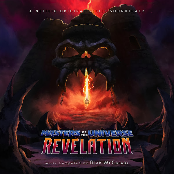
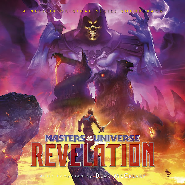

The score was released in two volumes (to accompany the two parts of the show's release), released digitally by Mattel & Arts Music/Netflix. The two album covers are fine, featuring decent artwork, but as often happens with these streaming show covers, I wasn't a fan of the added text treatment, as well as the overbearing streaming branding placement. I simply went with the font that is actually used in the show credits itself (I don't know why this so rarely seems to be done...). Fortunately there was a variety of cool posters and promo art to choose from, and I wanted to treat the text portions more elegantly. My first step was to recreate the title logo itself, which I had to carefully trace over a lo-rez version, so that I could manipulate the re-size and style to my liking. In the end, I'm pleased to present a total of eight new covers. Also, as a technical aside, rather than split the covers into 'volume' or 'part' 1 and 2, I've simply kept all the titling consistent, so that way people can either choose two matching covers, or just pick a single cover if they choose to combine both volumes into one.
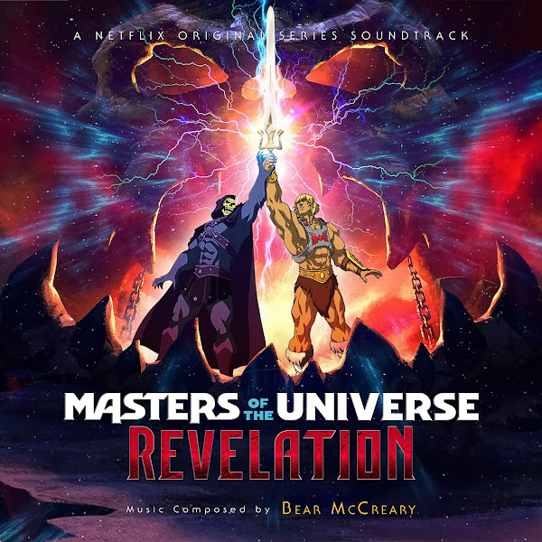
Cover 1 adapts a piece of teaser artwork that shows He-Man and Skeletor bringing the Power Sword together. I just love the color and dynamism in the image (a more exciting replacement for the Volume 1 album cover art). The art itself was relatively easy to adapt, though I still had to patch together a few different versions to remove text, and then used moved some of the cropped landscape from the sides of the image down to expand the bottom portion of the image to allow the title and text. For this, I ended up using a hi-rez version of the logo I found one the 2nd album cover and carefully cropped around it to be able to then use and edit it here to my liking.
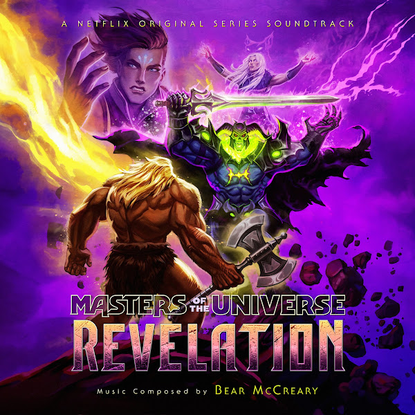
The second cover adapts the central piece of promo artwork for the show's first half. Figuring out how to crop and edit this was challenging, as the full piece is incredibly dense, with so many characters and details crammed together. Fortunately I found an alternate wallpaper version that had a bit of a textless version of the bottom rocks, which cloned out to totally cover over the previous title placement. I then had to manually paint out and shift several of the characters along the top edge of the image, as chopping the image in the middle of someone's body is just lazy and in poor taste. I then did my best to recreate the title as used in the same poster, but now in a better location. This took some muscle, but in the end I like how it turned out.
Cover 3 is my alternate take on the main artwork used for Volume 2's cover. I used a wider wallpaper version as my basis, which I had to enlarge and enhance significantly, as well as then patching over the main characters with more hi-rez versions of this artwork, to regain some missing texture details and clarity. For the title logo, I chose to keep the colors more in line with the art itself, though I superimposed the detailed 'Revelation' texture/style from the official logo.
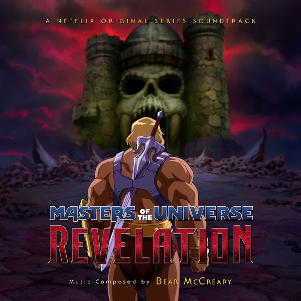
The fourth cover is a custom composite. The background is from a piece of concept artwork by Pedro Cardoso that depicts Castle Grayskull in full glory. On its own, I figured this would be too minimalist, so I ended taking a still image from the show itself, with He-Man facing away from camera. I had to cut him out (as he's staring off into a distant army in the original image), and then pain in his legs, as the original image cut off right below his sword. In the end, I think the two images blend together well enough.
Cover 5 actually uses artwork from a plush blanket I found online, go figure. Anyways, I thought the art itself was fun, and it was fairly simple to edit, just crush the black levels, widen out the horizontal margins, slap on text and call it a day.
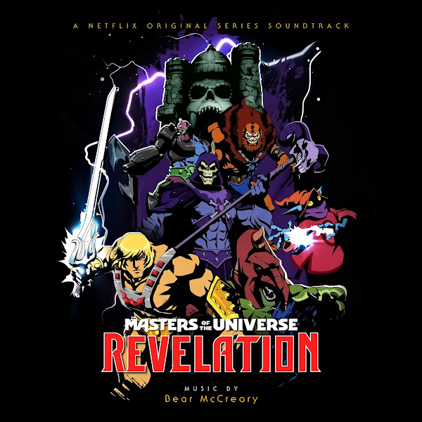
The sixth cover uses another dramatic promo painting of Castle Grayskull and the Power Sword. I had to paint out the text at the top of the image to give myself a clean margin to crop, and then created my own variation on the title logo to match the palette and style of the image.
Cover 7 uses a digital painting by Dave Wilkins, that was the cover of the #2 prequel comic that accompanied the show, published by Dark Horse. Fortunately I found a textless version that I was able to enhance, but the challenge was compressing the image vertically, to be able to retain most of the image and not just chopping it in half. I played with a few versions, but in the end I slip He-Man up just a bit, and then lowered Skeletor down quite a bit, as the middle section of the image would have been too hard to re-size/paint.
Finally, the eighth cover uses an original piece by Hellboy creator Mike Mignola (colored by Dave Stewart), that was used for the #1 issue prequel comic. I am a huge fan of Mignola's work and visual style, so I couldn't resist including it here, even though his style is wildly different than the show itself. The challenge here was to paint out all the text and credits at the bottom of the image, and then using paint and clone tools to add quite a bit of side cushion to the image, while making it feel seamless.
Hope you enjoy the collection, and let me know your favorites!
No comments
Post a Comment