
James Cameron's "Titanic" released in the winter of 1997, but its road to the big screen was not easy. The film went over-schedule, several cast and crew members were injured or got sick from the arduous shooting conditions, and many predicted that the film's massively-ballooning budget (the most expensive ever, at the time) would sink the two studios that helped finance it. Despite all this, the film became a tremendous success, its profits grew and grew, drawing audiences back to the theaters for repeated viewings for several months in a row--ultimately becoming the biggest box office success (until Cameron broke his own record years later with "Avatar"), and also winning a boat-load of critical nominations and wins. The film received its share of critical backlash, with many criticizing its melodramatic script, and Cameron's penchant for wooden dialogue, but there was no doubt that its director was a master at pushing the cinematic arts forward with ground-breaking technical craft and delivering a riveting blockbuster thrill-ride like few others.
Cameron originally envisioned Enya as providing music for the film, but she refused, so he turned to his previous "Aliens" collaborator, James Horner, despite the two having had a very rough working relationship on that project. Horner was instructed to tell a modern love story, not tied to period sounds, nor Golden Age composing styles. He ultimately created one of his biggest scores, involving romantic, tense and thrilling orchestral music, the vocal contributions of Norwegian vocalist Sissel Kyrkjebø, a synthetic choir (to add to that modern, new-agey feel), and Horner himself on piano. Cementing it all was a timeless love theme, and noble melodies for the Titanic herself. Horner recruited singer Celine Dion and lyricist Will Jennings to flesh out a song based on his melody, thought Cameron took significant convincing to allow the song in the film. Ultimately, between both the song and score--the "Titanic" album became the best-selling soundtrack album of all time, and one that contributes massively towards the emotional success of the narrative.


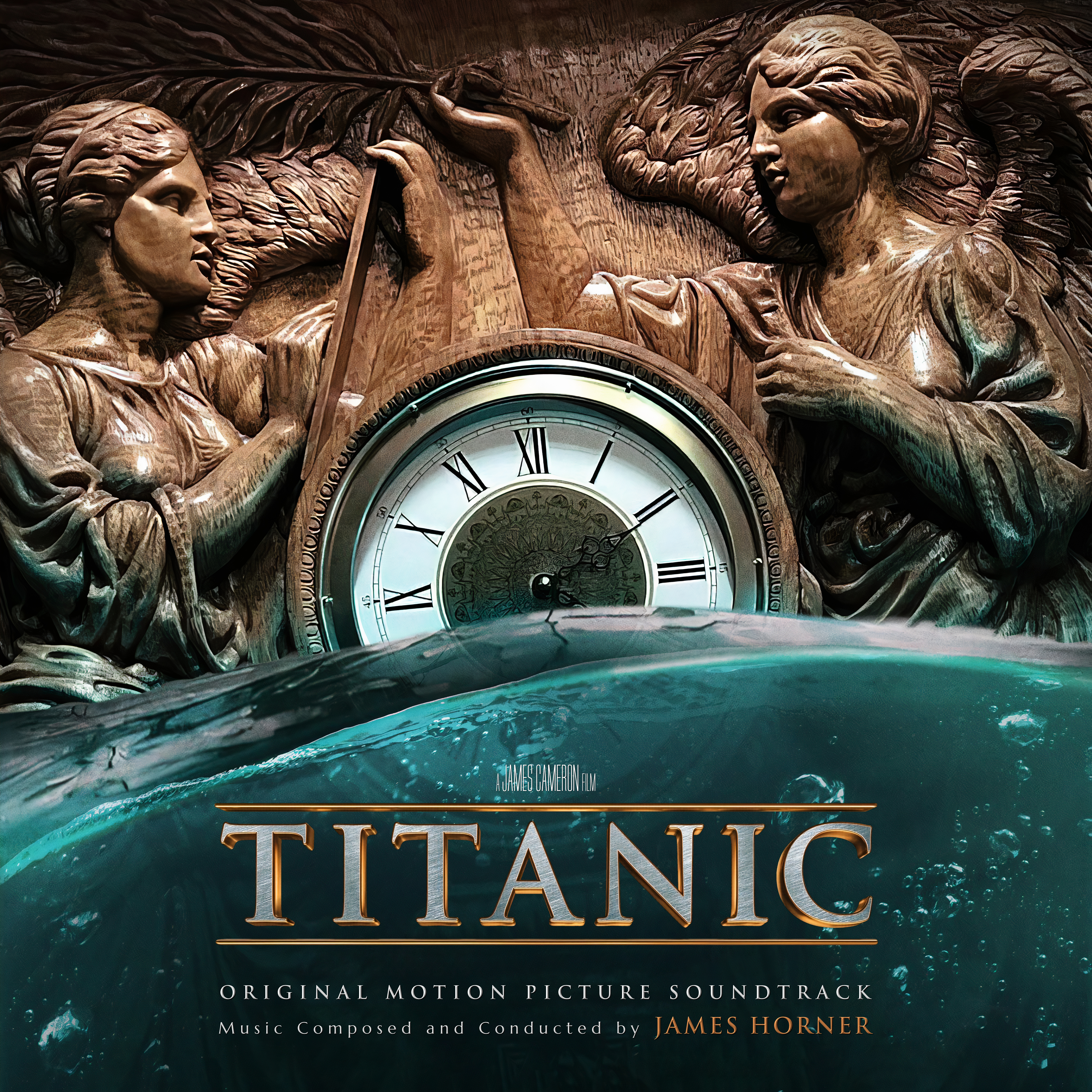
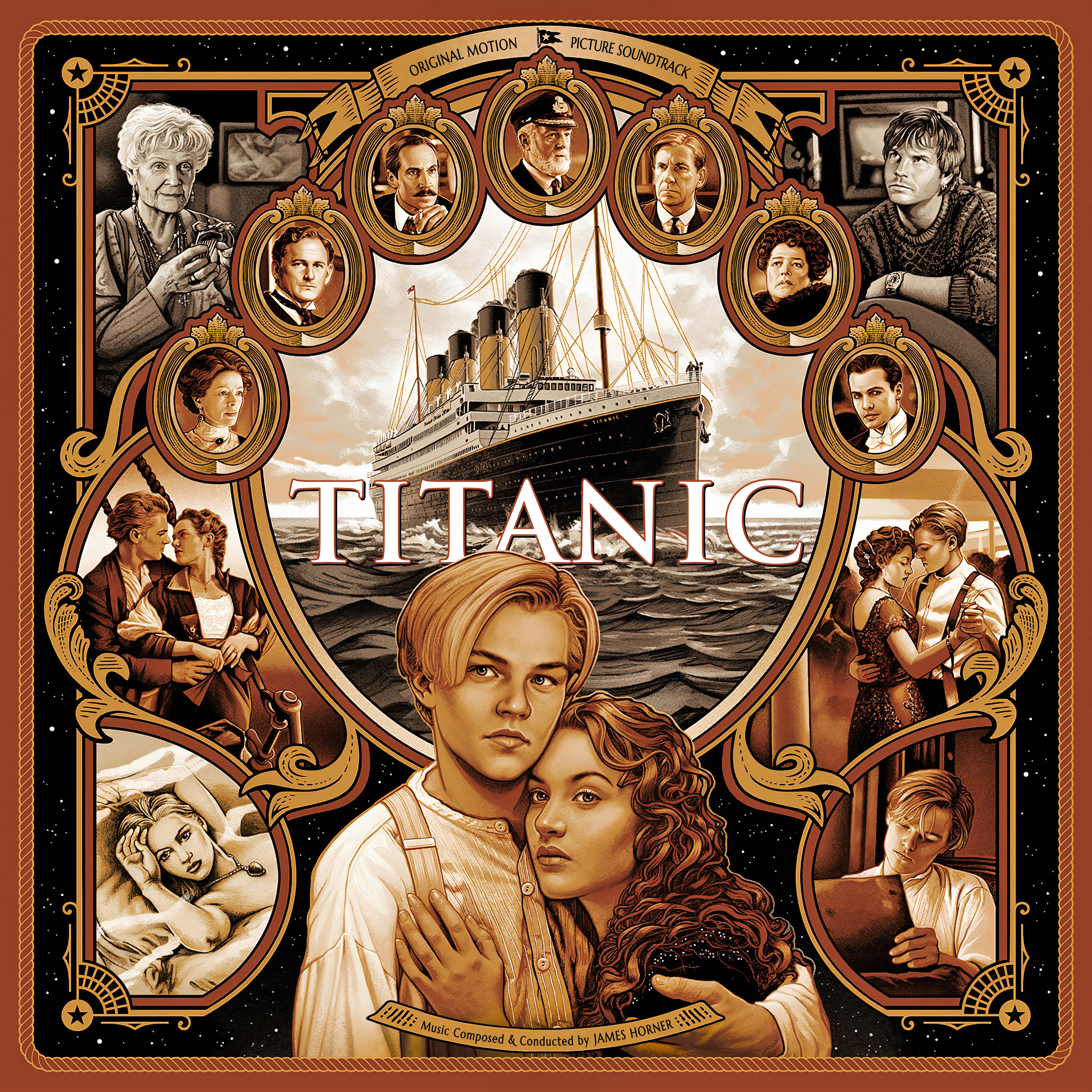

The film was recently re-released in a 3D 4K version for its 25th anniversary, and I'd only recently re-watched the film after probably a decade or two myself. It seemed a good time to finally cover this set. On album, the soundtrack has had a varied history, the original Sony Classical album contained a little over an hour of score, plus the Dion song. Released the following year was the "Back to Titanic" album (one of my first ever soundtrack purchases as a young lad, on good old cassette tape)--this release featured a few extra score cues, some of the classical and Irish source music recorded for the film, as well as number of new suites that Horner developed and recorded with the London Symphony Orchestra and Choristers of King's College (whose sound is much more lush than the synthetically-aided version that was rushed through for the actual film score). In 2012, a "anniversary edition" re-released the above contents, with some added source and period cues. It wasn't until La-La Land Record's 2017 release that finally got Horner's full score, presented as he originally intended his compositions (which, in his usual style, were often significantly re-edited by Cameron in the film). Given the popularity of the film, and its numerous theatrical and video releases, there was plenty of art to choose from. I ended up creating a set of thirteen new or alternate covers to choose from. If these aren't enough, you can visit my buddy Heidl's take on the project from years back at HQCovers, it's always interesting to compare two people's take side by side, he used a few posters I didn't like quite as much, but perhaps you'll like some of his versions more than mine? It's all a subjective matter of taste, plus, the more art, the better. Also, final comment, my use of credits in somewhat arbitrary, some just kept the classic OMPS, others I used Expanded, I also personally like Deluxe, which I find a little more elegant, so I sprinkled them throughout as I thought appropriate for the artwork (if you want to commission a personal cover with a different credit, use the contact form).
Covers 1 - 10 all source official artwork, with the usual alterations as needed, with the final three pieces coming from fan-created pieces.
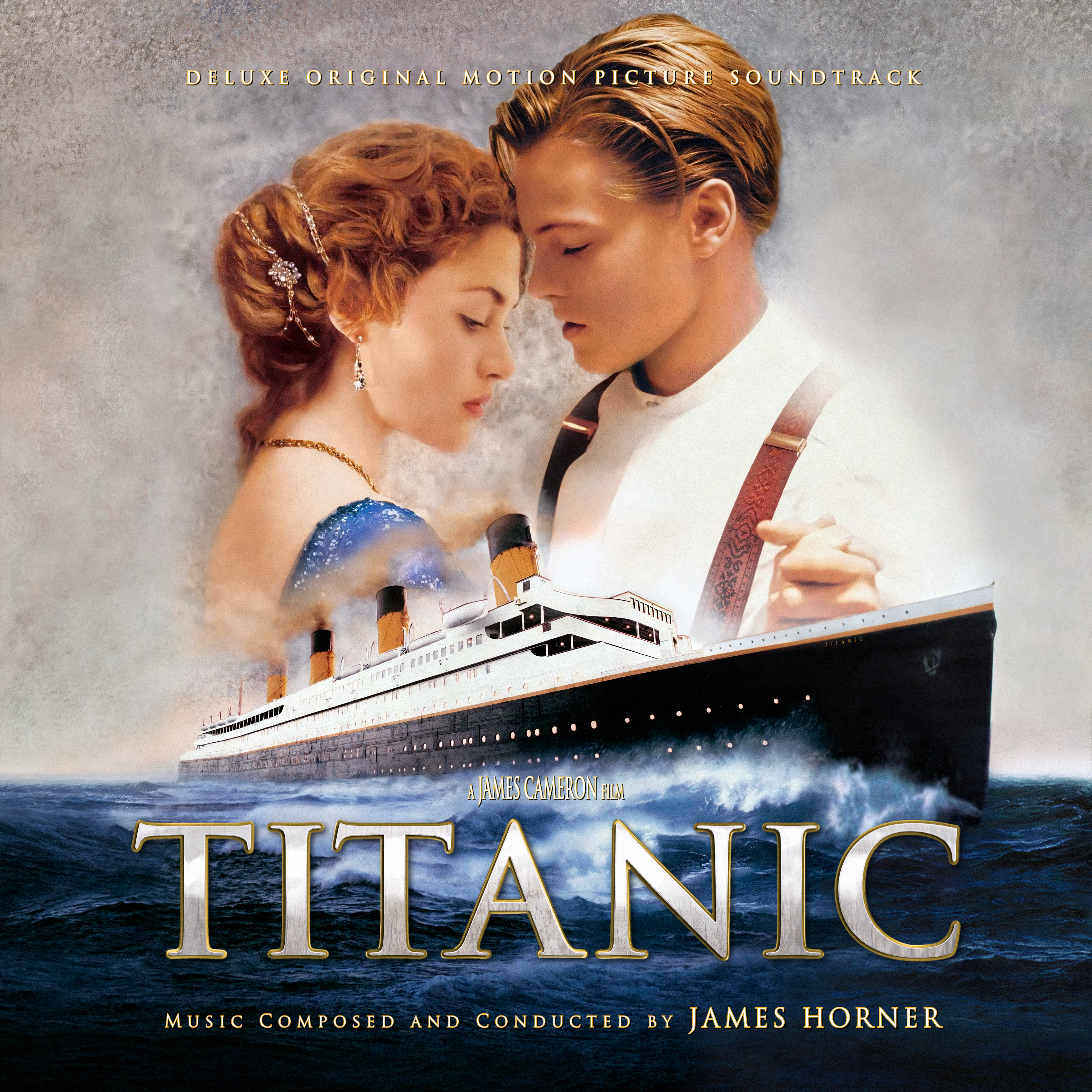
The first cover was the trickiest one the complete, and the last one I finished. It uses the film's secondary main poster, which I've always loved, but there were several issues. First was the main overall composition, the original version naturally was too vertical to just crop into a square, there never seemed to be a proper wide wallpaper version of this art, and the only wider version I found was in terrible quality. LLL's expanded album cover used a version of this poster, and was actually enhanced into very nice quality, but the placement of the two leads and the boat itself next to each other always seemed very odd to me. In the end, I had to take parts of that cover, and then parts of maybe three over versions of original poster to composite together a giant layered Frankenstein of insanity to create a new composition that worked comfortably for this format, while still not losing too much of Jack and Rose, or ending up with too much gray dead space. A big problem was fixing the prow of the ship (as its cut off entirely on my two main art sources, the LLL cover and the theatrical poster). I had to use two much lossier sources which had the complete ship, but even those two had totally different finishes on the ship, so I had to up-rez them, and them morph and bend them to create a blend of the two shapes, and then try to patch up a lot of glaring issues that were still present due to the low quality. Finally, the ocean itself had to be patched and cloned to expand the sides out, and then the gray background (with its seemingly random noise and texture) cut up into chunks and hopefully blended into a semi-smooth version, and then all the color-balancing and make all the pieces hopefully feel as one. In the end, this was a royal pain to complete, but I hope the final product mostly hides all the imperfections I fought so hard to fix.
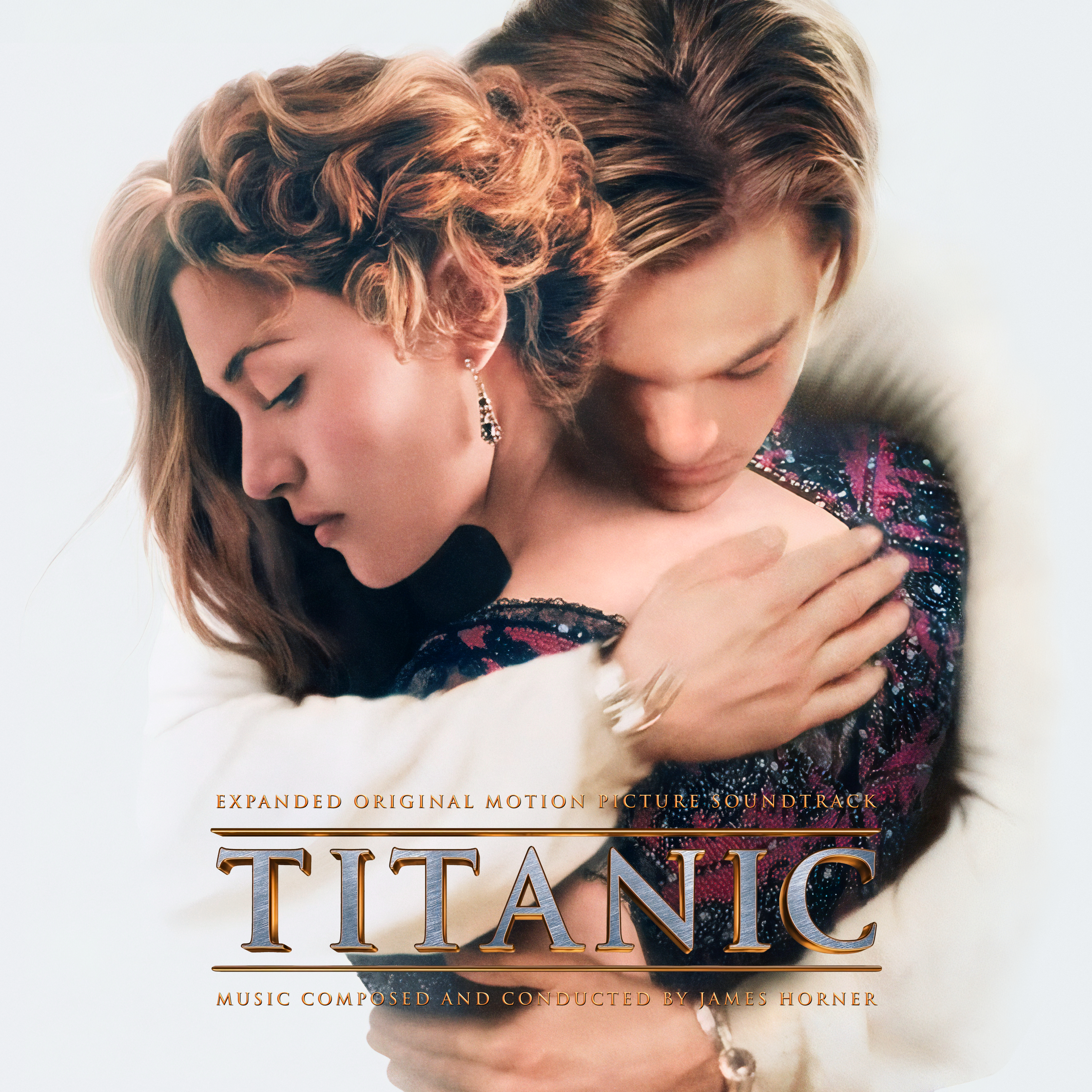
Cover 2 uses artwork from a previous 3D re-release of the film. The composition was frustrating on this one, as all the wallpapers had plenty of width over on Jack's side, but nothing extra to work with on Kate's. Ideally, I would have liked the image to be zoomed out a lot more, with the title up at the top, but since I had no wiggle room on the right, this would have created too much dead space on the left and throw off the balance, hence the slightly uncomfortable closeness of this version. Still, its a unique piece of artwork that I hadn't seem used as a cover before.
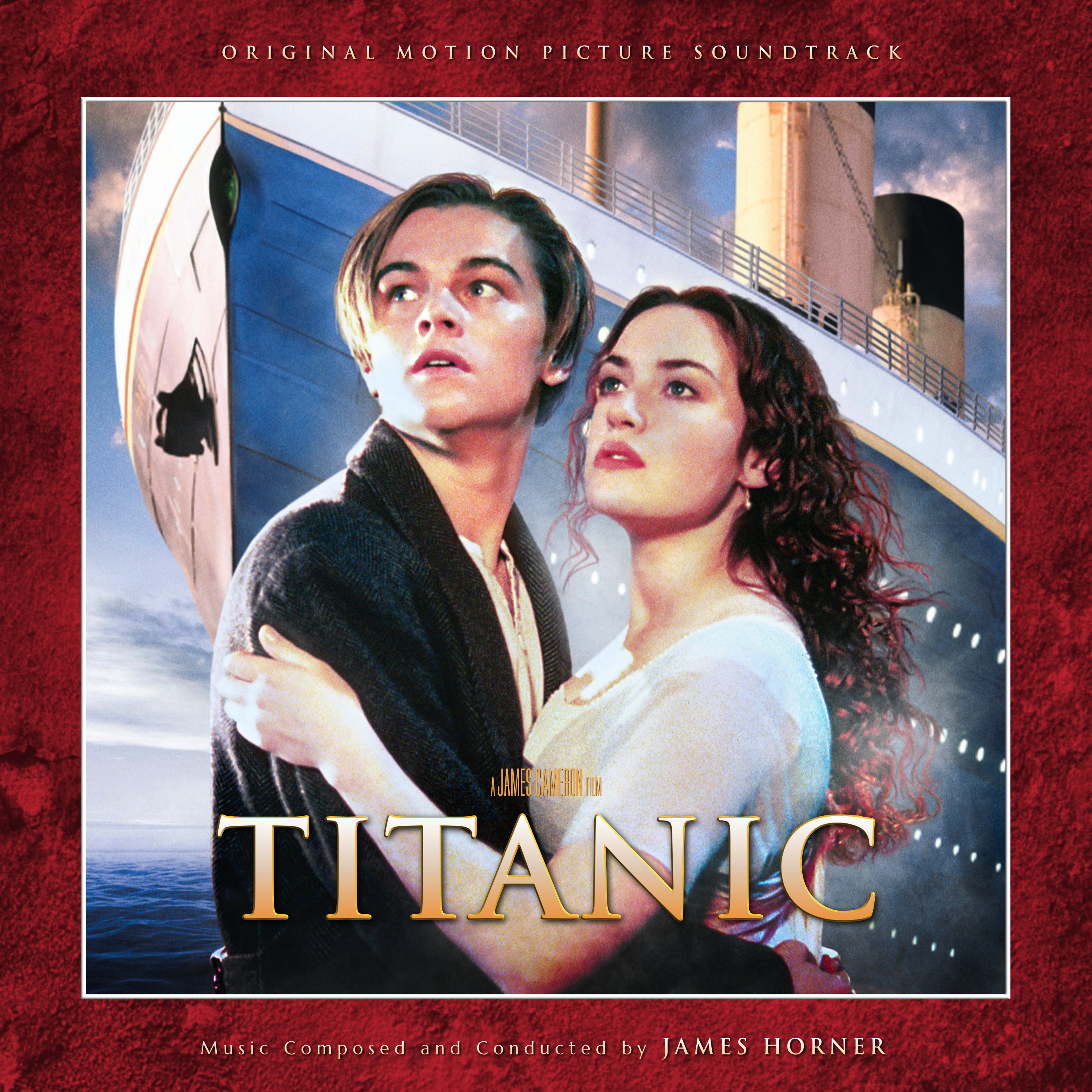
The third cover tackles the main theatrical poster, also used on the original album cover, though there it was always very washed out and rather lifeless. Editing was fairly simple here, other tweaking saturation, black levels and then figuring out the text.
Cover 4 - 6 use various re-release posters. On 4, I just stretched out the sides, which worked fairly well, as well as trying to enhance the flesh tones on the leads' faces by overlaying a film still, and then creating a simple, vaguely art-deco-esque frame to counter some of the negative space. 5 shares artwork with the Anniversary soundtrack version, but I edited my own blend that incorporated the Titanic itself back into it. Widening out 6 took a bit of work, the ocean was simple enough to stretch out, but the rest of the sky I had to mostly create from scratch to then blend into the little bit of existing sky, this just involved painting and blending colors, and then overlaying a few cloud textures (I still don't think it was entirely successful...).
The seventh cover is a variant of sorts on the "Back to..." album, using the same shot at the top, but blending in a nice shot of the ship from a taller poster.
Cover 8 uses some home video artwork, I just recreated a similar red framing, added a simpler title. Something different, anyways.
The ninth cover required blending two images together to keep the wider background, and then playing with the colors to keep the warm romantic tone, but add some life and remove the sepia wash.
Cover 10 uses art from the recent 25th anniversary release, which kept things to a simple, classy style. I found a wider image that I had to up-rez, as the main posters had a lot of white space, and cut the characters off on the right side. Also, I chose to trim the image where I did, because when you see the full bodies, the image becomes quite absurd (like, what's happening with Kate's arms??). I had a bit of a tricky time adding the text credits here, as everything was a bit hard to read over the background.
The eleventh cover uses a fan poster I randomly stumbled upon online, which seems to be an original piece created by Justice Gage. I thought it was rather unique and striking. I had to paint out their text and add my own, but full credit for the art itself to them.
Cover 12 uses an original digital painting by illustrator Courtney Autumn Martin. I had to up-rez the image, then couldn't keep the lower third, so just copied the bottom frame of the original, shifted it up in the image, and then painted and blended it all back together to fit smoothly, as well as adding the appropriate text.
Finally, the thirteenth cover uses a piece of art by designer Kilian Eng. Not too much editing required, but nice to have something a bit more moody and minimal.
Hope you enjoy the set, and that my covers do justice to the scope of the film and Horner's work. Definitely curious to know which covers are your favorites, so let me know below!
No comments
Post a Comment