Australian director P. J. Hogan's "Peter Pan" was released in winter of 2003. The first official live-action feature adaptation of J. M. Barrie's beloved novel and play, the film received positive critical and audience response, but debuting just one week after "The Return of the King", the film ended up being a box office failure. Fortunately its reputation has grown over time, not without its flaws, but a lovingly told and mostly faithful adaptation of the source book, captured with much heart, color, and added depth for the young protagonists on the cusp of adolescence, with Rachel Hurd-Wood and Jason Isaacs shining in their respective roles.
Over the decades, there have been a whole host of adaptations of this classic tale, all of which have inspired absolutely stellar music--and James Newton Howard's work sits solidly in that body of work. He brings a massive orchestral fantasy score, with the addition of magical choirs and a touch of modern electronics during a few sequences. Howard's score greatly enriches the world and adds that child-like wonder necessary to convey the adventure, action, and budding romance of the story.
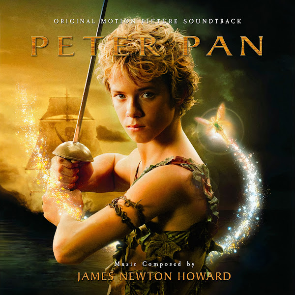
The original Varese Sarabande album only featured 44 minutes of score, less than half of the total, and was oddly missing most of the final act of the film. leaving the presentation feeling rather under-developed. Fortunately in the spring of 2023, Intrada Records released the 2-disc expanded score, clocking in at almost two hours, filling in all the gaps in the narrative, and helping to highlight a lot more of the thematic development and action. I always loved this score, and I'm glad the new expansion finally does the material justice. One major issue across all release though, was the artwork. The original cover just felt too cramped, and the new Intrada covers just feel sloppy (and in the case of the red cover, horribly crushed)--so I knew this was the perfect opportunity to finally work on this project. I present a total of 8 new covers, all sourced and adapted from official marketing artwork.
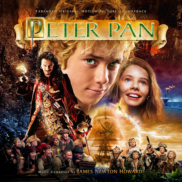
A few of these covers were just a nightmare to edit, Cover 1 being a prime example. I kept toying with this series off and on for months, because sometimes you just keep bumping your head against a particularly problematic piece of art, and it's much easier to run off and work on other things then tackle it head-on. This used perhaps the second main poster art for the film, it's fun and colorful, but perhaps a little too busy and jumbled. Plus I had the usual problem of needing to condense it even further for my needs. Taking the textless poster, I was able to expand the right margins a bit, which better centered the three main characters, and gave me a bit more wiggle room, but I still majorly needed to reconfigure the bottom portion of the image. Anytime your source is so crowded, with so many characters, layers, effects, let alone all the trails of pixie-dust, it becomes a royal pain to try to separate all those elements and be able to re-size and re-position them, but then still have each layer clean enough to be able to re-blend everything. This required comping on alternate image takes of the pirates, lost boys, and Wendy's hair using other poster versions, as well as then creating a whole new solution for the middle right side--pulling some sky from Hook's solo poster, and then the London night sky from Wendy's solo poster (ironically, even here I had to edit things, as the corresponding right side of her hair in the original is covered in pixie dust, so I had to flip it and patch in the left side of her hair), and then blending that all back in over the existing elements. Fortunately the colors of these images mostly worked together, and I think the final custom edit works fine enough, although it still kinda feels like a rainbow kitchen-sink stuffed into a tin-can.
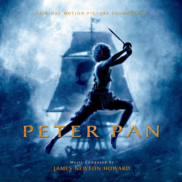
The second cover uses the fantastic teaser poster, with Pan silhouetted against the Jolly Roger. Editing the art itself was relatively simple, just had to paint out some text and then figure out the title and text placement. Fortunately I was able to find fairly hi-rez version of the different logo treatments, although some were a pain to matte out. I ended up jumping between two fonts for the additional text.
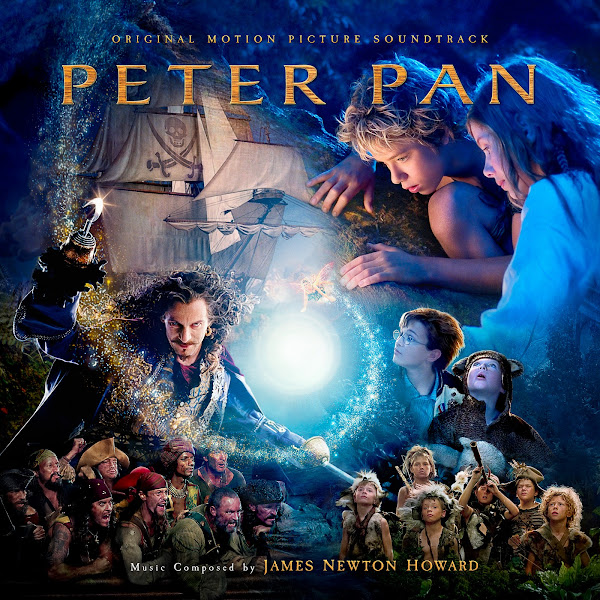
Cover 3 was another royal headache. This one adapts the central theatrical poster. I always loved the colors and unique composition and design of the poster, but again with something with so many characters overlapped, so many layered-on filters and effects and magic sparkles... this took so many effort to crank through. I wanted to keep the general idea of the original album cover, but just give it a bit more space to breathe, this required using the full textless poster, and then comping in some elements of the original cover (which had itself been restructured and moved around), as well as pulling in random other bits and details from some other posters which had the same source photography of a character. In the end, even though at first glance it probably looks fairly close to the original, almost every single element you see has been moved, re-sized, and completely patched over and overlaid with different versions (except for a small area in the very center and moving up to the ship), both to get the highest quality art, but also to be able to patch over details and expand margins to then be able to cleanly move things around and still have space to re-blend. Then making sure all the lighting and colors were relatively even across all sources, making sure the pixie dust got added back where it needed to... Like I say, a royal pain. In the end, all the agony will probably be invisible, but I hope fans can appreciate the overall improvement of the image.
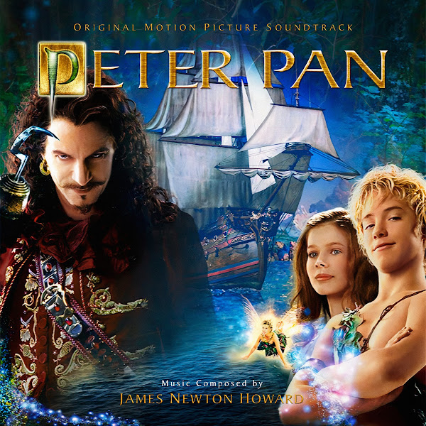
Covers 4 and 5 utilize promotional artwork used on some European home video versions. I could only find clean versions of the artwork in very very small size, so I had to apply some pretty heavy AI up-scaling. They don't look perfect, but it's functional. For Cover 5, for the longest time, I had a totally different composition, with the characters up near the top, and trying to keep the two swashbuckling silhouettes at the bottom, but the image was too busy, and it worked much better when I centered the characters, added more water to totally paint over the bottom, and then vignetted the top and bottom.
Covers 6 and 8 all feature the series of solo posters for Pan, Hook and Wendy. I used some small elements of Wendy's poster to patch onto the right side of Cover 1, but otherwise I didn't figure anyone would have use for solo Hook or Wendy covers. Pan's solo poster on 8 is mostly unedited and simply. For 6 though, I decided to blend Pan and Hook together, the only trick was to get their sizes and composition right, and then blend the background imagery smoothly between the two. I've also lately been toying with some new blend modes to try to help me when I'm trying to edit tricky edges like hair, where I'll for example keep the main face in normal mode but matte out the edges, and then overlay a darken mode of just the hair details, so I don't have to individually try to paint around each single hair strand. This can still be a pain requiring lots of details, but I find it both more accurate and forgiving in certain specific instances.
The seventh cover uses another piece of video art, though again in very low quality, and with text and disc branding to pain out. The original had the big 'P' logo right in the middle of Peter's lower torso, so I ended up finding the source photo of Jeremy Sumpter on set and then blending that in to match and be able to paint over, and thus forced all of Tink's pixie dust to go behind him rather than in front, which worked better for text placement anyways. It's always interesting when you can find the actual source still that was used for a final marketing image, especially for a fantasy film like this where it has been heavily edited, and trying to make dozens of little adjustments to match the original to the final image can be challenging, but also fun when it finally comes together. Finally, I messed with the color grading a bit, adding a bit more life-like tones, and adding some complimenting green hues, rather than just the nearly monochromatic sepia.
In the end, this set took a lot more effort than I imagined, which is why I was toying with it off and on for months. I hope the end results are appreciated. As always, let me know your feedback and which of the above options are your favorites!





No comments
Post a Comment