Releasing in the summer of 2012, "Snow White and the Huntsman" was the latest in trend of adapting classic fairy tales for a new audience, this time with a darker, more feminist take. Directed by Rupert Sanders, this marked his first foray into feature directing, coming from the world of commercials and music videos--this film gave him the chance to play with a big budget, and his visual skills are on full display--the film looks absolutely stunning, with impressive sets, costumes, and visual effects that help bring this dark fairy tale to life. The actual script and performances are much more uneven (an extended cut helps fill in some gaps), the film received pretty mixed critical reviews, but performed decently at the box office. Despite its flaws, as a genre fan, I find this to be one of the most visually ambitious fantasy flick maybe since LOTR--the film is like the very best fantasy concept art brought to life in rich detail, with Theron's evil queen being a delightfully wicked Gothic highlight.
Along for the ride was composer James Newton Howard, no stranger to the world of epic orchestral fantasy. Perhaps in an effort to differentiate the more modern take on this story, the score would feature a harsher synthetic edge than his usual scores in the genre, though there still are several moments of orchestral and choral majesty throughout. Built around a noble theme for Snow White, and an insidious motif for Ravenna.
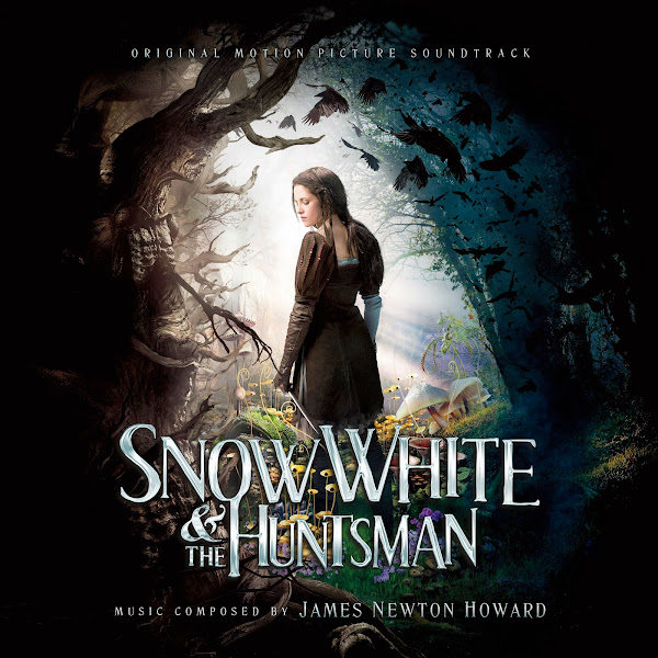
The Universal Republic soundtrack album, contains about an hour of JNH's score, along with the credits song written and performed by Florence + the Machine (for which Howard arranged the choral/orchestral accompaniment). This was a fun project to work on, as there were a whole host of posters to please a fantasy fan like me. All of these use official promotional artwork, and with a few exceptions, they were mostly fairly simple to adapt, not requiring too much heavy editing.
For most of these, I was able to find hi-rez wide textless artwork, which makes turning them into covers a cinch. Text was fairly easy, I actually used the font for the extra text credits from the sequel film, rather than from this film's, which looks a little more cartoony when removed from the full title treatment. Added a little 3D effect, and a light color gradient to mimic the title logo, and it all flowed together nicely.
The trickiest covers were actually the last three, 7-9. Cover 7 is a remix of the official album cover (which shows how the custom font looks a little too "Alice in Wonderland"-ey on its own). The overall concept of the poster is solid, Stewart looks great in her Joan-of-Arc-esque armor, but the spacing of the text elements was always awkward. I ended up having to the album cover with another taller poster to get the widest and tallest possible image, and then cut-out and reposition the background army/castle to fit the newer framing (with Snow White centered, and her head not as aggressively cropped off), and stretch and merge the sky to fill in the gaps. All the original sources were fairly low quality, so after I made my custom edit, I ran trough the AI enhancer to sharpen up detail, and increased color saturation to give it some extra life.
For Cover 8, the home video artwork was in fairly poor condition, even with enhancement, the light levels were off, and I couldn't get it to pop quite as much as I would have liked. What I did end up doing was adding a new sky overlay to the top, was the original image was almost totally blown out, and adding in a new sky helped slightly neutralize the harsh contrast in the image.
Cover 9 uses a teaser poster. It was a relatively simple fix of just cloning out the text, cutting out the frame element, shifting it up and stretching it slightly to create a seamless-looking square frame. Then I stretched that all out to a wider size and stretched and cloned the inner background gray texture to properly accommodate the image within my new frame. The usual vertical-to-square sacrifices.
Hope you enjoy, and let me know your favorite picks!


No comments
Post a Comment