Releasing on Apple TV+, the television show "Foundation" was created by David S. Goyer and Josh Friedman, with Goyer as the main showrunner. Loosely based on the series of novels by Isaac Asimov, the series aims to recount a thousand-year narrative about a scientist who discovers a tool by which to foretell the arcs of history far into the future, and flees with a group of fellow believers, desperate to keep their knowledge safe and survive the all-powerful genetic ruling dynasty known as Empire. The scope of the show is gargantuan, jumping between many different planets, characters, and casually jumping decades and centuries. The show received some mixed reviews, largely due to the complicated plotting, but a solid cast (with Lee Pace stealing the show), and stunning visual effects and photography, made this one of the most lush and cinematic shows ever filmed. The first season premiered in the fall of 2021, with the second coming out in summer of 2023. Season two received largely better critical reception, due to a more streamlined plot (although the sci-fi mechanics needed to keep this story going still get quite ludicrous), it is nevertheless a treat to see sci-fi executed on such a grand scale.
Joining the venture was composer Bear McCreary. As typical for the composer, the show is largely orchestral, with a number of recurring themes and an epic scope. He developed a system of musical machine learning that would represent the prime radiant, the MacGuffin that holds Hari Seldon's 'psychohistory', thus allowing a sort of mechanical robot brain to overlay over certain moments in the story. For Season 2, McCreary created a set of new themes, but allowed his team of former assistants and additional composers to start receiving a primary credit, here including Omer Ben-Zvi, Etienne Monsaingeon, Trey Toy and Kelsey Woods, collectively going under the moniker of Sparks & Shadows (the name of McCreary's record label/production studio). Sadly, the albums for both seasons only feature about an hour of music, leaving a lot of the musical journey unreleased.
Season One
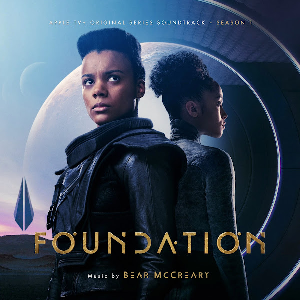
Cover 1 offers an alternate on the official album cover art. This version adapts a wallpaper layout that was featured on an "art of" book. The image was still a bit too wide, so I had to make some small edits, principally bringing the two characters on the edges (Gaal and Demerzel) closer into the center of the image, and re-blending everything back in, and editing out the golden frame, as well as increasing saturation and giving the faces a warmer skin tone.
Covers 2, 4, and 6 were largely unaltered. Often when starting with a wider image (such as the wallpaper in Cover 3, or the screenshot from the opening in #7), I rarely just crop into a square and call it a day, rather I cutout the central characters and then shift the background landscapes, bringing the left and right extremes both towards the center, to better feature and frame those elements within the tighter frame (sometimes isolating specific elements, like the spaceship in 3, or Seldon's monolith in 5). Again, small details, but to me they make a big different in making the image feel properly spaced and composed, rather than just arbitrarily cut off.
I also wanted to design a new look for the additional text credits. Apple TV+ insists on using the same dull font as the text on all their covers, which I find quite obnoxious. So I wanted to find a newer font that matched the setting better, giving the composer credit the custom font used for the title itself.
Season Two
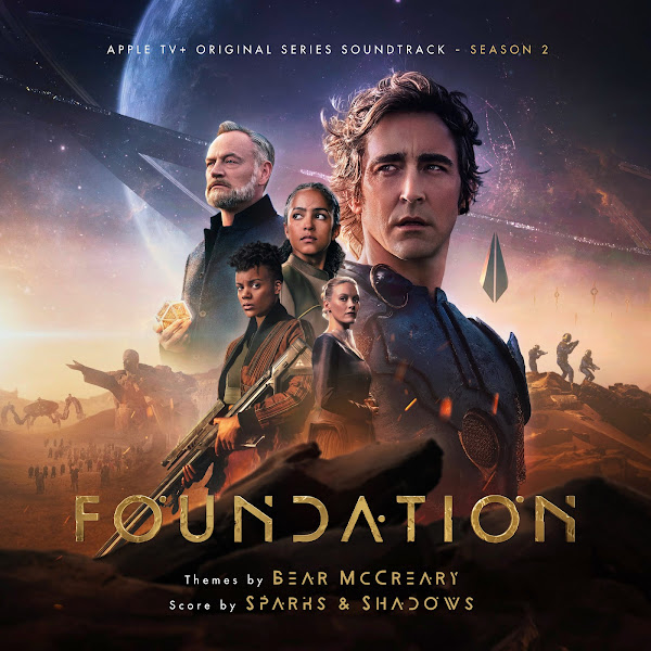
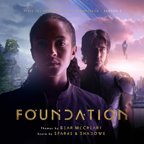
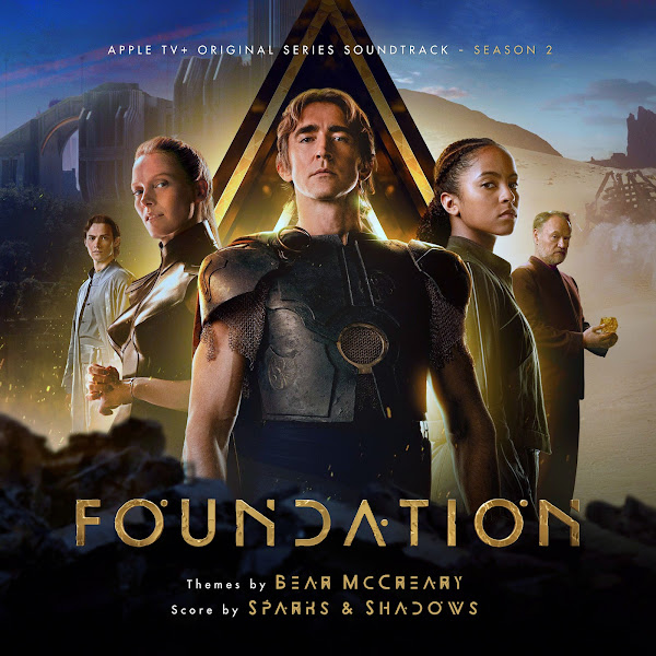
For Season 2, I created nine new covers. Usually I'm all for showcasing a wide image, but the official album cover here took this to an extreme, with far too much dead space, so for Cover 1 I found an alternate layout of the same piece of art, one which uses the space much more appropriately.
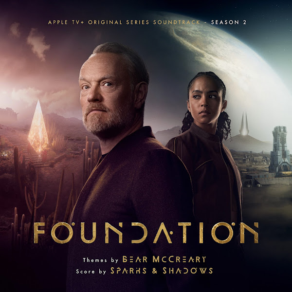
The rest of the images have all been edited from their original source in some way (except for Cover 9, which is just a plain crop on a credits screenshot).
For Cover 3, I brought the top of the sky down, to feature more of the constellations in the image, as well as bringing the rock on the bottom left corner up into frame, as it gave it a nice weight.
Covers 4, 5 and 6 again required turning a wider wallpaper into a square crop, but trying to do this elegantly and still feature as much of the background as I could (which would have been lost and unbalanced with just a simple crop). This required matting out the central featured characters, then splitting the backgrounds into a left and right panel and sliding each panel closer to center until whatever element in each side was nicely balanced within the remaining side space, and then re-blending the top of the image to smooth everything over. In the case of #5, I actually increased the head-room at the top of the image, shrinking the characters down, cloning in to complete the top of Gaal's hair that was cropped in the original wallpaper, enlarging the sky above Empire's head to fill in that new gap, sliding the forest to Gaal's left in, to feature more of the forest elements, and then relighting it to the what was there previously. #6 was a similar process, as I needed to increase space at the top to allow the text to sit comfortably, and also shrunk down the planet to Hari's left, so it could feature more of the space station (which would have otherwise only had a corner of it visible).
Cover 7 didn't require any spacial content editing, but I wanted to shift the colors significantly. The original wallpaper was almost a flat gold color, with just bare hints of cooler colors in the sky. I wanted to increase the saturation, and really pull out all the rich colors that were hiding in the image. This required multiple color passes, separating the central characters, from the sky/background scenery. I could honestly tweak these colors endlessly, and I still see small flaws that I could adjust, but I think the image is dramatically different and more lively than the official version (probably matching closer to what it looked like before it received a dull yellow overlay).
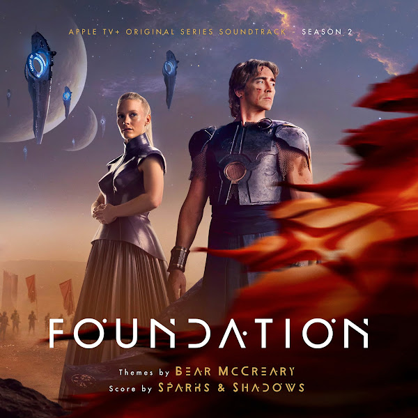
For Cover 8, I overlaid a tall poster and wide wallpaper version of this image, each of which had radically different compositions, when it came to the landscape, sky, planets, and war-ships. Ultimately, I tried to blend these together, cutting out a few spaceships to resize and reframe them, and blending in behind them as needed.
I hope you enjoy these covers. All the artwork for this show is so gorgeous, I couldn't help myself but wanting to play around with it all. Let me know your favorite selections. And hopefully down the road I can add more, as Season 3 has already been green-lit!








No comments
Post a Comment