Denis Villeneuve's highly-anticipated sequel, "Dune: Part Two", finally came opened in March of 2024 (after the studio decided to delay its December 2023 release, due to the SAG and WGA strikes earlier that summer). Adapted by Villeneuve and Jon Spaihts, this film concludes the second half of Frank Herbert's seminal sci-fi masterpiece. The film choses to deviate at times from the source in certain key aspects, but is otherwise incredibly reverent, and engages deeply with Herbert's thematic concerns, presenting one of the most ambitious and visually stunning films of the genre in a long time, balancing character intimacy with jaw-dropping scale. As we witness Paul and Jessica's journey to become one with the Fremen people of Arrakis, and Paul's reluctant rise to the role of prophesied messiah, this story gives us a bigger world, introducing the Imperial House Corrino and a young Harkonnen prince who serves as Paul's new rival, keeping the story fresh and engaging, despite the long run-time.
Returning to score the desert power was composer Hans Zimmer, who seemingly never stopped working on the project, developing new material ever since finishing the first film. Zimmer's original score was quite divisive amongst the soundtrack community. Many hailed it as a masterpiece, while many purists decried Zimmer's need to always "re-invent" the genre by throwing usual thematic structure and orchestration out the window, producing something much more textural, more akin to a sonic landscape than a traditional film score. Many of those elements still return here. Zimmer again abandons the orchestral, focusing on featured vocal and instrumental soloists and heavy synthetic overlays. There are still large sequences that feature musical that is quite brutal and unpleasant on its own, blaring, grinding, groaning. Zimmer does however bring a fresh sound at times, especially in the introduction of a new "love theme" of sorts for Paul and Chani (technically not new, it was actually first teased on the "Sketchbook" album of the first score, as an expansion on the House Atreides material), which serves at the heart and soul of this film. Played on duduk and other newly-created woodwinds by the brilliant Pedro Eustache, this material is utterly captivating, haunting and so extremely delicate, a brilliant contrast to the more industrial sound of the oppressors. By this point, Zimmer also has developed so many motific elements, that the score does have a much clearer structure (that the first rejected), and many of those ideas that are actually melodic in nature have indeed grown on me. Personally, I was rather mixed on his first outing, but overall this sequel score won me over.
Originally I hadn't even planned on covering this film. I'd skipped the original, not because of the film or the artwork, but given my ambivalence towards the music at the time. This one, as I say, won me over, and given my love for the film, I quickly dove into making covers. Unfortunately, as they often do, this project kept ballooning in size. I kept discovering more great pieces of art, and being the completist than I am, I couldn't help but add them to the collection. As much as I was trying to wait to have all the best of the best, knowing my luck, as soon as I publish this, some new great art will drop. There is one specific piece of art I'm waiting for (relating to the final cover), but I've toiled long enough on this and needed to get them out in the world. In the end, I present a total of thirty covers, making this my biggest project yet!
(Buckle up. I'll try to run through these quickly, for those that are interested. For (hopefully) ease of reading, I'll try clumping the descriptions together in sets of three, to match their gallery layout above)
Cover 1 uses the Screen-X art, it required editing, but finding the proper placement of the title was tricky here (the vertical placement on the original seemed too small for this format and not consistent with the overall design of the series).
Cover 2 uses the Dolby Cinema art, editing was pretty simple, merging a poster and wallpaper variant.
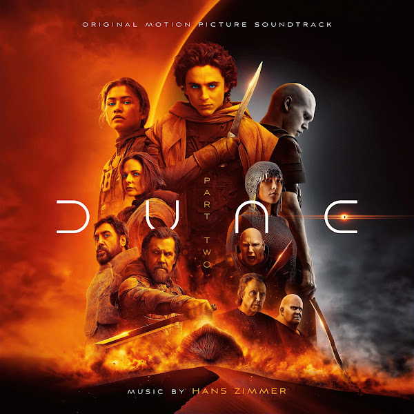
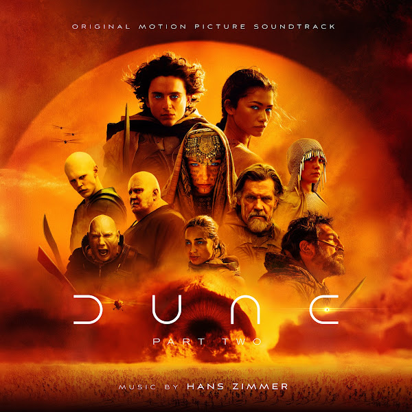
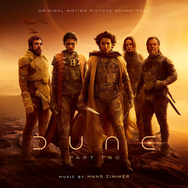
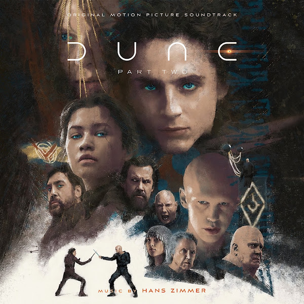
Cover 3 adapts the main "floating heads" design, similar to what was used on the official WaterTower Music album cover. That overall spacing of that piece just feels off. I had a hirez version of the textless poster, which I used as the base, but even that needed fixing. I cropped in a little, but still giving the characters some side space, and allowing for the fuller planet shape to become more evident. I also brought up the bottom of the Sardaukar soldiers escaping the sandworms, and shrunk the Shai-Hulud down significantly, and blended everything back together in the new configuration. All together, this was already a big improvement, but I decided to make my life even more difficult, as the poster version had the characters really crammed together, and the character of Chani's friend Shishakli being put off-center just makes no sense in the otherwise symmetrical design. I found a wallpaper version that had more spacing between the characters, so I then had to cut out each character and use the extra spacing from the alt version and use that to move some of the side characters a bit wider out, edit their sizes slightly and give them all more breathing room. A headache, but I think a prime of example of how even with what is essentially the same piece of art, small changes and conscious design choices can make a huge difference to the impact of the final product.
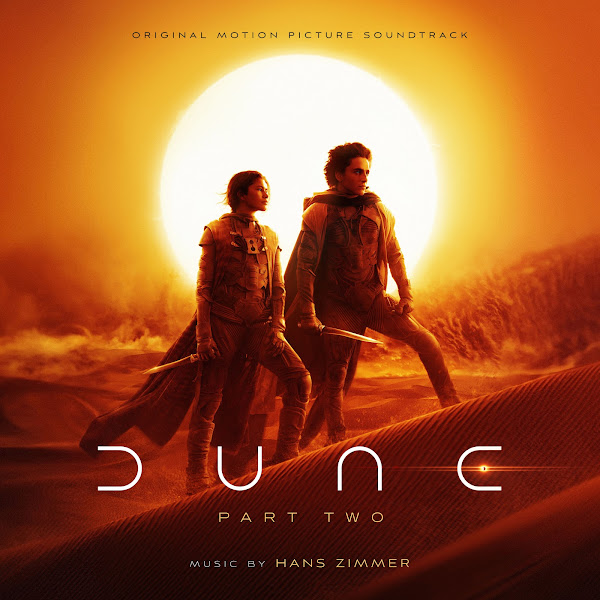
Cover 4 uses the theatrical poster, a striking image. I found a square design of this, that was used for an early promo track release. But I didn't settle with that. Oddly the sun behind them was slightly off center, and I didn't like the extra spacing above them. So I ended up shrinking down the sun slightly which enabled me to center it, and then just had to blend in the lower parts of the image to fit in correctly with the altered sun. I enlarged the text too, compared to the original design.
Covers 5 and 6 use a paired set of art that served as covers for Empire Magazine's issue covering this film. The magazine of course had text over it, I found some textless verions online, but I still had to do my own paint-outs to clean up parts of the images.
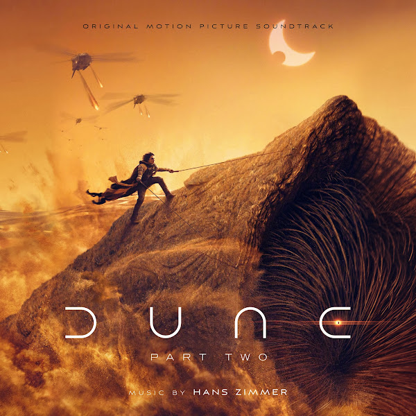
Cover 7 uses the IMAX poster, with the charging sandworms from the film's climax. I simply combined a few versions to get the widest textless base I could get. I largely used similar text work across all pieces, just editing colors and font weight here and there as needed.
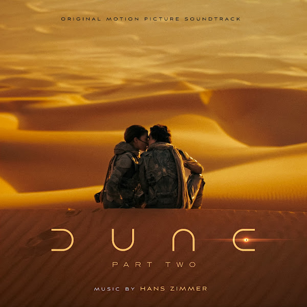
Cover 8 uses a banner of Feyd-Rautha facing off against Paul. Again, combining posters and wallpapers, some cleanup and adding a slight vignette.
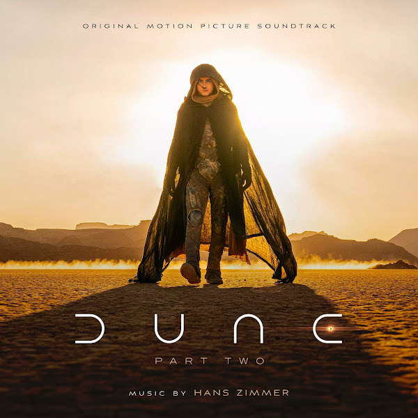
Cover 9 uses Paul's solo character poster (which exist for most the major players, but I just stuck with him). Little editing required.
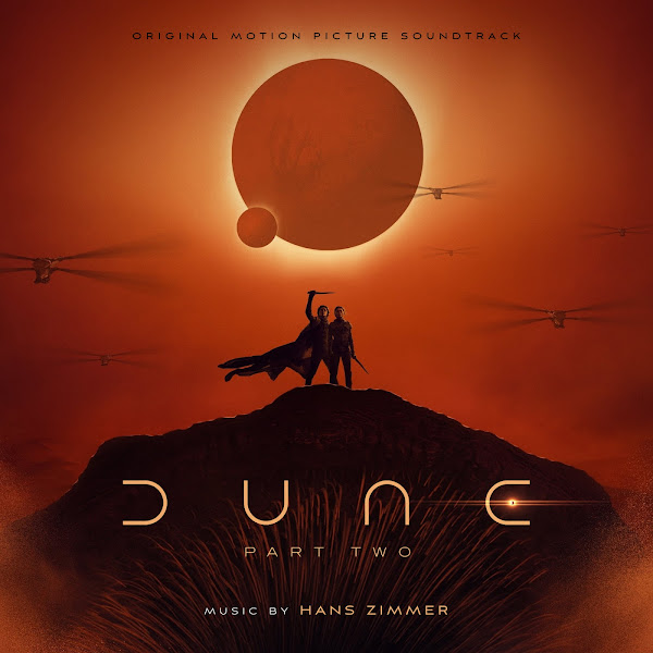
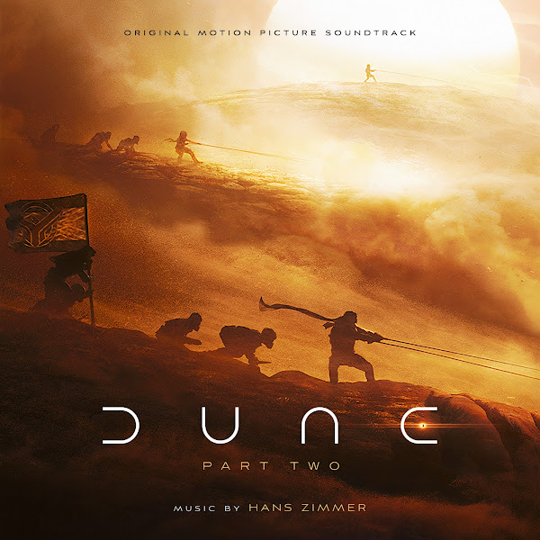
Cover 10 uses the main teaser art for the film. After finding the widest format available, and overlaying to get the best character quality, I again chose to alter the structure here, significantly enlarging Paul and Chani in relation to the sun behind them, though text and title placement here again proved a little tricky, having a giant circle limits some options of where you can comfortably frame text.
Cover 11 uses the 70mm release poster. I'd found still of this same scene in wider format, but the coloring was wildly different, and in the end, I just resorted back to the original framing.
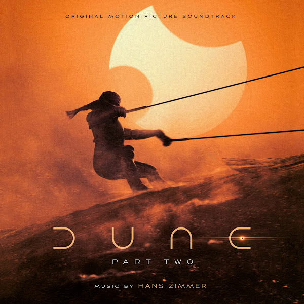
Cover 12 shows a Fremen warrior riding the sandworm (I actually don't know of this is an official image, or a fan edit yet). I just removed some text and applied some color balancing.
Cover 13 uses another teaser image, I simply lowered the sun down in the image a little and blended it back in.
Cover 14 uses a Chinese poster, which I combined with the wider wallpaper variant and blended between the two.
Cover 15 was a bit of a custom job. The original just is a shot of Shai-Hulud in the desert, which was fine and minimal. Maybe I should have just left it there. Instead, I had the idea to insert Jessica's solo poster, I find the glowing blue eyes give a nice contrast, and mirrors the Bene Gesserit's looming presence over the story. Fortunately the coloring on these posters all had the same look already, so I just had to cut out and blend between the two.
Cover 16 uses a promo still from the film. The original has more natural colors, I'd played with a version that echoed the other promotional art (with the heavy orange processing). In the end, I ended up somewhere in between both versions...for better or worse.
Cover 17 uses another promo still, with Paul stepping into the role of the desert prophet, the Lisan Al-Gaib. I just combined poster and wallpaper, and applied some more saturation and shadow.
Cover 18 uses cover artwork from the "Imperium Uprising" tie-in board-game. Unfortunately I couldn't find the name of the artist who actually painted it. I had to paint out all the branding and title, to insert my own text. Pretty epic piece, so had to include it.
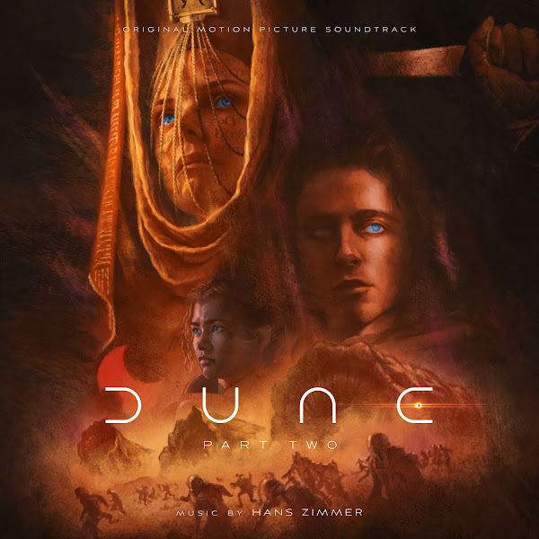
Cover 19 uses a piece by architectural designer and artist Nada Maktari, used as another cover alternate for Empire Magazine. Found textless, so fortunately required no editing.
Cover 20 uses a wall etching from a Fremen sietch of a worm-rider. The piece was used on the cover of the "Art and Soul of" book from this film. I had to uprez the image as best I could, and then brought the outside edges in to compress the image, and tried my best to blend all the body together so the stitches aren't too noticeable.
Cover 21 uses a striking custom fan poster by artist Matt Griffin, who has previously illustrated several printings of Herbert's Dune books. Fortunately the image had plenty of negative space at the top and bottom, but I did have to blend the outer frame elements to fit the new size, and paint out text to adjust the spacing of the title.
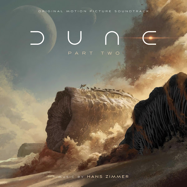
Cover 22 uses an incredible digital painting by artist Greg Ruth, which I knew immediately I had to fit into this collection! The problem was that the original piece is probably about three times the width, so I had to find a way to compress as much of the image into my limited square canvas. This required separating the three layers of sandworms from the background, and then shifting their spacing much closer to one another, and then matting and blending them all back together in a way that hopefully looks cohesive. In the end, I was pretty happy with the result (though unfortunately couldn't make space for the Emperor's ship and outpost on the far right of the painting).
Cover 23 uses another fan creation I stumbled on online from artist KR Kawsar. I had to significantly change the bottom third or so of the image to fit this format, so I struggled with how to edit the design, in the end, removing the two side sandworms, shrinking the center one, bringing up the border, and then trying to paint in texture to fill in all the missing space from taking out the sandworms. Highly stylized images that have very geometric formatting can be tricky to edit down, but I enjoyed the challenge and like how it all sits together.
Cover 24 uses fan art by Matthew Ceo, a pretty fantastic piece that was widely circulated online. Little editing required.
Cover 25 uses a stunning digital painting by artist Matt Taylor (he also had a variant with the darker orange tones, but I ended up just using this one). The trick here was cropping in. I had to chop the bottom, tightening in on Chani, beyond this, I couldn't crop in any tighter without damaging the intent, so I had to significantly expand the sides of the image myself. Fortunately these areas were more sparse and textural (besides the cape), so I just had to create some of the geometric shapes to take over, and them paint in the yellow, white, and sand spray. A strict flat style like this is actually tricker than you'd think, as you can't just blend things (like you would with more photo-real elements).
Cover 26 uses a custom creation by YouTuber and designer PhaseRunner. I just had to uprezz the image, and then compress the plans of the different worms a bit closer together and blend them out.
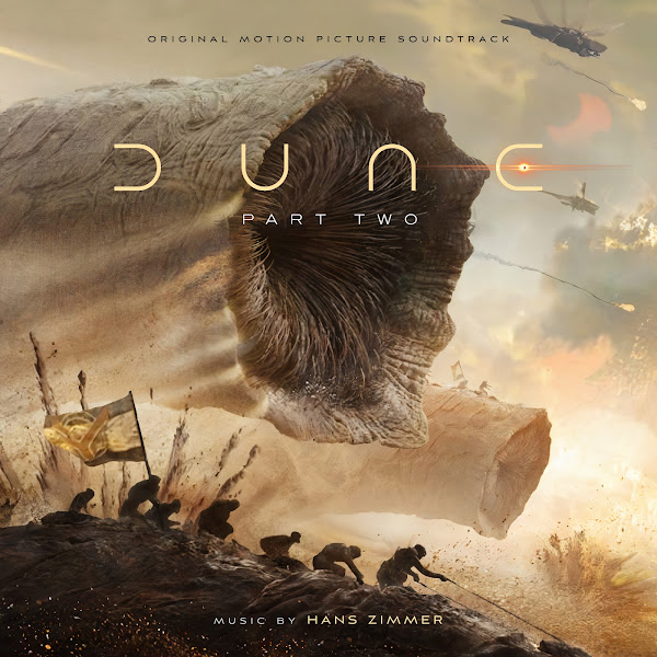
Cover 27 uses a terrific piece by artist Samer Alkaabi. I reached out, and he was kind enough to send me a textless version of his piece. He had two variants, one which Paul's face seen (with a softer sand color), and one where his face is masked like in the film (with a darker, redder hue). I ended up doing my own composite of the two, keeping the mask, but editing the colors a bit. The hard was again was how to compress the image vertically. I started by moving the whole top half with the moon down, I then had to manually cut out many of the ornithopters, smoke trails, explosions, etc, and reposition them and blend everything back together. You always try to make these edits as smooth as possible and honor the intention of the original piece.
Cover 28 uses digital artwork by Wolfgang LeBlanc. I like the different feel of the piece, featuring Jessica's ceremonial garb. The problem is always spacing, a straight crop would miss half of the image, so I had to make some major edits. First I moved the bottom (sandworms vs. Sardaukar) up, and blend that in. Next I made the decision to shrink Jessica down significantly, while still trying to honor her dominant placement in the image. This means I had to paint out and expand several parts to them blend them in smoothly, and then warping and painting to fill in the gap created on the left side, and trying to minimize the older shape created on the right by her robes in the original configuration. Fortunately, these forced edits actually helped slightly fix one small detail in the original that bugged me (where it looked like Paul's crysknife salute had it appear like Jessica was holding a knife to her own head), I think the re-spacing here makes that appear less problematic.
Cover 29 uses a fan painting by Ty H. My main changes were expanding the outer side edges (trying to get more creative using textured brushes for actual painting, not just smooth blending, especially for pieces like that are digital textured paintings to begin with), and then shrinking down Paul and Feyd's duel. I'm a bit iffy on the title placement, especially the part overlaying Jessica, but I couldn't find a cleaner place for it.
Finally, Cover 30 was quite a roller-coaster. The source of part of the image came from a Total Film magazine cover, which is a super dynamic image. The problem is, half of the image is covered with text, and to this date, there is no textless original version available (trust me, I've been checking almost daily for weeks). Hopefully one day it'll surface. I did however find an online edit by artist Axel Almiron, which takes the characters, but had to crop in significantly, and basically entirely edit the foreground and background of the image from scratch. He did a great job, given the limitations. I made an attempt to recreate my own version of the original cover, discovering that the top park of the Sardaukar ship is from the opening scene of the film. Technically, it would be possible to entirely rebuild this from scratch, but the elements weren't in high enough quality, and with thirty other covers to deal with, I was already overwhelmed and just ended up falling back on Axel's edit here, which is still fantastic, but I hope to be able to add a proper version of the magazine art one day, if it ever surfaces, it's just such an epic image, with a dynamic action pose.
So here we are folks, thirty covers, several quite tricky--all in less than a month of the film's release (for a spontaneous project that I hadn't originally planned on tackling). I'm quite proud of these, and hope others will enjoy them too. The spice must flow!












Kudos to you for having the guts to begin an enormous task like this in the first place and keeping it up until the last piece is completed. I certainly know how overwhelming projects like these can get, the longer you dwell over them. But once the old steam engine starts rolling there's no stopping, eh? :)
ReplyDeleteThanks, Heidl! Yeah, it was quite a beast, one I wasn't even intending on doing, but inspiration struck, so I felt compelled to put several projects on pause and just push through to get this done!
Delete