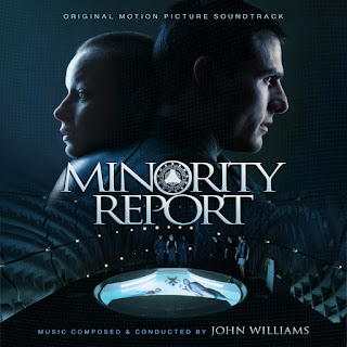
In 2002, John Williams once again collaborated with Steven Spielberg, this time for a futuristic crime thriller. The music is relatively understated and moody, underscoring the noir vibes, and less the grand sci-fi concepts. It remains a fascinating score nonetheless, certainly worth a revisit.
The original album cover utilized the main poster and is perfectly serviceable (ignoring the random bar on the bottom left of the image). Rather than redo this image, I just moved on to an alternate poster design, used for the steelbox home video edition. As is often the case, I overlayed two images to get the desired detail and colors, then redid the simple title (oh, Trajan font...), and it took me a while to find a pairing font for the other text that was modern, but not clashing.
This film really had a lack of quality alternate posters, and for a major blockbuster film of this time, there was a surprising lack of high-quality art or stills available. So I took it upon myself to try to create some "original" composite designs using what I could find. This second cover is quite a bit more muted, though I like the shifting green and blue hues. The relationship in the film between Sean and Agatha is central to the humanity of the story, so I wanted to use this image of them centrally. There was actually an existing poster using this design, but I found it pretty lifeless. I added a Blu-ray still of the Precogs pool room at the bottom, and then added a subtle grid pattern on top of the background to echo the design of the official artwork.
The third cover is another custom composite. I originally was going to use this image, used for the later Blu-Ray cover. That image unfortunately, was rather garish, with poor Tom Cruise's face Photoshopped almost beyond recognition. I found some original press photos that this image was presumably based on, but unfortunately it existed only in various qualities of terrible. My plan was to simply superimpose the photo to try to regain a bit more human skin detail, but I then decided to just take that whole and build a whole original design around it. So I took the concept of the HUD screens Sean uses in the film and attempted to mimic my own, using simple HUD graphics I found online, then playing with all sorts of blurring effects. Then I decided to fill in the empty space by adding other moments from the film, including, of course, Agatha. Again, trying to play with layering, Gaussian blurring, color, opacity, etc., to try to make it all blend, and somewhat capture the feel of this scene from the film. Sadly the actual photo of Tom's face is still a lot lower-rez than I'd desire, but hopefully with everything else around it, it doesn't suffer too much.
La-La Land recently released an official expanded album of this score, but I wasn't a fan of their cover--kinda dull, and not a fan of the titling. So I made a shiny remake. Fortunately there were good quality images to work with. I changed his skin color to actually look like, you know, human flesh--though I still wanted the focus to be on the eye.
I really wanted some cover to incorporate the Spyders from the film, but unfortunately couldn't find any images with high enough quality and/or the angles to fit my designs.


No comments
Post a Comment