
Lee Tamahori brought along Jerry for this 1997 survival adventure tale--one of several tremendous Goldsmith scores in this year. For it, Jerry wrote one of my all-time favorite main themes of his, as well as some rousing and aggressive action music that perfectly capture the fear of being alone in the Canadian wilds, driven by deadly jealousy, and being hunted by Bart the Bear (I mean, a blood-thirty Grizzly).


The original album is certainly very aggressive, but not very attractive. I found a higher-quality poster of the same image to begin with and tried to improve the composition and coloring a little, though it's still a little bit awkward a design to compose. Nevertheless, an improvement, imho. Years later, La-La Land Records released a complete expansion, though somehow the artwork here was even worse! The top image doesn't remotely match the bottom stylistically, the black levels are atrocious, it feels sloppy and frankly an embarrassing cover for a great release--one that's always been in my mind as one of the worst covers that springs to mind. Something had to be done.
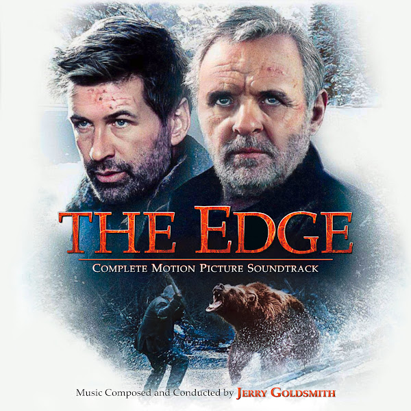
For the next cover, I took the Blu-Ray artwork design, though had to combine two to get a look I liked that was less extremely contrasted. Tightened the composition vertically, added a little background horizontally, then just had to recreate the fonts to match this more modern aesthetic. I quite like this art on its own, although I don't know if it really captures the look of the film itself.
The third cover is built around the home video artwork, presumably at time of release. The artwork is very dated in a 90's style, but I liked having more forest-colored art options. I was initially hesitant as I couldn't find high enough quality artwork, but eventually found a few that worked well, and in slightly wider formatting. As per usual with these older posters, I had to superimpose two images to achieve a desired quality and look and a bit of color correcting, plus trying to reduce the awkward shadows around the characters faces to give more life to the forest. This image also features the same shot of Hopkins standing off against the bear that's in 2 other covers, so I chose to switch it up again. Same scene, but this time a still from the film itself, featuring both protagonists. As you can see, there's a lot of foreground tree branches and twigs in the image, which wouldn't work for this composition in the wider picture, so it took a while to clone all this detail out and relatively matched into its new surrounding home. I don't know if I quite like this cover, it still feels fairly dated style-wise, but variety is good.
For the final cover features a variant on the same BR artwork, though this particular image was graded in a way to give it a very different feel--and with a different, wintry background. The artwork was extremely grainy, so I again had to composite another image on top and brought out more warmth in the image. I wanted to create something tonally in between the extremes of the first two covers, and I love the original title treatment of the film's poster, so steered colors to complement and contrast this look.
I hope I did Jerry's excellent score some justice, and righted some artistic wrongs in the process.
No comments
Post a Comment