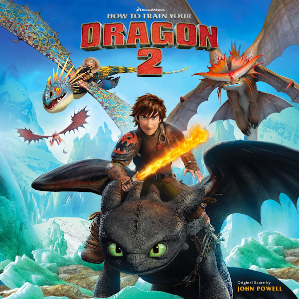
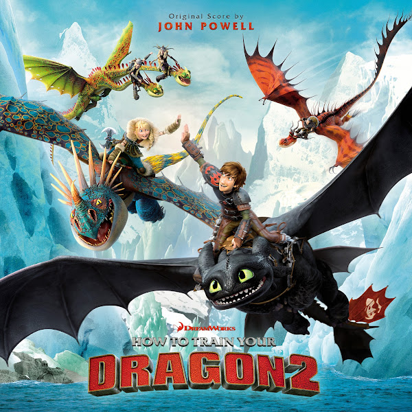
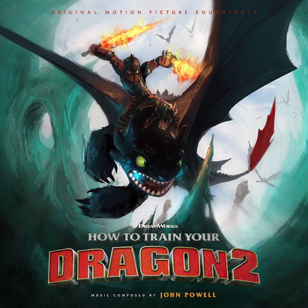
Director Dean DeBlois returned to the "Dragon" franchise in 2014 with the first sequel film--introducing a new human villain, expanded family dynamics and more mature themes and a stunning visual palette. Composer John Powell seized the chance to develop his sonic world, reprising most his previous thematic ideas, while also introducing some truly stunning new material for Valka and her relationship with Stoic, the aching "lost and found" theme, a new villain motif and the gloriously old-fashioned Alpha theme, which both echoes the sound of Scandinavian classical composers and Hollywood legend, Miklos Rózsa. Although the story of the sequel doesn't quite hold the level of the first for me, the visual improvements and expanding story make it well worth your time. It features one of the very best sequel scores of all time, one of my very favorites of the decade, and one which (depending who you ask) equals or even surpasses its predecessor.
I went all out with this project, completing a total of thirteen (13) covers! It took me a good two weeks to go through them all, some were fairly simple, while others required loads of detailed work. My first big challenge was actually creating a new version of the logo. The main one is the one with the "2" centered on a second line, but this gives it an odd rhomboid shape, which is difficult for many compositions. I wanted the version of this where the bottom red text is all in one line, creating a more space-efficient design. Only problem was, I couldn't find any hi-res version of this logo, so I had to take the other one and customize my own. Trying to move the "2" to its new position was challenging due to the 3D nature of the design. I tried my best to match the correct angle, and then had to clone on all correct metallic shadow from other parts of the image. In the end I probably made a mess of it, and it took way too long, and the 2 still doesn't quite look right, but I hope it's passable enough to not be distracting, it was certainly a royal pain to work on--but it was definitely necessary for a couple of the images.
The first cover was mainly used for home video artwork. This was actually the last one I worked on. I was really dreading the cloning job necessary to remove much-larger title in the original version, as I couldn't find textless. But fortunately in the end, I actually found isolated portraits of these same dragons, which made editing the sky back in much easier (once I tweaked their colors/levels to match), rather than having to clone and guess to restore the missing bits. Composition was also a bit tricky--you'll see on a number of these I had to resort to using "Original Score by", stripping the usual 2 text credit lines down to 1. Many of these posters were just too busy, and it was tough to cram even more text onto them, so this was the most elegant compromise I could find.
Cover #2 is basically a remake of the official album cover. I just hate the text credits font used here, totally clashes with the style of the art and the film. I also got a version of the cover with more more natural colors, and not that weird blue tinting that creates toxic teal grass.
Covers 3-9 were mostly pretty straight-forward, so I won't bother to narrate and link to each one. They always require the usual tweaks--sometimes combining a few poster versions for the highest quality, color correction, sometimes moving around smaller parts of the image to allow better title composition, and then the hardest part which is usually figuring out where to place the text credits, deciding size, color, etc., to try to create a harmonious image overall--which as you can see, requires slightly different setups depending on the design of each individual image.
Not content to call it a day at the official marketing artwork, for Covers 10 and 11, I turned to some awesome fan artwork. The first seems to be an analog, hand-painted image by artist Kevin Patag that is really gorgeous, I just tried to keep the added text small so as to hopefully not distract too much. The second one uses a fantastic bit of digital artwork by artist Sai Foo from DeviantArt. This one was quite challenging, as the original image is a wider wallpaper design, and if I just cropped in, you'd lose half of the image (that wonderful ice cave), so instead I had to try to widen the image vertically by actually cloning and painting in new space that hopefully doesn't destroy the image. I also scooched the ice wall on the right a bit closer to center to give it a better circular frame. I don't have a ton of experience actually painting from scratch digitally, so it was tricky to be able to expand the image, partially cloning using the existing textures, but also adding my own brushes and colors, without (hopefully) butchering the kick-ass original artwork.
The final two covers use the Limited Edition IMAX posters, which are somehow minimal and moody yet utterly epic at the same time. The biggest problem was that for some reason, the image itself was created with an ultra grainy/noisy finish. I'm sure this gives it a nice cinematic quality when looked at the printed poster, but to edit digitally was a total nightmare, especially in the first image. Even with the de-noising filters cranked to their max, it's clearly still super noisy. This wouldn't be a problem until you have to clone over parts of the image (to remove the frame before re-applying), and also I had to clone in significantly to widen the image on either side, expanding the wings and sky. Cloning smooth, clean textures is a synch, cloning grainy material smoothly is an absolute nightmare! In the end, I hope the slightly botched pasting and coloring isn't noticeable.
The last cover thankfully didn't create the same issue with noise, but I did have to vertically compress the image, shifting a few of the background dragons, fading in the top, sliding down some of the cool mountain details that were hidden under the title, etc. Overall these two covers are pretty stunning, but all credit there goes to whoever the original artist was.
Hope you enjoy the fruits of my labor--now the trick is deciding which to use for your personal collection, given so many options! Impressive or Excessive? You decide. Even with all 13, I still didn't use all the available art, there's still all the solo characters posters, plus tons of fan art, and some gorgeous original concept art (which sadly I couldn't find in good enough condition to use). I honestly don't know which one I'd go for yet either. Some of these were a royal pain to work on, but a man's gotta keep plugging away until it's at a passable level for their own standards. All part of the job. Let me know your favorites in the comments!


Wasn't expecting you go as hard on this one as you did! The promotional campaign definitely got a healthy budget this time around.
ReplyDeleteTo be honest, I like this set even more than the first one. I'm especially fond of the final four, I'm a sucker for the more abstract artwork compared to the cleanliness of the more used promotional artwork. Not that there's anything wrong with those! I could definitely see 1-9 being for a standard release with 10-13 being for a deluxe or expanded edition. #10 is my favourite so far, you've got a good eye for artwork and the implication of the monstrous size of the dragon in the distance coupled with the eye-popping colours really gets the imagination rolling. Looking at the original image source for #11 and how you managed to get it into a square by literally painting the bottom image from scratch is the type of work that impresses and terrifies me. I don't see myself ever getting to that level of skill. You're an actual artist!
Just a small typo I noticed, when you're talking about the work you did for covers 9-10 you're actually referring to covers 10-11. Otherwise fantastic writeup as usual.
And that's it, really. I can't really add anything else when every cover is fantastic. Eagerly awaiting Hidden World, of course, as well as your future work. Happy Holidays!
Thanks! I definitely prefer these covers overall too, I was always more excited to get to the sequels. They're overall just way more elegant than from the first film, and I love the colors, especially the ones with the aqua ice colors, but also the more subdued earthy ones. Though overall the designs for the official marketing, is still fairly in-your-face, and pretty busy, and that's considering I several times had to chop the image and cut or paint out smaller characters flying around on top.
ReplyDeleteThanks for catching the Typos when I was referring to the images, I'll go fix that right now!
Yeah, I kinda like to clump my images together by categories, when it makes sense, like putting the two fan-art-based ones together. The first, just slapped text on and called it a day. The ice one definitely I struggled with for several days to figure out the composition, and then the hard work of actually expanding the image and not having it look like garbage. I added a bit to the top of the image too, to better accommodate the OMPS credit. Mostly it was just a hard one to figure out, since it's a very asymmetrical design, which works great as an action-packed wallpaper, but expanding the image vertically (and slightly tightening the right side) was the only way I could find to get the image to work in this context. The characters' faces (which normally would be right in the center) are definitely off to the left, but I think it mostly manages to balance overall. I'm definitely not 100% satisfied with the "painting" I did at the bottom, but I think it's mostly passable, and it helps that half of it is covered over by the text.
I'll definitely get to Hidden World soon hopefully, though might have another couple projects in between first, just to switch things up visually. Thanks, and Happy Holidays back!
Ralph Breaks the Internet Soundtrack by Henry Jackman
ReplyDelete