Released in 1995, Ron Howard's "Apollo 13" told the true-life tale of the failed NASA mission and the astronauts' harrowing journey to return home. The film was a commercial and critical success, one that keeps you on the edge of your seat and deeply invested in the drama. Director Howard brought along composer James Horner (whom he'd previously collaborated with on "Cocoon" and "Willow"). Horner had a busy and successful year in 1995, with this music competing at the Oscars alongside his own score for "Braveheart". Featuring noble trumpet solos by Tim Morrison and ethereal vocals by Annie Lennox, the score captures both the majesty and haunting loneliness of space, and in this fan's opinion, ranks among the strongest compositions of his incredible career.
For years, this score was a source of frustration for many score collectors. The original album featured a mix of period songs from the film, a healthy amount of score, but littered with dreaded dialogue overlays. Though there was a complete promotional release that floated around on the bootleg market online, it wasn't till 2019 that we received a proper expanded album from Intrada Records, featuring the complete score (sans dialogue). The original covers all featured the standard poster of Hanks, and the Intrada covers sadly were somehow even worse, with poor font choices, and appalling black levels that revealed the poor compositing job where the text was clearly just chopped out and pasted on. There really were only two main posters released at the time, neither particularly exciting, though fortunately a few alternates have been produced over the years for home video releases that are at least a bit more visually engaging. Above, are six new covers to choose from, and though they're not my most glamorous covers, hopefully they'll provide a noticeable upgrade from existing options.
The first cover is an alternate composition of the basic poster used in the original campaign (and on one of Intrada's two covers). Though the original featured a vertical composition, with the moon cutting across diagonally, this video cover art version I found flipped things sideways, a composition I thought worked better for a square cover. I recreated the film's title--a simple task of typing up some Trajan text, creating a shifting gradient overlay to give it that metallic sheen, and a subtle 3D bevel. I altered this title slightly per each cover, but overall it matches closely enough to the official look.
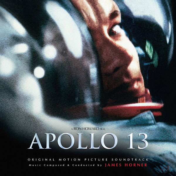
Cover 2 takes the central poster, featuring Tom Hanks as Jim Lovell. This poster is odd--it's intimate and dramatic, but also just a strangely off-putting and unpolished as well. All the previous covers utilized this image. The original covers cropped the top off of the image (right above his eyebrow), but the expanded cover version chose to do some terrible cloning work (the repeated and obviously visible "stutters") to expand the sides of the image. In addition, the actual poster has that strange gray bar at the top (presumably this makes sense in context in the film, but as a piece of art, it's a very strange thing to include). So I choose to clone this bar out completely, giving another inch or so of space to the top of Hank's head. It's difficult to build out someone's face using cloning, when you have no reference for what this part should look like, to try to maintain general shape and lighting, etc. It doesn't help that the image is exceptionally grainy (presumably to maintain that pseudo-documentary feel), which always is a nightmare when it comes to cloning, as you're essentially shifting from brush painting to pointillism, to blend new material smoothly into the existing. Anyways, I think having that extra bit of headroom at the top really helps the image, and hopefully it's smooth enough that you don't actually notice that I drew in a whole new forehead using existing bits from the rest of the image.
The third cover uses the artwork from the Blu-Ray Steelbook edition. Editing was fairly simple, just tried to sharpen up the image a little as it was fairly soft.
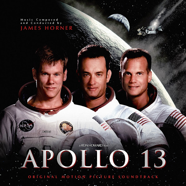
Cover 4 takes another Blu-Ray video cover I found. I had to comp together two versions to enhance the clarity of the actor's faces as well as I could. The whole composition here feels a little dated and cheesy, 90's aesthetic combined with 2000's. But I like providing options. The original poster had the astronauts at the bottom, but I thought the composition worked better shifting them to the middle, moving the star-field down to give space for the title.
The fifth cover was a custom creation of sorts. I found film still of Hanks in his NASA suit, ran it through the enhancement tool, which brought out a fair amount of detail and sharpness. I had to use cloning to expand the top and bottom of the image to provide more space for text. I then blurred the background to really bring the focus to his face, and simplify the visual clutter. Not entirely sure if I like the red title, but it fits the general color palette, and it was the option that popped most against the background. Another little experiment of mine to try to provide something a bit more unique than the typical poster variants.
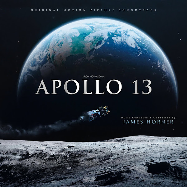
Finally, Cover 6 is another variation on the moon poster, still keeping the same rocket, though using more dramatic images of Earth and the moon. I basically just split the image up and shifted some things closer, added a bit of extra space on top, etc. Along with the graded text, it gives it a bit more of an epic and modern look, though I still wanted them all to feel fairly cohesive and in line with the film's tone.
So there you go. These images were mostly pretty simple to create, the only real challenge was shifting the composition around to balance alongside the added text. Not too much of a challenge from a painterly angle, but each image always provides its own new hurdles from a spatial design standpoint, that always requires lots of trial and error to find the right sort of "feng shui". Hope Horner fans will be pleased to have some more dynamic cover options to one of his best scores. He is a composer and a soul that I dearly miss, but his love of flying and his own warmth and emotional grace and sensitivity come through so clearly in this music. Rest in peace, James.


No comments
Post a Comment