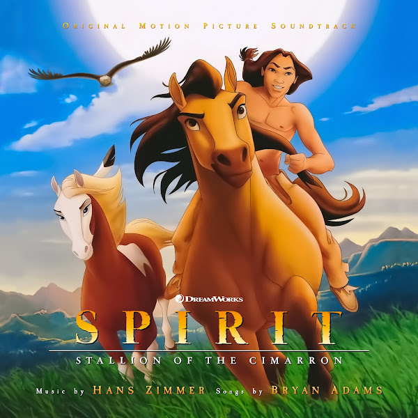
In 2002, DreamWorks released "Spirit: Stallion of the Cimarron." Directed by Kelly Asbury and Lorna Cook, the film was a modest success and earned decent, but not stellar reviews from critics. It tells the story of a young Kiger Mustang stallion who is captured from his home in the American plains, and who meets friends and foes as he struggles to return to his family. This was DreamWorks Animation's penultimate 2-D film, and though the plot is fairly predictable, I always loved the visual style they developed in these films. Their films were also known for having excellent musical accompaniment, always in collaboration with Hans Zimmer and his crew at Media Ventures/Remote Control Studios. Zimmer here presents a score loaded with many of his stylistic traits of the time, including a modern sound and anachronistic use of synths, but it features a terrific central theme that captures the nobility and proud Americana at the heart of the story. Since the film tried to capture a more 'realistic' nature by avoiding talking animals (instead using occasional voice-over), original songs were written to speak to the character's thoughts and the themes of the story--with Zimmer and his team collaborating with Canadian rocker Bryan Adams.
Another unexpected project that started out as a quick personal cover, but quickly grew into a full covers set. One that often took a bit of finessing, as it was often hard to find hi-rez versions of most of these posters. The original album featured all the songs, performed by Bryan Adams and Sarah McLachlan along with a small selection of suites from Zimmer's score. Sadly, an expanded score was never officially released, though there is a fair amount of score missing. I'm not a huge fan of the songs, they're fairly cheesy and on-the-nose, but several of them incorporate Zimmer's melodies, so at least they're fairly well-integrated as a whole. I created a total of six covers, two of which credit the Zimmer score only, for those that prefer to remove the songs.
The first cover is maybe the most unusual, but I just love the different vibe. There were a number of tie-in books for this film, art-of, novelizations, spin-offs, coloring books, etc. This painting was taken from the cover of one such adaptation, an illustrated children's book with painted art by William Maughan. I couldn't find a good image or scan of the cover, but fortunately I was able to do some image enhancement magic to enlarge it and add detail. Since this appeared to be either oil or acrylic paint on canvas, rather than try to erase out that texture, I actually overlaid a new canvas pattern onto the image, to add further texture and detail and to really distinguish it from the other marketing artwork for the film, which all featured clean digital coloring. I moved parts of the image around (bringing in elements from the extreme left and right of the image for a tighter composition), painted out the text and inserted my own, and played around with the colors a bit. In the end, I think it's quite a stunning image, I really wish more posters used hand-painted art like this.
Cover 2 is a bit of an original composite. The central image was used on some of the Blu-Ray covers for the film, featuring Spirit and Rain, but the original featured them over a flat green-yellow gradient. I decided to spice this up by matting them out and then inserting a more cinematic background (by splicing together part of the wider scenic background from Cover 5's art). For each cover, I toyed with minor changes in the coloring style of the title, and with a few different fonts for the additional credits. In the end, I find this version much more engaging than the original video cover it was derived from.
The third cover adapts one of the main posters used for the theatrical run--something more textural and minimalistic at the same time. This is similar to the official album cover, though I prefer the more rustic color and the emphasis on nature, rather than the blatant American patriotism. I cloned to widen out the image a little bit, shrunk some things down, and struggled for a while to find the right style and placement for the text to be legible over such a busy texture, but in the end, I think it works.
Cover 4 uses another digital illustration, used on one of the video covers. This one didn't require too much fussing, other than the standard image tweaking, and composition/font placement.
The fifth cover uses a lovely, wide wallpaper-style variant of another poster. The original again was fairly lo-rez, but was able to enlarge and enhance to decent quality. I'm not totally satisfied with how that top text credit sits, but adding text around a movie title that already had a second-line subtitle can be challenging.
Cover 6 uses again another central poster, giving Little Creek a more prominent position this time. The original again was in fairly lo-rez, and with the addition of a weird glitchy/grainy texture on top. I first de-noised the image, refined the colors, then enlarged and enhanced to try to restore back detail (fortunately a simple cartoon makes this more forgiving than something more photo-real might). I then cloned the sides of the image out a bit to relax the framing, isolated and moved the eagle (something I had to do in every image that features it), and called it a day.
Hope you enjoy these covers. These are my first covers for a 2D animated film, so outlined style was something new to work with, but I like these overall, I tried to really capture and enhance the vibrant colors in the artwork, as well as feature the prominent characters as well as the majestic landscapes. Hope you enjoy, and let me know below which is your favorite.


No comments
Post a Comment