
Directed by Phil Alden Robinson, 1992's "Sneakers" is a comedic caper thriller about a team of security specialists and hackers, led by Robert Redford, who in order to clear their records, must hunt down top-secret piece of computer technology from a reclusive tech mogul. The film was a success, due to its stellar cast, thrilling heist elements and clever humor and camaraderie. Reuniting with the director was "Field of Dreams" collaborator, composer James Horner. The score is filled with many elements that would become staple Hornerisms--light female choirs, piano-led motifs that would become his staple "genius" sound, and a mysterious variant on his infamous "danger motif". Joining the pared-down orchestral elements was an array of synths, and the cool vibes of featured saxophonist Branford Marsalis.
Though probably not at the top of anyone's favorite Horner list, the score remains well worth a listen, offering the composer a playful canvas in which to refine many of his most famous musical signatures, with less focus on huge orchestral drama, and allowing more electronic experimentation and an overall light and enjoyable vibe. I watched the film several times growing up, and its slick plot and charming humor always made it a winner. The original album features a healthy amount of score, though there seem to be about 25 minutes or so of unreleased material. Unfortunately the album artwork is simple and feels very dated. From what I can tell there was ever really only one main poster commissioned for this film, with two variants. So this was a small project, but it was nice to offer something that felt more polished and modern.
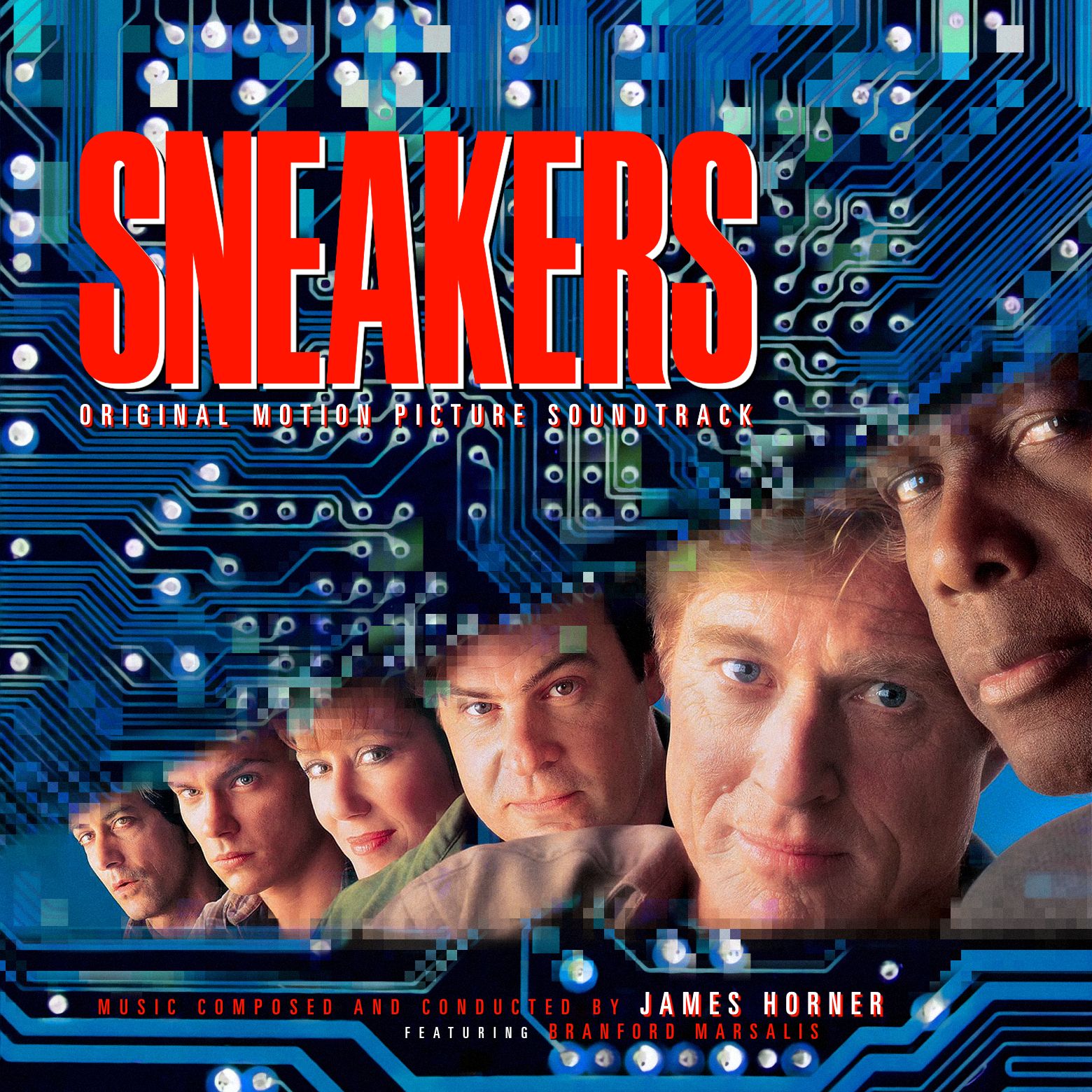
The first cover offers an adaptation of the alternate version of the principal poster. Instead of the white background, this one offered a blue microchip texture. Being an older films, I couldn't find any textless versions (with the cast names blocking large parts of the image), and regardless, none in high quality. So I decided to loosely recreate my own version of it, using the source as a starting point. I found a generic image of a circuit board, enhanced it, and changed the color from green to blue. Then I tried to recreate a similar effect as featured on the poster, by using the Pixelate filter to blend between the background and the insert of the characters. I used two layers, with different sizes of the pixel effect, and then blended those back on top of the cutout image. It certainly isn't an exact replica of the original, but I think it captures that same 90's-era approach to technology, and was a fun filter style to experiment with--and probably not one I'd have the chance to use often.
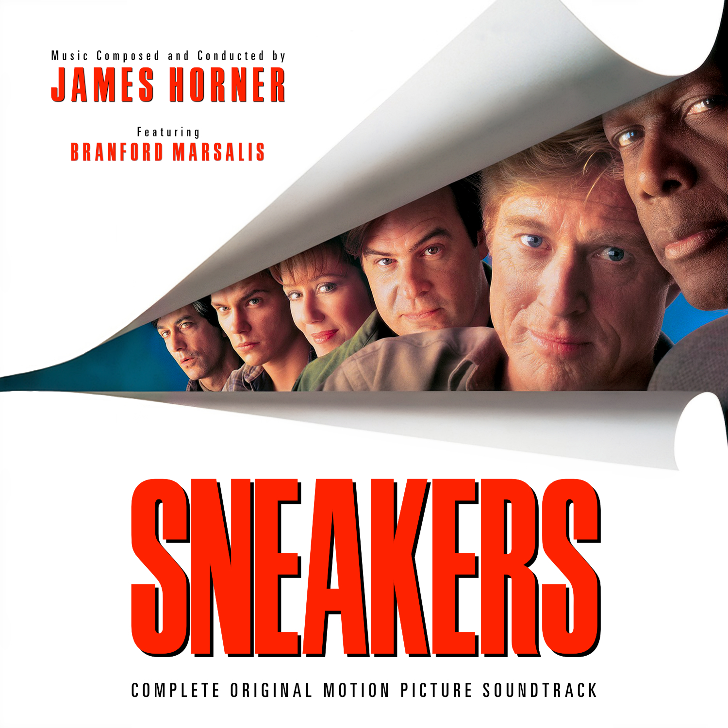
Cover 2 is a more straight-forward variant on the central poster/album cover, though keeping a more consistent text style, and using overlaying and tweaking several images to get the central image in good quality. Overall this was fairly simple, other than figuring out the placement and font style for the added credits. But overall I think it should be a nice, crisp improvement over the existing covers.
No comments
Post a Comment