In 2001, the Hughes Brothers, Albert and Allen, directed "From Hell", a loose adaptation of the graphic novel by Allan Moore and Eddie Campbell. The film tells the story of a detective investigating the Jack the Ripper murders, and a young woman who is among the killer's prime targets. The film was not a huge critical or commercial success, but it features a great cast and a slick and moody style that captures the horror of the London streets, leaving the audience with the mystery of trying to solve who Jack really is. Joining the project was Trevor Jones, one of my favorite composers, but one who sadly stopped scoring major blockbuster scores just a few years after this project. Known more for his lush adventure scores, Jones here provides a score that focuses more on eerie mood and Gothic darkness, though hints of his orchestral majesty shine through on occasion.
Though it's far from my favorite of Jones' scores, the score is well worth the listen, and when it came to covers, this is the first project I thought of that could really needed an artistic upgrade. As a fan of the gothic, these images were a nice change of pace. A majority of the film's marketing imagery used a fairly stark look, with a very modern font style. This works in some images, but I felt the tone and setting would benefit from a more period styling to reflect the gas-lit and fog-bound chill of the grimy London streets. I present a total of five new covers that hopefully reflect the mysterious tone of the story better.
The first cover uses a fantastic piece of artwork, which I believe is by designer Dan Mumford, though I couldn't actually confirm the occasion for which the image was commissioned. Nevertheless, the blocky and moody style is fantastic and gives the cover a very distinct feel. Editing was relatively simple--I scooched the left lamp down a little and shrunk the sun silhouette down a little to better fit the crop. The original poster had a custom title down at the bottom, though when relocating the title, I opted for a font and color that would be easier to read. I did however, take his cue and added the red blood splatter to spice it up a little.
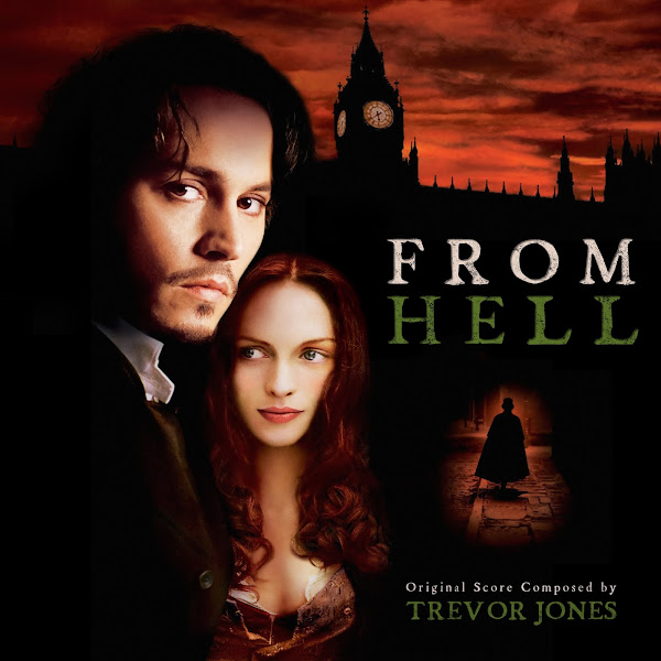
Cover 2 uses a variant on the central poster (seen in Cover 5), with a different shot of Heather Graham, and featuring a moody red sky. I had to edit said sky to be able to expand the left-hand side of the image and space everything out properly for the square frame. I thought the green text would be an interesting look to balance the ruddy sky, and it is a color combination that I remember from the film itself, especially with the absinthe scenes providing that green accent. Added a bit of grit onto the text to just blend it all in.
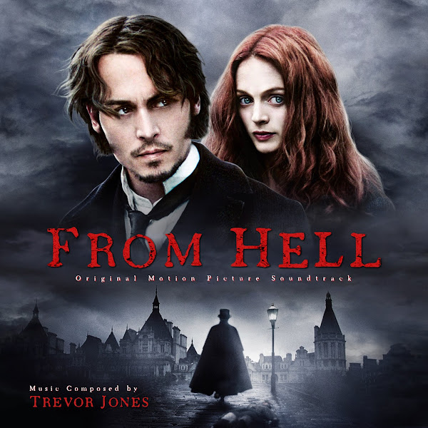
For the third cover, composited together a narrow poster and wider wallpaper version of this image. I split the image up into the top half, the bottom landscape, and then playing with several sky layers to blend it all together and allow blank space to place the title. I like the vintage, black-and-white feel of it, though I did add back in a bit of color to the skin tones of our protagonists.
Cover 4 uses a cool bit of poster art, though I couldn't actually confirm when this was created, or by whom, as I couldn't find any actual physical media that used this cover, so not sure if it was fan or studio-made. Johnny and Heather are taken from a still image from the film, though the background was clearly re-designed. Either way, it's a cool composition, I tweaked the colors slightly, added a bit of a green mist in places, redid and moved the text (and superimposed a wool texture), but otherwise I mostly just wanted to compliment the artwork itself.
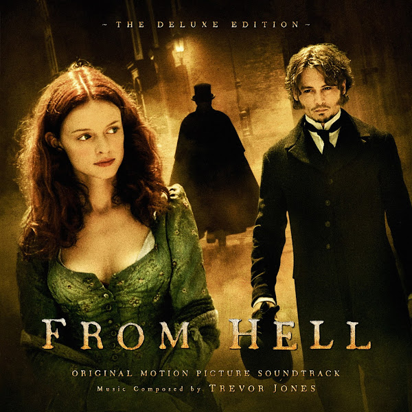
The fifth and final cover is my remake of the official album cover. I tweaked the fonts a little bit, though tried to echo the official look. The title design here wouldn't work well to my eyes on any of the other images, but pops nicely over the minimalist black background. Fortunately this one didn't require much actual editing, other than adding the negative space on the left to accommodate the newly added text.
So there you have it, folks. Hope you enjoy this latest covers set, and let me know which cover you might pick for your personal collections, or which you think best reflects the film and/or music's tone.


No comments
Post a Comment