After a long gestation period, director Duncan Jones' dream project "Warcraft" finally came to life in 2016. An adaptation of the long-running video game fantasy universe, the sadly failed to live up to expectations, with a story that was both overstuffed with mythology while simultaneously offering little connection point for newcomers to the franchise. The film performed admirably, though not enough to earn a sequel, and critics were not kind to the film, despite some exciting visuals. Teaming up for the venture was German-Iranian composer Ramin Djawadi, who composed a thematic and colorful score, led by a seriously-stomping main theme.
I'm not a gamer, so had no attachment to this world, though I was hopeful at the time that Jones would finally be able to bring us a successful game-to-screen adaptation. The world was rich with potential and the scope was certainly admirable, though it ultimately ended up feeling more like a Saturday-morning cartoon. And although I wasn't a huge fan of Djawadi when he first broke onto the scene, I think he has continued to mature greatly over the years, producing some creative and memorable work. I present a total of nine new covers for this project using various main and promotional poster artwork. There were also a number of promo posters that featured all the individual characters, these are quite elegant, but there were just too many, and I generally prefer covers that capture the film as a whole, rather than a single element.
The first cover features a desaturated version the central poster of the film. There were a whole selection of variations on this poster concept, with Durotan and Lothar up top, and featuring the supporting characters and army below. Mostly, they varied in colors, saturation, placement of smaller characters. In the end I picked two that were fairly typical, but maybe the most different from each other (Cover 8 being the other selection). For this one, I played up the desat look (expanding the style so the coloring of the image overall was even). Faded out the bottom, and for a few of these, I used the same font as on the official album cover.
Cover 2 features a piece of promotional artwork showing Durotan's arrival to Azeroth--the picture has a lovely fairy-tale quality to it, full of potential and the exciting promise of a beloved mythology coming to life in a new medium. Visually, I just added the title, tweaked the image saturation a little bit, and then struggled to figure out how to fit the bottom credit and on the font choice. Sometimes you have to step away, work on other projects, and keep coming back and fiddling with an image until you come up with a better solution to a problem.
The third cover features a gorgeous piece of artwork by Paul Shipper. It has a lovely hand-drawn feel, echoing to me the work of Drew Struzan. Image-wise this was pretty simple, just a matter of enlarging and enhancing the image for sharpness, fading out the bottom. The challenge was figuring out the text treatment. Honestly that top text still bugs me, it looks too 3D and modern (even though it was the same effects as the bottom text). It's fascinating how different stylings can play off the font depending on where they are in the image, light and shadow, etc.
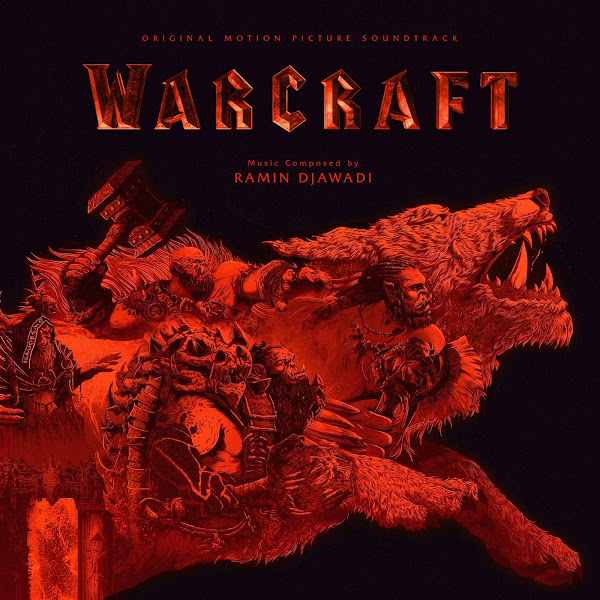
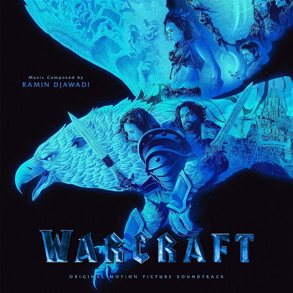
Covers 4 - 5 feature the work of artist Kevin Tong, red and blue, Draenor versus Azeroth. These have a lovely graphic quality to them that is a nice change from the other poster art. Fitting the text into the second image was more difficult as there was less negative space to fit text into. In the end, I guess no one will have both covers side by side in their collection, so having both designs be exactly identical was a bit of a fool's errand.
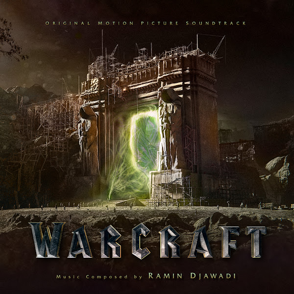
The sixth cover features the magic portal between worlds. I superimposed one teaser poster version of this, with another image I found online that featured the green glow from the activated portal powers.
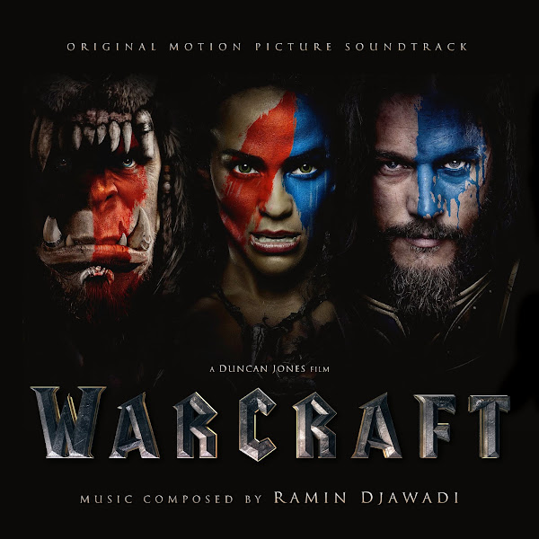
Cover 7 uses a wallpaper featuring the leads, which also featured Khadgar, whom I cropped out for better composition. I like the featured tones of the war paint and also featuring Garona in a central position as a the character that helps bridge the two worlds.
The eight cover uses a cool poster I found, that seemed to be from an international box art. Though it features many of the same characters, I liked the different color and mood and a better look at Durotan. On both this and the following cover, I had to take elements from other similar poster variants (mostly the army at the bottom) to use to patch over existing text in bottom of the images. So I'd have to shrink to size and fit into the new space, then totally chance the colors, saturation, contrast, etc., to match the existing artwork behind it. These patch jobs are ultimately invisible, but it often is a fun challenge to pull off a little magic trick and play with it until it blends in seamlessly till even you yourself can't see where it came in or out.
Finally, Cover 9 is another a more colorful variant on the central poster. Here I really tried to capture as much life as I could. I overlaid matching portraits of the characters pulled from other poster versions, as they were a bit lifeless in this image I was working with, to try to bring in as much sharpness and life-like colors back as much as possible. I also tweaked the colors at the bottom of the image, as in the original the sky had a pretty sharp shift from red to blue that looked pretty unnatural, so I tried to blend it out more naturally by shifting it into a yellow and green range in the center.
Hope you enjoy, and let me know your favorite selections from among the covers and which you choose to use for your personal collection, should you choose to use one!


No comments
Post a Comment