
For director Ridley Scott's follow-up to "Alien" and "Blade Runner", he collaborated with American novelist William Hjorstberg to develop the fantasy film "Legend". Starring a young Tom Cruise and Tim Curry (in one of cinema's greatest character make-up's), the plot centers around a princess and forest wildling who must prevent the Lord of Darkness from fulfilling his plot of murdering the last unicorns and bringing eternal doom to the world. The film opened in 1985 to mixed critical response, but has since gone on to become a cult film in the genre, thanks to the utterly gorgeous production design and cinematography (created entirely in-studio) that captures some of the most iconic and stunning imagery of its genre, despite ultimately being let down by a mediocre story. Post-production was also tumultuous, as a longer cut of the film was screened for audiences, who found it to be too unwieldy. For the American theatrical cut, almost a half an hour of the film was cut, and the original symphonic score by Jerry Goldsmith (retained in the European cut) was thrown out, being replaced by a more "hip" synth score by German electronic band Tangerine Dream. Fortunately, years later, Scott revisited the film and produced his 'definitive' cut, restoring Goldsmith's original music in the process (though a few musical moments are still dropped or moved around). Goldsmith produced one of his best fantasy scores--featuring one of his most lyrical romantic themes (based on a song written for Mia Sara), some of his most abrasive use of experimental synths, and a lush and impressionistic use of orchestral and choir.


Working on these covers was a real treat. The film itself is far from a masterpiece, the plot is a bit non-sensical at times, and the American leads are both a bit wooden and miscast, but as an aesthetic experience, I find the film (the director's cut, anyways) to be a totally rapturous experience, a sumptuous journey reveling in color and some of the most picturesque fairy tale imagery ever captured on screen. The original marketing campaign only had two or three posters, but fortunately over the years, the film has amassed quite the collection of artwork, both for later home video releases, as well as custom commissions and fan-made designs--all of which is stunning. Although the Tangerine Dream score was released at the time of the film, Goldsmith's score was nearly impossible to find, until it finally got a proper CD release by Silva Screen in1992 (later re-released in 2002 with new cover art). Just earlier this year, Music Box Records released an expanded and remastered album, featuring two new cues and two alternate bonus cues. These new covers were not to my liking, so it seemed as good a time as ever to finally create my own versions--nine covers in total.
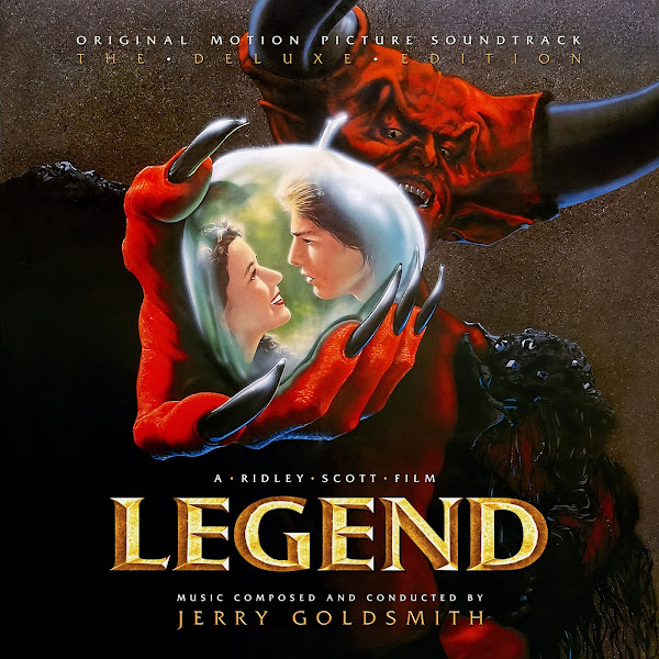
Cover 1 adapts a gorgeous painting by illustrator Neil Davies, commissioned for the recent Blu-Ray set by Arrow Video. The piece is meant to be a wrap-around box cover, and as such is a bit awkwardly framed. The box art centers the image around Jack and Lili (though ironically, they aren't actually in the center of frame). The full textless piece of art was easy to find, though this only highlighted the odd composition of the piece overall. I first blended two versions of the artwork and enhanced to obtain the best resolution. Then my challenge was to figure out a framing appropriate for my format. I choose to place Darkness at the center, as he's a much more arresting image than the young lovers. The poor unicorn is shunted a bit off to the side, but you don't really miss much. I then had to move the two goblins over closer to center, to balance with the other two characters. This required cutting out several layers and doing quite a bit of cloning and painting in the background to cleanly re-position them--but in the end I'm quite happy with the new composition, and hopefully my edits will be largely invisible.
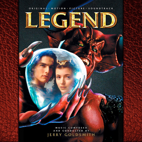
The second cover takes one of the central posters, itself a variant on the painted version (used for Cover 8). The pose is largely the same, though here it is using photography, and has a different image inside the apple. Unfortunately there was no wider composition for this, and I didn't want to forced to crop tightly into the image, so I went with a slightly old-timey storybook side matte.
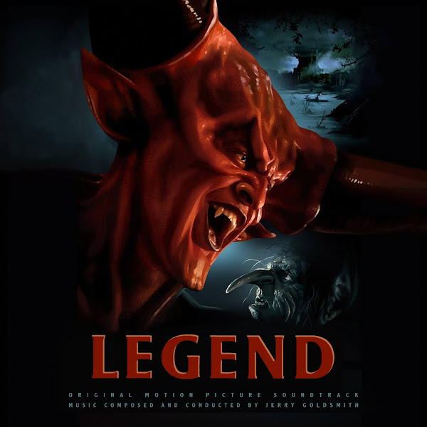
Cover 3 adapts one of the other central posters from the film's release--this one a stunning painting by the legendary Thomas Blackshear II. I first has to align and superimpose several different versions of the artwork, and enhance and enlarge for maximum quality. I wanted the full verticality of the image, so I had to clone and widen the image out quite a bit. This artwork was used as one of two cover options for the new Music Box album, but I found the actual quality of the artwork itself to be gritty and quite ugly (at least as available digitally), and I disliked the dark blue tones used, so I wanted a much cleaner image here, with a more timeless and elegant feel for the text.
The fourth cover takes a stunning fan painting by Casey Callender. My biggest challenge here was simply dealing with the crop, since I couldn't widen out the image any. I could have cut Jack and his friends out entirely, or just have Jack's face down at the bottom, but that'd be very odd framing. Instead I was forced to shrink them down, retaining Jack's torch lined up to still fall into the flame pocket. It's still a bit awkward, they should have been a bit higher up, but I didn't have enough material to paint in all the gold around their feet to create a whole new ground layer at this width.
Cover 5 uses a Blu-Ray cover for the film, this artwork uses the original film's promotional photography--captured by none other than Annie Leibovitz. Didn't have to do too much to the image itself, other than compositing and color-matching two images, to get the wider edges of the frame to allow decent spacing and composition.
The sixth cover takes another a painting from digital illustrator Brian Taylor's matching movie poster sets. I had to clone and paint to extend the width of the image by a significant amount to allow room for the text below.
Cover 7 again uses a more recent piece of artwork used on a home video cover. My biggest challenge here was again vertical compression. I wanted to keep the unicorn and bottom landscape, but to do so I had to significantly shrink down the unicorn, shift up the bottom scenery and then cutout and repaint several parts of the image so they would all blend properly together again in this new arrangement.
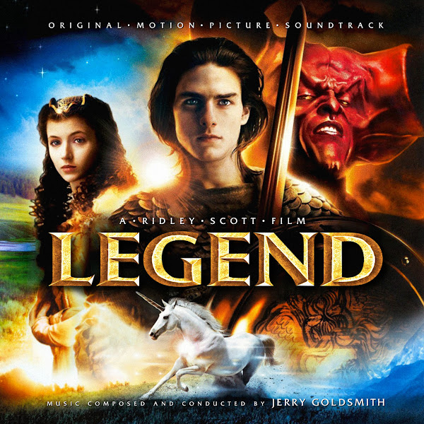
The eight cover uses the painted version of the main theatrical poster. I couldn't really find a modern, hi-rez version of this image, most I could find are physical scans of the original one-sheet, with folds and all. So I was forced to composite together several versions, and then run it through an enhancer, but I'm still not totally satisfied with the quality of the art itself. This art was used on the Silva re-release as well as the new expansion album--and I wanted to create something between the two, keeping the width, but the original color tones.
Finally, Cover 9 adapts a digital illustration by artist Vance Kelly. A portion of this art was actually used for a 2015 vinyl release of the score, though they only used the top part of the image, and I didn't like their font choice. I love the architectural structure of the full piece, but I also knew if I left it unedited, it would force it to be shrunk down to an uncomfortable size. In the end, I created a compromise, trying to keep as much of the overall image as possible, but still compressing the bottom third, so make space for text and not have it all be microscopic. I cut down the edge filigree and columns, and ended up shrinking Jack and the unicorn quite a bit and moving up the yellow sun. I then had to repaint the unicorn's legs (as I could only find an image with the title superimposed), and then had to find plant silhouettes to re-create that soft cut-out to crop the bottom. This took several days of experimentation and hard work to really figure out the new spacing and then make it all blend together smoothly, but I'm pretty happy with the final product.
I hope you enjoy the covers above, some of them were definitely quite a challenge to work on, but fortunately the artwork itself was always a visual treat, so it kept me going. Let me know your favorite picks from among the bunch.
No comments
Post a Comment