
Directed by indie darling Chloé Zhao, 2021's "Eternals" takes the MCU's Phase 4 in bold new cosmic directions. The film introduces us to ten Eternals, supernatural created by the Celestial Arishem and tasked with fostering Earth's development and defending it from the Deviants. The film was panned critically, though fared well enough with audiences--it features lovely interplay between the wonderfully diverse cast and some jaw-dropping cosmic imagery, but the script also fails to flesh out the world and villains and has a time-jumping edit that is hard to follow. Joining Zhao for the adventure was composer Ramin Djawadi, thirteen years after being the MCU's premiere composer with 2008's "Iron Man", and he has come a long way since then. The score features a prominent hero theme for our group of Eternals, as well as a theme for the Celestials, the hero's connection to Earth and a Deviant motif. Interestingly, Djawadi chose to leave many of the key action cues off of the album, instead focusing primarily on the more ethereal and contemplative orchestral tones, and the mix of electronics, organ and choir to highlight the supernatural scope of the story.


Personally, I was a quite torn on the film, really respecting some of the philosophical questions it raises in its big twist, and the questioning blind religious faith--while other parts of the story left me quite cold, even with the long running time, certain characters and themes were just not given enough time to be properly developed, given the epic nature of the story, over a dozen new characters, and a timeline that spans centuries. Either way, there were some truly stunning sequences, and it raised some bold topics not often addressed in modern blockbusters. The official soundtrack is a solid release, really highlighting a different sound than the typical Marvel flick, though I would love to hear an expansion that features more action variants of the main theme. The official album cover features fairly dull artwork, with little thought to matching the fonts or style of the film... so I created thirteen new covers of my own that hopefully do the film and music a bit more justice.
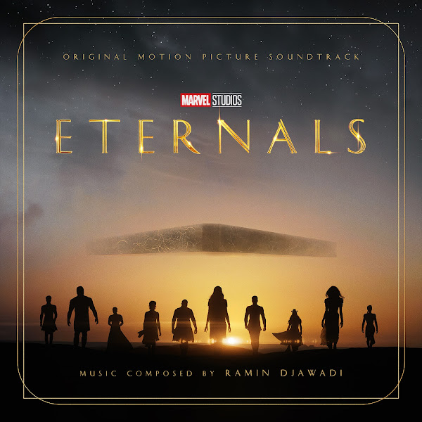
Cover 1 adapts a poster for the Dolby Digital release of the film. I removed the extraneous text from the central poster, then composited that on top of a wider wallpaper version. I also choose to eliminate the round glyph at the top of the triangle shape, to better make space for the text. I used a few different fonts for the variety of covers, this one using the same font as the title logo itself.
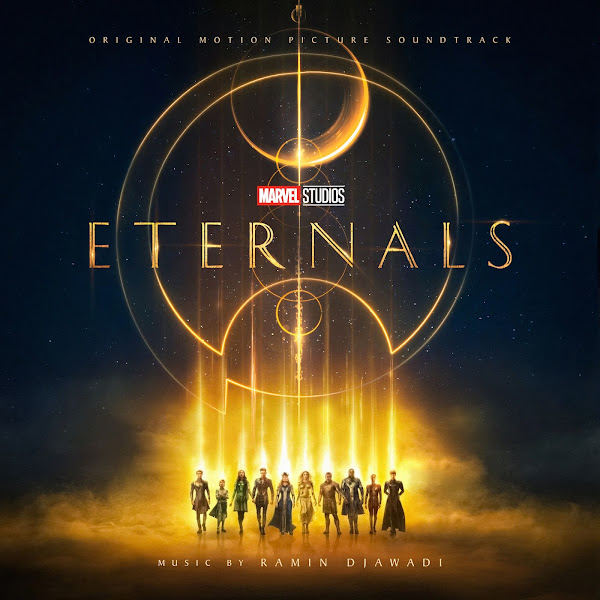
The second cover features our main heroes posed against a dramatic sky. The art required little editing, other than that I chose to bring the star-filled sky lower down in the image, which I found a bit more dramatic than just a pure yellow sky. I couldn't find a totally hi-rez version of the logo, so I often had to resort to compositing multiple layers, to keep both the text detail and also maintain the light flares.
Cover 3 uses the art from the 4DX release poster, this version I found had the characters on a dark blue star field, which I found more dynamic than being over solid black. This required little editing, other than expanding the background horizontally to allow better spacing. Many of these images has complex shapes, often asymmetrical in design, and properly spacing the added text credits to fit comfortably was often a challenge that required much experimentation.
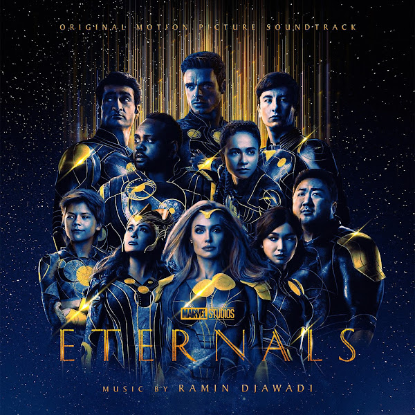
The fourth cover uses another variant of our heroes looking dramatic in front of the sunset, accompanied by their ship, the Domo. Despite being a major new release from one of the world biggest companies, I found a lot of the available poster art wasn't in pristine resolution, so I had to make due with cleaning it up as best I could.
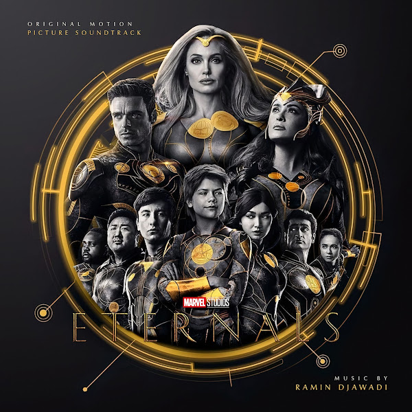
Cover 5 is my variant on the official cover album. My image is a hair wider and more vibrant and colorful, as well as using a more subtle and fitting font. Originally, my plan was to have everything centered much lower in the image, having more range in the sky above them, but this was the only cover I found that accommodated the logo variant over the star field, so I chose to keep all the negative space at the bottom.
The sixth cover uses a more minimal poster art, with the heroes silhouetted against a moody background. I used a more gold-plated variant on the title here, and added my own frame design around the edge to fill all the negative space. My frame is certainly nowhere as complicated as all the geometric shapes on many of the other posters, but hopefully it at least hints at the same design universe.
Cover 7 uses a piece of fan art, created by Agt Design. This artwork (and also Cover 9) was created largely using the individual character portraits from Entertainment Weekly's series of magazine covers. I changed the font here for a slightly more modern look, to match the more technological feel.
The eighth cover here adapts the IMAX release poster. I found a version that had the large IMAX text removed, which saved me a lot of time from having to clean it up myself. Unfortunately all the different posters I found had really terrible resolution of the main characters themselves, but they're small enough that it hopefully doesn't ruin the piece overall. I had to blend those two posters together, and then slide the whole logo and spiral designs quite a bit lower in the image, which fortunately was pretty easy. I experimented with doubling the same part of the image, each layer set to different blend modes to more easily keep the glowing lights without having to manually cut them out. Overall I think it's a pretty strong design, though I hope one day I can update it with better resolution.
Cover 9 uses another piece of fan art, this time by Junior_Neves. I simply had to clone-paint over the bottom to allow for the text credits.
Covers 10-13 all use alternate posters by a group of talented designers, officially commissioned for the film. Cover 10 is by Aracely Muñoz and features a cool 2D art deco geometric style. I simply had to cut out and slide up the Eternals and the bottom frame, and then add text in matching colors.
The eleventh cover features art by Chris Christodoulou, featuring the characters silhouettes from Cover 6, as well as what seems to be a still image from the film, a wide shot of the characters' time in ancient Babylon. I had to compress the image vertically, so again I slid the top of the poster down, using again two layers set to different blend modes, letting the glowing circles stay, while smoothly blending the backgrounds together, and then manually erasing the text at the bottom to make way for my added text.
Cover 12 uses an awesome illustration by Liza Shumska, done in a classic art nouveau design of Arishem looming over his creations. Rather than trying to compress vertically, I simply padded out the image horizontally, and added matching text.
The thirteenth and final cover adapts artwork by Salvador Anguiano, I was very happy to have another piece featuring Arishem. This one was a tricky one to edit, as flatly shaded art like this is, ironically, sometimes much harder to edit together than something more photographic, as you can't simply do smooth blending, but have to manually cut things out in hard lines, which I had to do for all the sky area when I slid the whole top of the image down to compress things. The problem is I then had two overlapping versions of the yellow geometric shapes in the center, so I had to spend hours matting part of them out, and physically painting them out of another layer. In the end, my shape is a little simpler and more compressed than the original one, but hopefully it's not too distracting, and I think the potency of the overall design still comes through, despite my changes.
Hope you enjoy the collection, and let me know your favorite picks below.
Though I haven't seen the movie, it's an impressive collection of covers! I always enjoy learning from your analysis of the film and score, and the description of your own work that produces such fine art! Very engaging.
ReplyDeleteThanks for reading!
DeleteWow! incredible work.
ReplyDeleteThanks for the kind words!
Delete