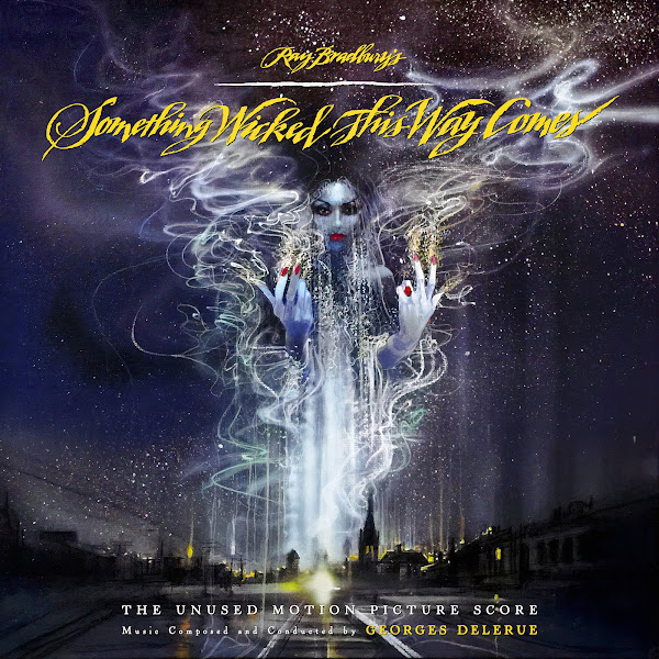
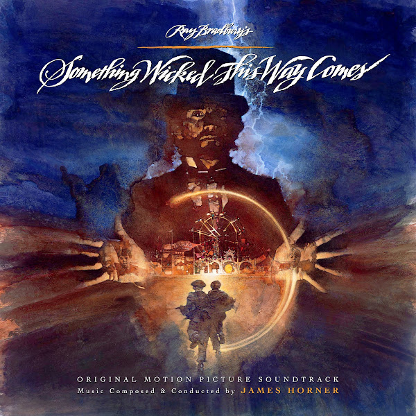
"Something Wicked This Way Comes" had a long road to the screen, following almost twenty years after the initial release of Ray Bradbury's novel. Bradbury himself wrote the screenplay adaptation, and the idea was shopped around for years to different studios and directors, finally landing at Walt Disney Studios, who were pursuing more live-action, and darker, projects. Bradbury teamed with director Jack Clayton, who had been a friend for years, and who had been influential in Bradbury adapting his earlier short story into a full novel to begin with. Unfortunately, the production hit some bumps in the road, with conflicts between Clayton, who wanted a darkly moody tone, and Disney, who wanted to amp up the special-effects and adventure to compete with other blockbusters of the day. In the end, Clayton was side-lined, a new editor brought on to recut the film, and several scenes and effects sequences were altered or re-shot, pushing the release back a year to 1983. For me, the film wasn't entirely successful at balancing its tones, the horrific with the more sentimental coming-of-age and family drama. To me personally, the film didn't capture the magic, heart and dread of the novel, though I'd love to see what Clayton's original cut might have been like.
Included in this change-up was the musical score. Clayton brought on his frequent collaborator, French composer Georges Delerue, who had been slowly transitioning from French cinema into Hollywood productions. Delerue created a score much darker than his usual style, presenting a haunting tapestry, with a haunting theme for the villain, Mr. Dark, whose night-time carnival comes to wreak havoc in the life of two boys living in small-town Illinois. He also presents a sad melody for one of the boys' aging father, whose disconnection from his son, and his own dreams, anchors the core tragedy of the story. Closing out the score is a lyrical, flute-based theme for the boys themselves, with a lush and melodic sense of innocence, ending the piece back in Delerue's comfort zone.
Unfortunately, when the film tested poorly, and massively re-edited, the producers decided to scrap Delerue's effort entirely and go with an up-and-comer, James Horner. Horner was hot off the success of "Star Trek: The Wrath of Khan", and this project offered a chance to expand his symphonic chops, while also incorporating some of the horror stylings from early in his career working with Roger Corman. Ironically, in broad strokes, Horner's score was not too dissimilar to Delerue's approach--both are fully orchestral and melodic, featuring wordless female voices for eerie moments of magic and dread, and plenty of creepy calliope music for the carnival. Horner's score manages to feel a bit more up-beat and his main title has a sense of magic and adventure in the air, where the darkness feels like an enticing ride, rather than a more somber reflection on mortality. His main theme is fantastic, and really nails that fall feeling, and Horner also uses some really creepy string passages for the horror scenes that are quite chilling. He also provides a similar sweet theme for the boys, which gets more play than Delerue's, and has perhaps a more robust sense of Americana goodness.
In the end, both scores are very good, and it's always fascinating to see two artistic minds tackle the same story. For years though, both scores weren't officially released, with bootlegs floating around on the secondary market for years, with Delerue's score in particular only existing in dreadful quality. Fortunately, Intrada Records rectified this all, giving Horner's score an official release in 2009, and finally presenting Delerue's work in superior quality in 2015, after the original recording masters were discovered in Disney's archives, finally bringing new life to this splendid lost work.
Georges Delerue
The theatrical marketing for the film only seemed to produce one poster (used below), so I took the same route as Intrada's release, using teaser artwork for the film by iconic commercial illustrator and poster designer Bob Peak. Peak seemed to have created four original pieces, ironically, I found the second one used by Intrada to be the most dull of all the options, so I present a reworking of Intrada's main cover (#2 here), featuring Mr. Dark on his hellish carousel, followed by two other Peak pieces, another moody tease of Mr. Dark looming over Green Town, and a much more exotic one of the Dust Witch.
Fortunately, I was able to find a fairly hi-rez version of the awesome, presumably custom title font, which I kept for all three posters, though I stretched it slightly to be a bit taller and more relaxed (especially to the Bradbury credit). I could not find any of Peak's pieces in high quality, so I had to use my usual AI enhancer to try to significantly enlarge them, adding some detail and definition to the pictures. For Cover 1, I brought the bottom city-scape up higher in the image, and shrunk Mr. Dark down a bit (and stretched the left side a little to fill in the gap), and had to nudge him closer to center so his the bottom and top of his staff would line back up. Cover 2's art went largely unedited, other than cloning out small imperfections, and tweaking the colors and adding more saturation to try to have the image pop, while still remain dark. Finally, for Cover 3, I again had to slide the bottom city up significantly and then just blend together the sparkling dust trail. The trick here was playing with the colors and contrast levels, etc., and finally deciding on colors for the text, as it is a fairly busy picture and I needed the text to still read clearly enough. I'm still not sure I was 100% successful, but I wanted to try to keep the artwork as intact as possible.
James Horner
For Horner, I give two options, the second of which is a fairly straight-forward edit of the more modern home video artwork. The art was fairly simple, I shrunk the kids down a bit and moved them lower, then just cloned and stretched the sides out to fill in the gap, and blended it down onto the main bottom half. The art itself is fairly dull and a little cheesy, but again, there's virtually no other artwork to choose from for this film.
The main attraction though is the first cover, which adapts the film's central poster (also used on Intrada's album), painted by David Grove. This painting is just fabulous, and really captures the magic of the novel in a way that the actual film doesn't quite do justice to. I downloaded every version of this poster I could find, trying to find the best quality, though I the end I had to still artificially enhance it. There was also a wide variety of values and color tones between the multiple versions, so I had to play around with color balance and shading quite a bit to find something that seemed more dynamic. The biggest challenge, as per usual, was in trying to keep as much of the art as possible, which necessitated expanding both side borders significantly. You can see the Intrada album basically just takes each side and force-stretches them out... which from a distance might look passable, but viewed with any scrutiny looks extremely cheap. To try to expand the side spacing properly took a fair bit more time. Basically I had to break each side into about four chunks each, that I could then resize, warp and stretch as needed (still keeping a proper angle coming out of the fingers), and then clone to fill in any gaps and then blend all those pieces together and then back onto the central core, so it all still hopefully appears as if it were fully hand-painted this way, and hopefully not too in-artfully forced or contorted. Is it perfect? No. Do I see small flaws and cloning glitches in it here and there? Yuuup. But overall I'm fairly happy with how I managed to wrangle this piece of art to meet my needs.
Hope you all enjoy, let me know your favorite selections, and your thoughts on the different scoring approaches between the two composers. Have a favorite of the two albums?


Delerue #1 is my favorite. So you're telling me the same guy illustrated posters for My Fair Lady, Wrath of Kahn, AND Apocalypse Now? What a legend.
ReplyDelete