Directed by Jaume Collet-Serra, 2021's "Jungle Cruise" has proved a moderate success, despite a pandemic-led releasing in theaters as well as streaming on Disney's streaming service. Using the eponymous Disneyland boat ride as a loose starting point, the film tells the story of a British botanist who, together with her brother and a riverboat tour-guide, must search the Amazon jungle for an elusive MacGuffin that promises to bring magical healing properties. Taking equal inspiration from "The Mummy", "Indiana Jones", and the studio's own "Pirates" franchise, the film becomes a bit of a bloated, CGI mess, but is nonetheless a mostly old-fashioned adventure led by an endearing cast. Joining the project is composer James Newton Howard, who after an early successful run on three animated Disney films in the early 2000's, has once again become a reliable staple for the studio. Howard delivers a rousing score, filled with a plethora of adventurous themes for our heroes, mythic awe and villainous pomp, taking some inspiration from John Williams, but filled with Howard's own signature voice and charming adventure style. Bizarelly, the studio also chose to incorporate Metallica's song "Nothing Else Matters" into two pivotal scenes of the film--JNH expertly blends their own metal guitars and the gorgeous melody with his larger orchestral and choral palette to create a totally kick-ass rendition of the song--but the choice to include such a famous tune when it is neither sonically nor thematically connected to the film, is utterly baffling, and for this listener, very distracting in context.
I've only rarely tackled covers for a new theatrical release, but this one had a fairly lackluster treatment, and I felt the music deserved a little more love. As with most of Disney's new soundtracks, it premiered only to streaming (maybe one of their usual collaborators will put out a disc down the road), but the studio's last few project seem content to expend next to no effort (maybe because they plan a proper album release later on?) on the design, with a 'cover' that is little more than blank poster art, without so much as an artist or even soundtrack credit. At some point, an alternate of this cover surfaced, finally with some text in place (seemingly a fan edit), but either way, it felt unpolished. Fortunately, there was plenty of gorgeous poster art to play around with, as one would expect from one of the world's biggest studios. I ended up creating a total of five new covers to choose from, choosing my favorite of the posters (there were plenty more, including a ton of individual character sheets, but I went with the ones that were best representative and would be easiest to adapt for a cover).
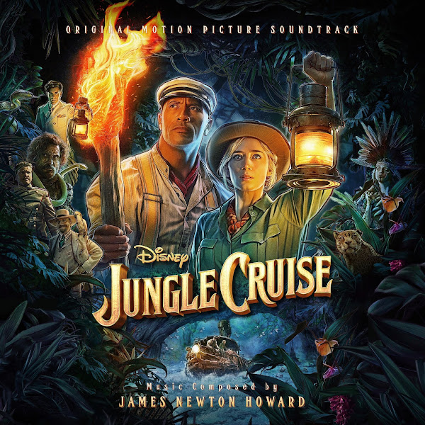
Cover 1 uses the film's primary poster. I don't know the specific artist, but it's clearly inspired by the mixed-medium hand-painted look of Drew Struzan. I found that a few of these posters were clearly quite segmented in their construction, as different versions of the poster/wallpaper would have the smaller side characters added on in different places and configurations, depending on the particular image specifications. Rather than individually cut out all the characters, I first just stacked several of these alternate poster arrangements together, and then was able to blend and matte in or out the parts of the image where I wanted them to keep a wider frame. I added extra plants from the wider wallpaper margin to the bottom corners (since using a wallpaper on the top created a blank gap to fill in). I found a font that was close, but sadly not matching the actual title font (which as far as I can tell, must be an original creation for the film). I choose the lighter logo treatment here, even though I generally prefer the darker orange main variant, as it popped nicely here against the dark background and made all the text cohere.
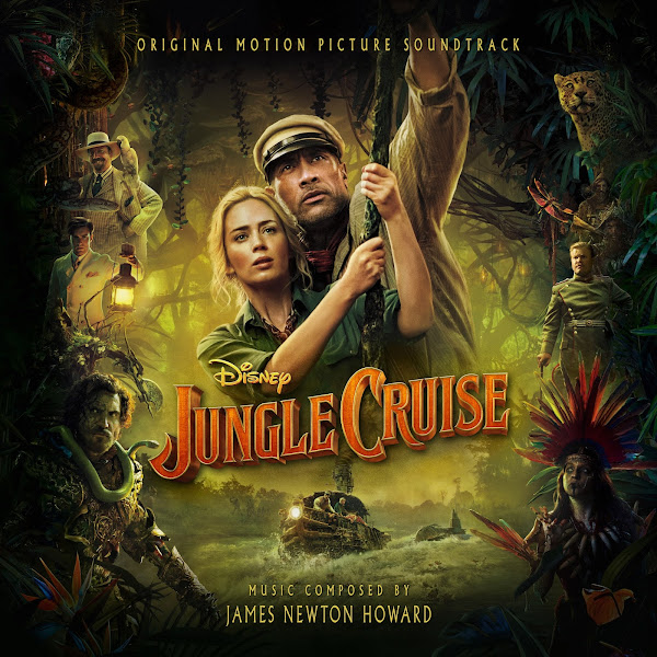
The second cover uses the second main poster art (that was used for the existing cover). I started with that piece of hirez 'cover art', but knew I wanted to make some alterations. Firstly, the cropping seemed uncomfortable, with all the side characters bumping into the sides, so I first had to again, combine a number of different poster versions, to get the best quality, and I then additionally cut out several of the individual characters from different sources to boost their quality, including adding Proxima the jaguar and the magical arrowhead back into the top corners. I used wider versions to include more comfortable spacing on all sides. I then however found that this wider canvas only exacerbated the fact that Johnson and Blunt were far left of center in the frame, so I then had to scooch the whole right side of the image over to make them central again (fortunately nothing much was lost in doing so, other than some jungle background). For the font, I modeled mine after the text used on the poster itself. Finally, I did a quick pass at color-correcting the image, as the poster (like the first several sequences of the film) has an atrocious yellow grading (I didn't push mine too far, but tried to cool it off a bit to restore some human skin-tones). In the end, this took way more work than it probably appears to have, I ended up with dozens of layers, but I think the end effect is an improvement over the original, both for the art and the text treatment.
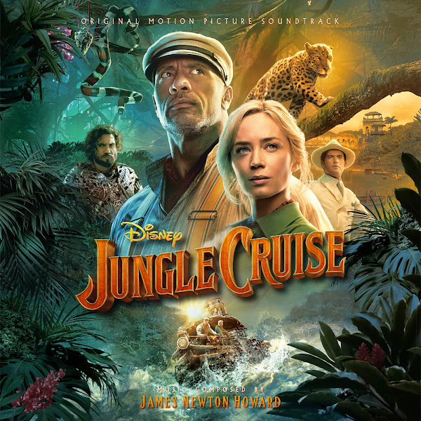
Cover 3 uses an international poster, more of a typical Photoshop job, I like the colors, even the image definitely becomes over-polished. Although there's quite a bit of negative space on the sides of the image, the original poster still very much uses it's vertical space, so to keep the bottom action of the image (the boat going through the rapids) and make space for the title above it, I had to shrink this part of the image down to fit into the available space, which proved to be a bit of a challenge to edit in, given how complicated the foliage and details are around it that had to be carefully matted out and blended back in. Maybe I should have gone even smaller? The headroom is still just a bit tight for my liking, but functional.
The fourth cover uses a more scenic teaser poster, no floating heads or collages, just a nice landscape featuring our heroes in their riverboat. The image itself didn't require too much work here, other than sliding the bottom part of the poster up (above the waterfall cutoff) to tighten the composition a bit. Also applied a tad of color balancing, as again, the poster was flooded with too much greenish/yellow for my taste.
Finally, Cover 5 adapts the poster for the Dolby Cinema advertisement. This one again for goes a Struzan-esque hand-painted style, though as always, all the digital detail that goes into recreating that painted effect makes for a greater challenge when I have to go in and manually clone and alter part of the image. First step was creating my frame, bringing the bottom frame up where it needed to be, and widening out the white canvas sides a little to give an even frame. I then shrunk the spear/skulls section in the lower corners down a bit to block less of the image, though this required lots of careful matting around all of that detail, and making sure that the background was painted in behind it so there was no overlap. I slip the title up a little, and then had to painstakingly clone and paint out all the existing text (as there was no textless version I could find of the poster). The big issue then was how to handle the gap at the bottom of the image, between the logo and the frame edge. I ended up having to a whole bunch of parts of the image that were in the bottom half of the poster and sliding them up into their new location, and then it was a ton of work to try to make all of these new patches seamlessly blend into each-other, which was especially tricky when you're dealing with triadic colors in the orange and green hues. Finally, I got to test out a simple skill, but one that I rarely have need to use, by having the text credits follow a curved path (and then manually changing the incline on each letter to keep them vertically balanced). In the end, this was another piece of art that was made needlessly difficult by the limitations of text in the original source, but I always liked the comic-book style of the art itself and figured it was worth muscling through the process, and I'm pretty happy with the final result.
Hope you enjoy my work on these covers. Some were definitely more challenging than I expected, but it can be cathartic to keep pushing through a series of obstacles until you know that you've reached the best version of the art that you could achieve. Let me know your favorite picks from the above.


Thank you!!
ReplyDelete