
Released in 1999, Tim Burton's "Sleepy Hollow" was a modest success and has since gone on to become a bit of a cult classic for Halloween horror. Loosely adapted from Washington Irving's classic short story, Andrew Kevin Walker's script escalates things to rather ludicrous mythical spectacle--but thanks to Burton's style, aided by Rich Heinrichs' production design and stunning cinematography by Emmanuel Lubezki, this is classic gothic fiction at its most epic. Along for the ride was Burton's long-time collaborator, composer Danny Elfman, who unleashes a score of truly colossal mayhem, anchored by a vicious main theme and his usual sense of haunting lyricism.
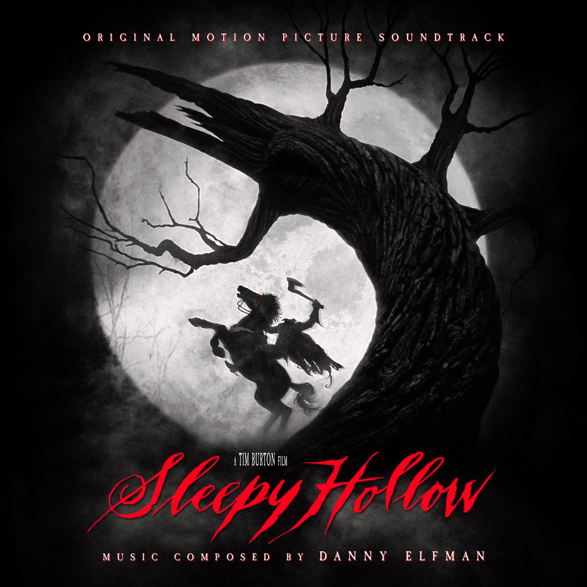


As someone who grew up in a pretty conservative home, never watching horror flicks as a kid, I remember being both scared and yet utterly entranced by the film's main poster (used for Cover #3). The promise of those characters, those haunting looks in their eyes, and the threat of seeing the Headless Horseman (far from his Disney cartoon incarnation) come to life grew in my imagination for years. Needless to say, by the time I actually got around to seeing the film years later, I found it rather disappointing, despite loving the fantastic visual style. The score itself has had a bit of a life, released by Hollywood Records at time of release, in a generous 68 minute album, then receiving a few bonus cues as part of the massive WB Elfman/Burton 25th Anniversary Music Box collection, and finally, receiving a massive, 4-disc expansion released just weeks ago (2021) by Intrada Records. Both central releases use the same poster artwork, though the Intrada version provides a second option using the moon silhouette. The original cover is a little dated, as as per usual, I strongly dislike Intrada's use of added text, so I wanted to provide my own tweaks on the art, as well as proving four other covers, using art from various sources, to provide a total of six alternates to choose from.
Cover 1 uses the film's secondary/teaser poster, a classic silhouette shot of the Headless Hessian next to the iconic Tree of Death. Mine isn't terribly different than Intrada's alternate cover, except replacing the text and font choice for something a bit more subtle and fitting.
The second cover uses a privately-commissioned digital poster commissioned by gothic illustrator Fabio Listrani. I sadly couldn't find the art in great quality, so I had to expand and try to enhance, but it still came out softer than I'd like. The other trick, as it had the full credits text embedded, was that I had to fully paint out all this text, which is especially hard over a busy, painted background. I also had to isolate the white art nouveau-esque frame to be able to re-fit it to my new square crop (and then paint out that same from where it was still showing up behind my new frame). Though some parts of the image are lost, I hope this edit still manages to honor the original art.
Cover 3 uses the film's central poster, featuring Depp and Ricci. I used a textless poster, though I overlayed a few different poster versions to try to get the best amount of detail and color. I like the very muted palette of the film reflected here, with the splashes of deep red. This one wasn't terribly complicated, other than trying to space out the text and figuring how tightly to crop the image or zoom out to give space (both official covers crop quite tightly), but without ending up with too much dead space.
The fourth cover uses a piece of digital fan art by illustrator Jack Flamel that showcases Depp's iconic glasses, but in a cool, Halloween-ey comic book style. Editing the image was fairly simple, enlarge, enhance, apply noise, move up the bottom canvas edge to crop the image tighter, move the artist's signature to a new location, apply text.
Cover 5 uses another piece of digital art, this time by artist Mainger Germain. Given all the texture in the trees and background, this was going to be near impossible to compress the image, so it is one of my rare ones where the only solution is simply to add negative space edges to the side, which fortunately in this case works easily, as the background was already a solid color and fully matted out. I changed the light/dark levels a bit to crank the darks into black. Aside from adding the large title, I had to keep the other text to a minimum to fit it in. Overall, I like the style of the art, even if in the end, the cover came out looking like some sort of gothic metal album.
The sixth and final cover uses a commissioned digital poster by Juan Esteban Rodríguez. I didn't do too much editing on this one, other than trying to enlarge and enhance the image a bit for sharpness. I chose not to try to widen out the image, as expanding the left part of the image would have been a bit tricky. I also kept the text to the most minimal possible, as it felt too intrusive elsewhere.
I hope you enjoy having some alternates, a few just simple improvements on existing covers, and some that are totally different. I also toyed with the idea of having some additional covers using stills from the film, but they were mostly too low in quality to make it worth the investment. Though these covers certainly aren't re-inventing the wheel, or maybe quite as essential as some of my other sets, I still enjoyed working on the art, and I hope you'll enjoy having some possible improvements to choose from. I'd love to hear your favorite picks from among them in the comment section below.
No comments
Post a Comment