
Following up their massive success with the original film, the Wachowskis returned with "The Matrix Reloaded" in spring of 2003. The highly anticipated sequel proved to be controversial--it's no easy task to follow up a smash hit modern masterpiece. Trying to up the ante visually, pushing some wild new CG technology and stunts while also deepening the philosophical discussions of fate and choice as we learn even more about how the Matrix itself is run. Returning was composer Don Davis, who this time pushed the score into both broader and more melodically accessible moments for orchestra, while also more heavily incorporating electronic experimentation directly into the score. Collaborating closely with English electronica group Juno Reactor on a number of pivotal action cues--this score remains for many one of the absolute high watermarks for orchestral/electronic hybrid scores, and was an absolutely monumental release for film score fans of a certain generation.


I remember being torn watching this film upon first viewing, but I think time has served this sequel well, showcasing just what an ambitious follow-up it was, not only technologically, but in its courage in challenging the mythology of "the One" that was previously established. For me the film holds up extremely well (Gumby-Neo aside), and is tremendously enjoyable. The soundtrack also remains a personal favorite, an utterly unique and unforgettable experience, with a genius composer working at the very top of their game pushing the art form forward. The situation on album was a little more complicated. At the time of release, Warner Sunset released a 2-disc album, with the first disc containing songs featured in or inspired by the film, while the second disc treated us to a long suite of Davis's score as a few other additional cues, totaling about 40 minutes. Although complete bootlegs would surface of the score, it was not until 2013 that La-La Land Records finally published over two hours of the expanded score. The major action set-pieces of the film are musically jaw-dropping and electrically charged, but the score also allows for much more tonal development, with the new theme for the Nebuchadnezzar crew, Neo's expanded messiah theme, and evolving Neo and Trinity's love theme to glorious new heights. I knew that tackling this covers set would be a real challenge, as neither official cover came close to capturing the dynamism of the project. In the end, this became one of the biggest projects yet, and I'm thrilled to present a total of fifteen new covers to choose from--some using official posters, others later box art, some fan art and even film stills. Another challenge was also trying to provide options that would match up as a trilogy set, which only adds more difficulty, as are forced to adapt to sizes and shapes to try to keep a previous style. In the end, I once again kept the soundtrack title credit consistent to allow the best mix-and-match potential for those wanting to adapt covers for their trilogy collection.
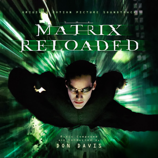
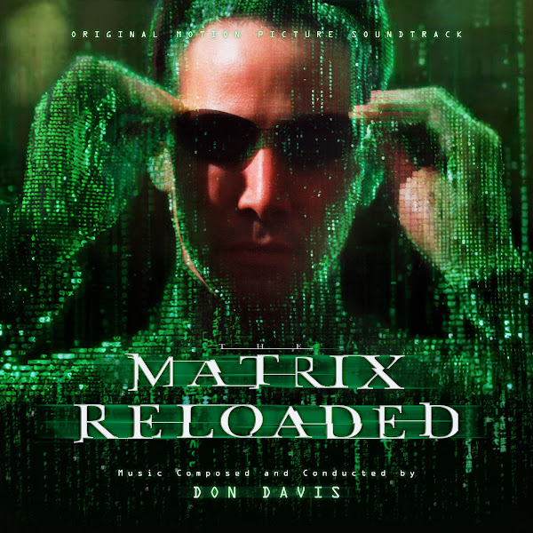
Cover 1 was one of my hardest covers in this set, and thus, the last one I ended up working on. This is a custom composite image that technically doesn't seem to reside anywhere else online, so I'm quite proud of it. Basically, this is an adaptation of an existing poster (seem in Cover 9), which had Neo and Trinity over the glowing code--this is essentially the central theatrical poster for the film, however there were also variants of this same image over a white background of the three leads, including Morpheus--so my goal was to try to smoothly incorporate him into the existing poster so that it would appear to have all been one image originally. The problem is I had to construct the entire left third of the image to make this happen. The image of Morpheus didn't include his shoulders (which I had to grab from another entirely different publicity photo), and it also cut off the top of his forehead, so I had to adapt and heavily edit that (sourced from a separate poster) to smoothly complete his head. I then had to use the bottom clean green code to fill in the background on the left, and then edit it to match the color and lighting and style and blending that went around the other two characters (as well as fill out the left edge of Neo's head). This all took days of work and keeping track of dozens of layers and filters. Once I blended the picture to my passable satisfaction, the challenge was then how to compose and crop the image. Naturally it went much wider to include the full faces, which looked great, except when cropped into a square, it produced was too much dead space, and I couldn't move the characters down in the image, as that was where they were cut--hence why I chose to crop into their faces a bit. For some reason I preferred a simple black bottom of the image here, it seemed more elegant, and the additional code at the bottom I found threw off the weight of the image.
The second cover adapts artwork of Neo in Superman mode, which was actually used for the 2005 spin-off video game "The Path of Neo", but I thought this was a fitting image to pair with this film score. I first had to comp together a two different versions I found of the cover to get the fullest image, clone over the top and bottom of the image to paint out all the existing text, tweak a few colors and then apply my new text.
Cover 3 uses another key piece of marketing art (used on many home video covers). I couldn't find this in adequate resolution, so I had to again comp together the image from a few sources to try to extract the best quality. The composition took some time to find, as the tall vertical shape left too much dead space on the sides, so I ended up cheating the image a bit by actually lowering and slightly flattening the top arch to closely frame the top of the character's heads. The original version has a bit more of a flatter green filter, but I tweaked the colors to bring out more three-dimensional tones and warmth.
The fourth cover takes the artwork from one of the Blu-ray trilogy steelbook (to match the cat one from the first film). The problem is I could find absolutely no hi-rez versions or scans of this image, only customer shots of the cover back from years ago or the official advertising image that was super tiny. So I had to do some serious AI upscaling, and apply a million filters to try to make the image pop, but in the end, it's still ridiculously crude if you look up close, though I just liked the overall image enough, I hope some might find it passable. If there were ever proper good scans of these covers, I would gladly toss out all this hard work to have a cleaner image.
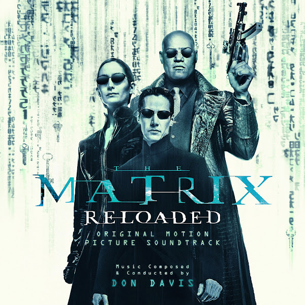
Cover 5 continues a set of newer artwork created for recent home video and digital editions. The biggest issue here was the composition, and balancing all the text (especially since I had to match the placement and style of the text as closely as possible to the matching cover from the first score). In the end, I shrunk the three characters down a bit in comparison to the background and then had to paint back in around those new edges with a textless version of the background code that I found. Was I approaching this cover on its own terms, I might have made different decisions, but again, I was trying my best to remain consistent with my previous cover.
The sixth cover again uses another more recent box art (from the 4K UHD set). This began with again compositing a few versions together, matching colors and tones, and then having to manually edit out all the title and text, as well as replace a huge chunk on the bottom left corner where all the digital versions obnoxiously kept a giant sticker that blocked the image. The problem was that the image is very highly textured, so when I'm using other parts of the image to patch and clone over, you have to be careful not just to match color and value, but also to perfectly match into the existing horizontal stripe patterns. Again, I tried to match as closely as possible to the previous matching rabbit cover, though the title here made more sense in the top, rather than lower third.
Cover 7 uses a promo character poster of the Agent Smith clones. I normally don't include solo posters of characters beside the central protagonists, but this one seemed a good exception. The full picture repeats the characters far off into the distance, but I couldn't really keep this same effect in cropped form without manually cropping out a hundreds of individual heads and having a more compressed receding of the field of view (as if the clones were spaced further apart), but in the end that seemed like way too much work, so I kept it simple and just added a slight wide fade at the top.
The eight cover uses a set photo of one of the earliest scenes in the film (that was then recreated in a more stylized way for the artwork in Cover 3). This image was used for the La-La Land expansion album, but I didn't like their text choices or the large red WB banner, so I basically just did a cleaner replacement of the similar idea.
Cover 9 is a pretty straight edit of the official poster (as discussed above). I just darkened the bottom at the bottom, so the added text would pop a bit better and changed the green in the title better match the teal hues.
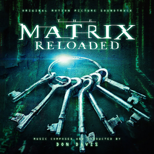
The tenth cover was also a tremendous challenge, and is also a bit of an 'original' edit. The basis of the artwork is actually an incredible lenticular motion poster for the film, that shifts the image depending on the angle from which it's seen. The image shows Neo's pose, but shifting from a colored photograph into the fully digital code recreation over black. So first I had to scour the internet for the best photographs of the actual poster installation I could find, and then digitally enhancing these as best I could. The problem was many of these were captured from odd angles (to best highlight the shifting nature of the image), so I had to morph all these images to get them to match up size and orientation until I ended up with multiple different version of Neo's transformation stacked on top of each other relatively smoothly. Once that was all (painfully) accomplished, I then had to choose how and where to blend all these layers into each other, to depending of which parts of the image had the sharpest image or and the widest range of physical transformation throughout across the image. Again, this would have been a challenge even in ideal circumstances (with clean, hi-rez modern scans of the poster), but I battled for days to force this into something workable, and in the end I'm quite proud of the end result. Created something like this from so many different pieces in so many different conditions really feels like sculpting clay, chipping and molding and pasting back, no matter how ugly the insides might be, until you've somehow managed to create a final 2D image that feels as if it was just a pre-existing piece of artwork.
Cover 11 uses a still from the film itself, as Neo sees Seraph through the eyes of the Matrix. Again, the film is old, so my base image was quite small, but I used the AI enhancer to get it to passable size (which was easier to stretch here due to the sparser and more stylized quality of the image, not a lot of photographic details to mess up, like a human face). I simply had to clone out some additional parts of the code to cover the bottom half and tweak the colors, but I like the more stark and minimal nature of the image, and the yellow/orange glow is a nice change of pace from all the other green covers.
The twelfth cover uses a night cityscape from the back of the "Reloaded" box sleeve from one of the trilogy box sets. The only version I could find was again small and at a warped angle, so I first straightened and then majorly enhanced the image into passable quality, and then edited the bottom of the image to slide the code further up and hide the merged seam behind the title.
Cover 13 adapts a piece of fan artwork that I found online by username 'akirathefighter24' created for the 20th anniversary of the original film. My friend SonicAdventure had used this artwork for one of his covers for a custom version of the first Matrix score he did a few years back, but I thought this art would be more fitting for "Reloaded", as that's where the scene of Neo flying is from. You can read the artists blog post to see his inspiration and steps in creating the original version. I then made a few additional tweaks of my own, and cropped things to fit my text and title.
The fourteenth cover uses another still from the film, from a quiet moment early in the film after Neo's arrival in Zion, when he's discussing his fate with one of the city elders. I like the more textural nature of the image, and the different color palette. The red and blue tones of the 'real world' are sadly not featured in almost any of the publicity imagery for the films, though to me they're equally iconic, if not actually much more rich and satisfying than the greener tones from inside the Matrix--the balance between the cold, dying machine world and the glowing organic warmth at the heart of these stories is part of what I love most about these films. The original again was fairly small, but fortunately the enhancing algorithm here worked beautifully to really sharpen and salvage a ton of detail. I colored the title logo to match the cooler tones, rather than sticking with the neon green.
At long last, Cover 15 uses a second piece of fan art, this time an original digital painting by Didier Konings, that beautifully captures the stunning opening scene of the film. I first choose to flip the image on its side, which not only fits better with the horizontal text layout, but also adds a slightly more surreal nature to the bullet-time falling action. Besides tweaking black levels and adding the text, the only major editing I had to do was to compress the image width-wise by sliding the right half of the image closer to the middle (so the two characters would be closer to center), and then blending that new edit smoothly together, so the buildings and reflections and glass shards would still all match up.
In the end, this project ballooned into a much bigger set than I'd originally anticipated (and that's after I discarded two additional covers that I'd mostly finished, but just weren't quite up to scratch to really add value to the collection). These were a joy to work on, despite two of them being some of the hardest covers I've ever worked on. I hope the covers do the film and the music justice, and that fans will enjoy them. Let me know in the comments which are your favorites among the options.
You've done it again. Congratulations on another fantastic set. It's exciting to see your skills continually improve, as they will when you keep taking technically-challenging and time-consuming projects.
ReplyDeleteI don't have much to add to these: I like #3 as a stand-alone and #5 would look great as part of the set you're going for. The colours for #14 really stand out, as you say; and I can appreciate the huge effort put into #1, I'm shocked an official version of that image doesn't exist.
Much anticipating 'Revolutions' at a future point. Keep on truckin'!
Many thanks, so glad you liked them! Yeah, Cover 14 reminded me how crucial that color palette is to the film, and inspired me to pursue that tone in other covers for the series (I'm actually planning to go back to add one or two covers now to the first film that will match with this).
DeleteI'm kinda dreading the Revolutions covers, as there's really not that many official posters, considering the size of the film--but I'm sure I'll find some surprises, as I did here.
Awesome set. I'll be grabbing some of it for my own player particularly covers 1, 2, 3, 5 and 15. Oh and btw, you just save me a work on covering this title mate. Good work!!
ReplyDeleteBugz
Thanks for the kind words, Bugz. And excellent picks.
DeleteI believe the fan art you found for Cover 13 is based off of the cover to Daniel Pemberton's score to Spider-Man: Into The Spider-Verse.
ReplyDeleteIndeed it is! Not my original art, but in the artist's blog he describes trying to recreate that "leap of faith" moment. I added just a few small tweaks of my own.
Delete