
Director and co-writer Matt Reeves is the latest to tackle a new reinterpretation of DC's beloved character. The film skips much-retold origin story, and essentially gives us a "year two" tale of young Batman who is still finding his place in the world, and a Bruce Wayne who is haunted by the trauma of his family's legacy. Inspired heavily by Coppola's "Godfather" series, and Fincher's serial killer flicks, the new film immediately conjures a dark and seedy Gotham noir that delivers "the world's greatest detective" in a way rarely seen before. Despite the three-hour runtime, I found the film absolutely absorbing, a stunning visual achievement, with a somber but rewarding character arc that pays tribute to many of the character's best comic storylines.
Joining the caped crusade is composer Michael Giacchino. Giacchino got his start in video game scoring (with early successes like "Medal of Honor" earning him the title of 'the next John Williams'), then television (with mega-hits like "Alias" and "Lost"), before moving onto becoming one of Hollywood's A-list feature composers. Giacchino reunites with Reeves (having scored all his previous feature films), creating a score that is psychological and often unrelentingly bleak, but a brilliant accompaniment to the film. Providing a pounding, hypnotic motif for The Bat himself, a softer theme for Bruce, a slinky string melody for Selina Kyle and a twisted variant on Schubert's 'Ave Maria' for the deranged Riddler. A far cry from Giacchino's more whimsical Pixar sound, or his established sound of orchestral heroism present in the MCU and Abrams' collaborations, this is a new sound that clearly is darker and more modern in tone, but tips the hat to previous composers in the franchise, and it is clear that Giacchino poured his heart and soul into the music.


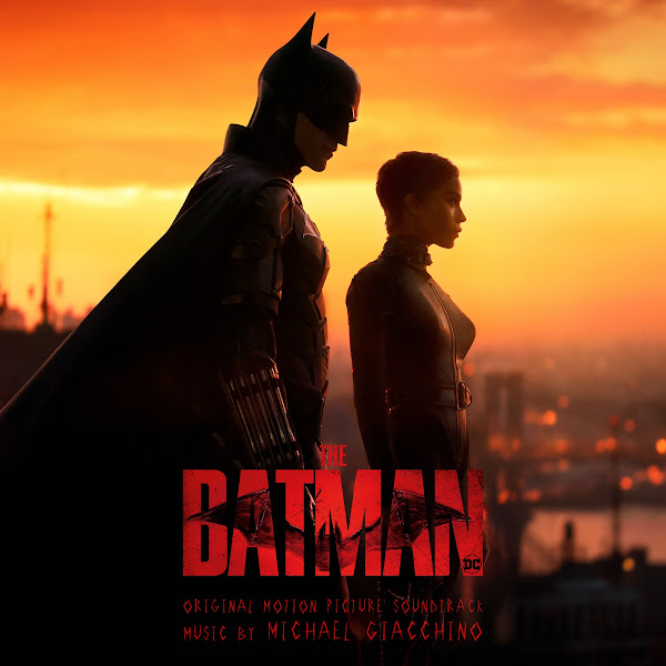


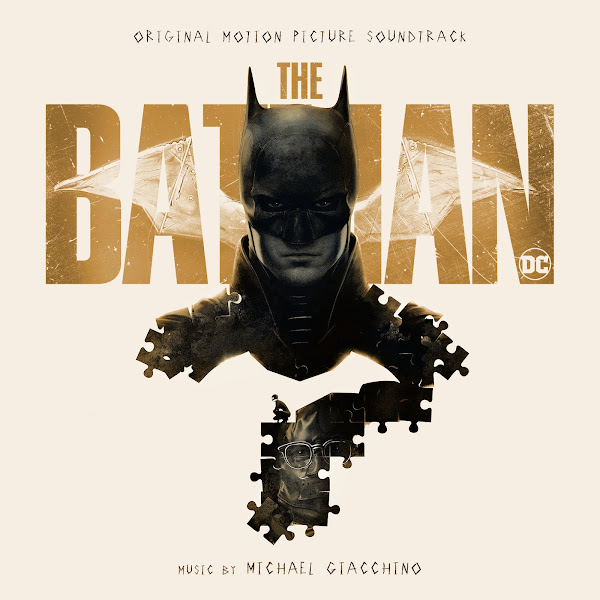
WaterTower Music released the official score album, in a hefty 2-hour release. I'm really not a fan of the piece of artwork they picked for it. First of all, it's among the most minimalist of all the available posters, and my personal preference always goes to art that best displays the film's strengths as a whole. Secondly, just the way that the light bounces off this Batman's cowl in particular makes him look a bit cross-eyed to me, as if we were looking at the eye that belongs on the other side of his face. Maybe it's just me. They publishers smartly also released individual character suites for Bats, Catwoman and the Riddler weeks before the film's release, a smart PR move, as well as prominently featuring Giacchino's main motif in the trailers. Overall, this artwork was just too good to pass up, and I started this project about a week before the film's release, and I'm happy to get a full covers set out so quickly after its debut. So here's fifteen new front covers to choose from.
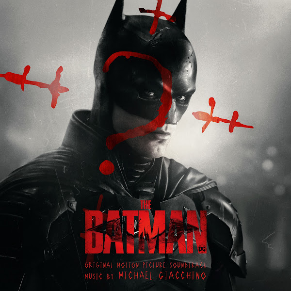
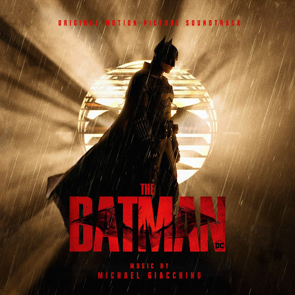
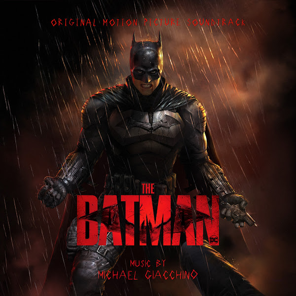
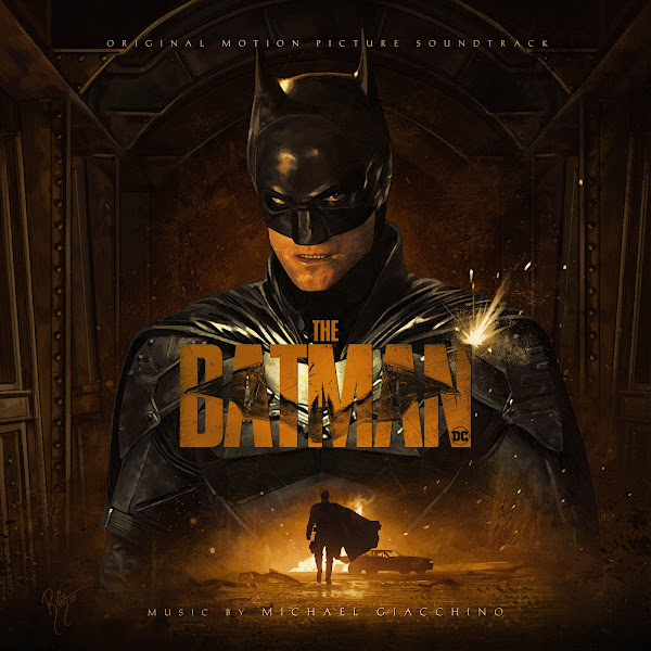
Since I have so many in total, I won't go into detailed descriptions on each single one, but keep it brief for once. Most of the artwork is fairly straight-forward, the first twelve are all sourced from the official marketing images, character teasers, international posters, etc. The final three are from acclaimed comic-book artists: from two of my very favorites in the biz--Jim Lee and Lee Bermejo, and the third from someone I was unfamiliar with, Dan Mora.
One of my biggest challenges was figuring out how to handle the text credits. The official posters and albums feature an original font, that matches the Riddler's hand-writing. I searched online for similar fonts, and I found one or two options that vaguely resembled it, but in the end they didn't look quite right, they looked a bit too cartoony, or like children's scribbles, rather than something more edgy. So I ended up just taking the actual text off of the official album cover, doing several filters and painting and masking to try to best isolate the text cleanly, and then be able to recolor and alter it to my needs. The problem is this really limited me in terms of how much I could edit it, since I was dealing with an actual static image, how an actual live font. But overall I think it still works pretty well. For two or three others, I used a blockier font that matches more closely to the title treatment.
Most of the artwork was just the usual jobs: painting/cloning to remove text/credits (when I couldn't find textless versions), matting out the main title logo to use as desired, minor color filters, etc. The ones that required more prominent editing were Cover 1 (where I had to compress the image significantly vertically, which required separating most of the characters, and then repainting over the background to be able to blend things out, and then removing the Riddler red question mark entirely), and Cover 8 (where I mostly just had to shift around a few characters to fit them into my crop).
Hope you enjoy, and let me know your favorites below.
You are my savior. The official cover is kind of awful IMO and I would hate for my beautiful new suite to not look as pretty as it does with your covers!
ReplyDeleteMany thanks, so glad you liked them! I guess when it comes to bad covers you could say... "I'm vengeance."
ReplyDelete