
Released in 1999, "The Matrix" was a big success, both critically and commercially--and quickly went on to be a ubiquitous part of the modern pop culture lexicon. Written and directed by the Wachoswkis, the film drew heavily from cyberpunk and anime, and offered ground-breaking VFX, stunning action and stunts, and a challenging and philosophical script whose story offered a transcendent experience for many a millennial viewer. Joining the adventure was American composer Don Davis, who had worked with the Wachowski's on their previous film, "Bound". Davis, who also had a fruitful career as an orchestrator for people such as James Horner, Randy Newman and Alan Silvestri, was a fan of avant-garde and atonal music, in particular, the sounds of minimalist composer John Adams, and found this project to be the perfect opportunity in which to apply these new and exciting styles into a film score. What he created (and developed in the two sequels), is in my opinion, one of the very best original scores ever composed--one that is instantly iconic to even a casual movie-goer, richly layered and rewardingly dense musically, perfectly spotted and utterly inseparable from the film.


Completing a covers set for the "Matrix" trilogy was on my essentials list when I launched this site, though I was a bit intimidated by the sheer volume of work--though with a new release of this score earlier this year, and a new sequel coming out later this year, this seemed the time to finally see how deep the rabbit hole goes. Particularly daunting was the prospect of having to provide consistently matching covers across the trilogy, when little of the original poster artwork really matched in any way. To ease this process a bit, I decided simplify some of my soundtrack credits, removing any differentiators like "complete" or "expanded" or "deluxe", and just keeping the standard credit across the set--this not only visually simplifies things (adding a second text line or an extra-long title would be very challenging against artwork as busy as this), but also allows more leniency for reader to mix and match their own cover sets at will. My goal is also to smooth over all the discrepancies of the official released covers (stylized totally differently as they were released on different labels). This first score has now been released three times by Varese Sarabande records (as well as a separate song album), a short 30 minutes at the time of release, a lengthy expansion in 2008, and a 2-disc complete version in the summer of 2021 (which to my eyes features a bafflingly atrocious cover). Ultimately, this is one of my absolute favorite films and scores, and it was a treat to get to play around with the artwork and to finally present these covers--eleven in total.
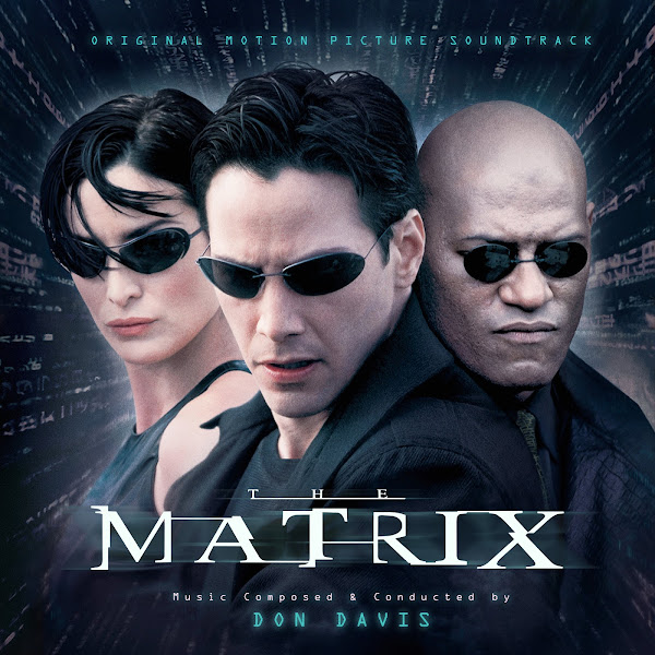
Cover 1 offers a variant of the artwork used on the original score album. The original poster is iconic, but also strange, with that box frame and sky blue making it feel like some dated Microsoft ad. My version uses the same characters but placed over a more moody background, used on a newer Blu-Ray cover. My challenge here was to expand the edges of the frame, especially on the left side, which required several layers of cloning and blending to transition smoothly into the existing image. I like the softer, unique color palette to this version of the image.
The second cover uses the iconic teaser poster with the real-world battery-harvesting pods--such a singular and haunting image. Given the age of this film, I couldn't find any hi-rez version of this artwork, so I first had to warp and edit several copies of this poster, and then significantly enlarge and enhance it to try to get something passably sharp and detailed. Color balance was a bit tricky, and I opted to tone the title colors to match (rather than the more purple title or the neon green).
Cover 3 adapts the film's most famous marketing poster. I tried to find the widest version I could find as I wanted to compose the characters in full, not cropped in like most other versions. For the actual title, I tried to recreate and slightly enhance the blue/purple blur effects on the logo.
The fourth cover was a late addition to the set, I figured I wanted more covers that would be easier to match across the trilogy, and this meant digging heavily into artwork made later for many of the home-video releases of the films. This one is the front cover of a trilogy box set, offering an allusion to the deja-vu cat. This one took quite a bit of time to clean up as I could find no proper digital scan of this, so I had to warp and match and composite together several actual photographs of the physical box cover, as well as some very lo-rez marketing images, and then enhance the whole thing and apply a whole slew of filters to try to improve the image, as well as clone out the trilogy title. The image is still not what quite I would hope, but it's functional, and I like concept overall. On this image, I also switched up the font of the text credits a bit, from the one that's always been linked to the film, to one similar to the actual title card reveal in the film.
Cover 5 uses artwork from a newer trilogy set release. They definitely feel more modern, but I like the variety in tone, and again, these will provide easier matching covers. I simply had to expand the edges of the image to widen things out a bit and recenter the characters better. I struggled a bit with the text styling and placement on this one, but hopefully I'll be able to make this work across all three.
The sixth cover is another using a newer set of trilogy matching covers for 4K Blu-ray releases. Since this is an actual box cover, all the versions I found had annoying stickers on them, so I had to clone out big chunks and expand the bottom of the image for text spacing.
Cover 7 uses an early teaser poster for the film, featuring a noiry black and white cityscape. I first tried to do some subtle clean-up on the weird shadow silhouetting the characters at the bottom of the image--it's not totally gone, but hopefully it feels slightly less dated--as well as vertically compress the image by removing the negative space in the center of the image. I found another version of this image with the glowing green Matrix code (the official text of which was apparently created using text from a sushi cookbook) raining down over it, which I intended to overlay, only to find that the text itself was all wrong, apparently some fan edit. Which means I had to recreate a similar effect all on my own using a wallpaper of the actual code and then editing and erasing parts of it and then blending it back on top of the city. I wanted to keep the code effect subtle, so as to hopefully not totally bury over the city behind it, but to suggest the blending of multiple realities.
The eight cover uses another vintage marketing poster, a piece of artwork that I've always adored (and uses for one of my earliest custom covers ages ago). I love the color palette of the poster, even though it doesn't really match anything from the film itself. Again, due to the age of the original artwork, I had to enhance and do quite a bit of filtering to make it crisper and fresher (though ultimately, it still wears its age). I cloned to expand the top margin of the image to fit that top text more comfortably, and changed the colors of the logo to fit this color scheme.
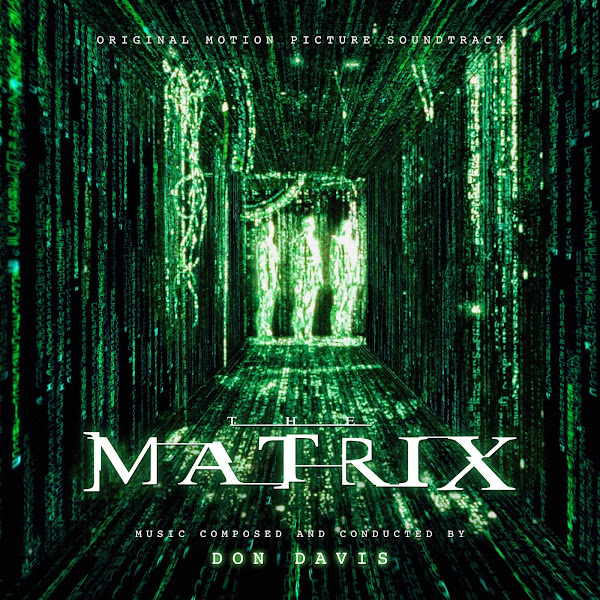
Cover 9 adapts a still image from the film itself, from when Neo is reborn and first sees beyond the Matrix itself. Because it was a film grab, not a digital creation, the image was pretty poor quality, and a lot of the green code extending out from the center just blurred into digital garbage. So I decided to create my own version, keeping the very center (agents) of the image intact, but then largely building out the oncoming walls and superimposing new code text warped to fit the walls, and then only keeping selective details of the original image. Ultimately, it's still a very "noisy" image, but hopefully it feels a little bit cleaner and more up-rezzed because of the extra work.
After exhausting most of the official marketing imagery I could find, I'm finishing my set with two covers utilizing fan artwork. The tenth cover uses a digital painting by Kirk Moffatt, a clever piece that shows us Neo's split realities, from being born again in his real human body to finally learning to master the Matrix itself. I enhanced the poster artwork a little, removed the movie credits, and added my own text. The only small changes I made to the artwork itself was to move a few things around a bit to better feature in my tighter square crop--I moved the larger plus on his arm further up to be more prominent, moved a bullet down to be in frame, and moved the artist's signature to keep it in frame.
Finally, Cover 11 uses another phenomenal piece of artwork, this time coming from graphic designer Nuno Sarnadas, that I discovered on his website, Dark Design--check out his site for more of his custom film posters and for other graphic design work. I reached out to him and he was generously shared with me a textless version of his poster, which saved me hours of having to clone out all the movie credits on the poster. I had little edit on the art itself, except darkening to top a bit to better frame around the new edit. I warped the title to fit into 3D perspective in context. I struggled with where and how to place the other text credits, I tried fitting them into a 3D warp too, but it was a bit too distracting, so I settled for something more traditional for that part, which hopefully doesn't distract too much from the awesome artwork itself.
Hope you enjoy this set of covers. They definitely took a lot of time and work, but I love this project so much that I really wanted to create the very best work I could. Originally I had completed eight covers, but then I kept searching and found even more options, and I just couldn't resist being even more exhaustive with my collection. Let me know your favorites from the bunch.
I've been quiet on your last few uploads since I don't have personal attachments to those scores, but that's not the case with this one! I echo your sentiments very closely about how special Don Davis' voice (via John Adams) was, and I find it such a shame that not only did he drop of the map after 'Revolutions', but that a score to such an influential film didn't have as much of an impact on the zeitgeist of film scoring as I would've thought; instead going down the Media Ventures / Remote Control / Hans Zimmer route.
ReplyDeleteAs for your covers, they're fantastic as always, and reading through your notes it's seems you're putting more and more effort into each set you produce. Certainly a struggle for these older films, particularly ones that didn't have as much of an advertising budget like the first 'Matrix' did. Therefore I'm seeing a lot of similar motifs in this set; particularly compared to the recent set SonicAdventure did for his Deluxe Edition. But there's enough differences here to make it worthwhile.
Surprisingly here, I'm drawn more to the more conventional covers here; I really like the professionalism of #3, #5 & #7. Although I really like the compromise between title and cover for #11; I think neither overpowers the other, so you can lay your doubts to rest over that one.
You'll find more to work with for 'Reloaded' and 'Revolutions', so definitely looking forward to that. Good work once again.